J. John Sepkoski, Jr., was a fossil-hunter who did most of his digging in the library, sifting through the literature of paleontology to build a detailed, quantitative timeline of life on earth. Focusing on marine animals, he recorded the earliest and the latest known appearances of thousands of ancient organisms. The final edition of his compendium, published in 2002 (three years after his death at age 50), lists dates for more than 36,000 genera.
A few years ago I had a chance to get closely acquainted with Sepkoski’s compendium, when I needed a machine-readable version of the timeline. The listings were published on CD-ROM (remember those?), but the files were merely unstructured plain text. I needed something I could compute with, and so I spent a week or two reformatting the records and importing them into a database. (Others have done the same thing. Shanan Peters of the University of Wisconsin–Madison maintains an online version.)
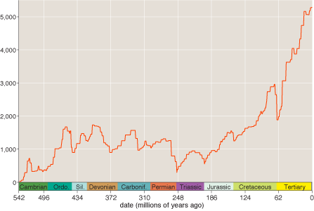
Here is the summary graph that was the goal of my data-conversion project; it shows the number of extant genera as a function of time, according to Sepkoski’s tally of comings and goings:
My brief hands-on experience with Sepkoski’s compilation gave me a sense of how much care went into its preparation. Getting any large data collection into a computer tends to be a fiddly process. Irregularities that a human reader would hardly notice are sand in the gears of automated text processing. Sepkoski’s data files caused less trouble than I expected. The problems I encountered were mainly trivial typographic anomalies—missing punctuation, erratic spacing—and even those were surprisingly rare. The only hints of potentially meaningful errors were a dozen pairs of duplicated entries, where the same genus appeared twice in the listings. It’s easy to see how that would happen in a project that went on for almost three decades; indeed, it’s amazing there weren’t more duplicates.
In any case, I came away from this project with great respect for Sepkoski’s accomplishment, but that doesn’t mean that the curve reproduced above represents the final word on the history of life. It’s not even clear that the main features of the curve and its overall shape give an accurate portrait of changes in global biodiversity.
In constructing any such historical time series, certain biases and distortions are hard to overcome. Of particular importance in this case, fossils from more recent intervals are more likely to survive and to be discovered than those from more ancient times. This “pull of the recent” effect raises questions about the steep upward trend that dominates the Sepkoski curve from the Cretaceous to the present. Has evolution really been going crazy with innovation throughout the past 150 million years, or is that hockey-stick curve an artifact of preservational and sampling bias?
A newly completed analysis of another big fossil database addresses this question (and others). The data source for the new analysis is the Paleobiology Database, a large collaborative project coordinated by John Alroy of the University of California–Santa Barbara. The Paleobiology Database might be called a metacompilation: It brings together statistical and descriptive information from thousands of more-specialized fossil collections (83,444 at the latest count). Initial work on the database began a decade ago (Sepkoski was an early contributor), but it has shown a recent growth spurt.
Of course the new database is vulnerable to the same kinds of systematic bias that Sepkoski had to confront. There’s no avoiding the fact that, on the whole, younger geological strata are more accessible and better studied, and younger fossils are better preserved. But by organizing the data differently and retaining more information about each taxonomic group, Alroy and his colleagues see an opportunity to correct or compensate for some of the biases. Of particular note, whereas Sepkoski recorded only the first and last known appearance of each genus, Alroy et al. attempt to keep track of every occurrence of an organism. This extra information allows sampling bias to be estimated and corrected.
Consider these hypothetical fossil records, where each dot represents a single occurrence of a fossil organism in one of nine labeled intervals:
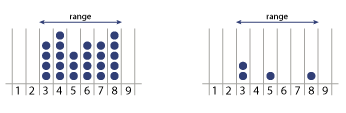
In both cases Sepkoski’s protocol would merely indicate that the taxonomic group originated in period 3 and became extinct in or after period 8. The new database records each time unit in which the fossil was found and, whenever possible, the number of occurrences per interval. This data might seem like superfluous detail. After all, if an organism was alive in periods 3 and 8, we can safely infer that it must have existed in periods 4, 5, 6 and 7 as well, whether or not fossil evidence has come to light. But it turns out that recording occurrences rather than just chronological ranges allows for some helpful statistical magic.
As I understand it, the scheme works something like this. Suppose we could gather together all the fossils ever collected by paleontologists, and sort them into bins according to age. Because of the various sampling and preservational biases, the bins for fairly recent periods (say 50 million years ago, in the Tertiary) would be much fuller than the bins for earlier times (say 400 million years ago, in the Devonian). Any bin with more specimens would be likely to exhibit more diversity as well, simply because rare organisms have a better chance of showing up at least once in a larger sample. But we can control for this bias through a simple subsampling procedure: Draw a fixed number of specimens from each bin, making each selection at random and with replacement. The counts of genera in the subsamples should reflect the true diversity of the biota in each bin.
In practice it gets more complicated than that, because we can’t actually sample the entire fossil record at the level of individual specimens; the best we can do is to randomly choose collections of fossils or the publications that describe them. And the publications vary greatly in how much quantitative data they include; some are just lists of species observed.
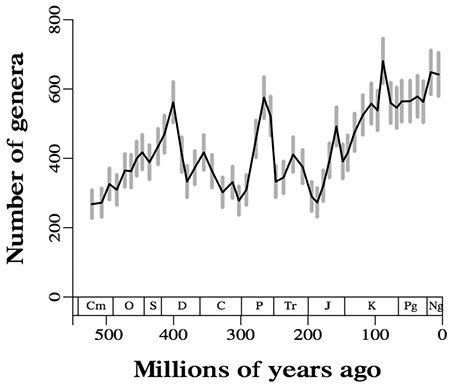
After many adjustments, refinements and calibrations, Alroy and 34 co-authors have published a diversity curve based on the subsampling technique:
Their article (subscription required) appeared last month in Science, along with 67 pages of supplementary material.
The Sepkoski and the Alroy graphs are twins separated at birth—widely separated. The overall upward trend still exists in the newer graph, but it is much less dramatic, especially in the past 100 million years. Some of the famous mass-extinction events, such as those at the end of the Permian (P) and at the end of the Cretaceous (K), are visible in the new graph but are altered in character; instead of a sudden crash after a sustained build-up, we see something more like a return to normal after a brief, sharp spike in diversity. (Alroy elaborates on the dynamics of mass extinctions in a second recent article, this one in PNAS.)
Looking at the two curves, I arrive at this question: How is the interested but nonexpert reader to evaluate these contrasting views of our planetary past? I want to emphasize that the question animating me is not “Who is right?” but “How can we know who is right?” Is there some way that the ordinary, scientifically literate outsider can form a reasoned judgment about such competing claims to truth?
It was questions like these that got me in trouble the last time I wandered into this area. In 2005 Richard A. Muller of the Lawrence Berkeley National Laboratory and Robert A. Rohde, a graduate student at UC Berkeley, published a report in Nature claiming to detect periodic cycles of rising and falling diversity in the Sepkoski data. Applying Fourier analysis to the time series, they reported finding a strong signal at a period of 62 million years and a weaker one at 140 million years. The claim was controversial from the start, and I decided to take a do-it-yourself approach to understanding the issue. I went back to the original data, reimplemented the analytic methods and tried to assess the robustness of the conclusion. I told the story in an American Scientist column.
The column pleased no one. It certainly didn’t please Muller and Rohde, who objected that I was out of my depth in my amateur attempt to replicate their work. It didn’t please the critics of the Muller-Rohde hypothesis, who thought my focus on certain narrow technical issues deflected attention from deeper conceptual flaws in the argument. And it didn’t please me, because I agreed with the criticisms from both sides.
I should also mention that my column had zero impact on the controversy, which not only continues to rage but has also been extended to the new database. Alroy writes in the PNAS article that some of the peaks and valleys forming the supposed cycles fail to materialize in the new data set. On the other hand, a preprint from Adrian L. Melott of the University of Kansas argues that cycles with periods of 62 and 150 million years emerge from the Paleobiology Database with higher statistical significance than they had in the Sepkoski collection.
All in all, I think I’ll sit this one out. I’ve been itching to get my hands on some records from the new database and implement the subsampling algorithm (which sounds both intriguing and readily accessible). It would be fun to play with these ideas. But I’ll let someone else have the fun this time.
Science builds its credibility on the bedrock idea that experiments and other kinds of results are subject to independent confirmation or refutation. And the advent of computational science has made this egalitarian ideal much more practical than it used to be. Although experiments in high-energy physics remain beyond the means of most amateurs, anything done with a computer rather than a particle accelerator is pretty much fair game these days. Still, there are bounds. If every reader set out to replicate every experiment, the world wouldn’t make much progress.
The Seposki graph shows over 1000 genera for most of the last 450 million years, and over 5000 in recent years; the Alroy graph shows there have never been more than 700 genera. This strikes me (a complete outsider) as a huge discrepancy. Have they redefined the word genus? Did you label your axes wrong? What gives?
One of the articles:
http://arxiv.org/vc/arxiv/papers/0807/0807.4729v1.pdf
suggests that the cycles correspond with the rotation of our solar system to galactic north, and speculates that the Earth is exposed to high energy cosmic rays, causing DNA damage. Time to put on my tin foil underwear!
@Gerry: Good question, which I should have anticipated. There are at least two major reasons for the discrepancy, as I understand it.
First, the Sepkoski data set includes roughly twice as many genera–about 36,000, compared with 18,700 in the Alroy et al. work. This isn’t a disagreement about how many animals actually existed; it’s more a matter of criteria for inclusion in the database. Sepkoski included anything for which he could find a literature reference giving stratigraphic dates; Alroy et al. include only references that list actual occurrences of fossils, with geographic coordinates, etc. They are gathering more information, but so far it covers fewer organisms.
Second, the subsampling procedure in the Alroy graph is a filter that tends to reduce the height of the curve. The procedure for constructing the curve is to randomly select collections of fossils within each bin until a certain quota of specimens is achieved; then you count up the number of genera represented by those specimens. The specimen quota has to be set low enough that the bins with the smallest occupancy don’t totally saturate during the sampling procedure. The number used for the published results was 16,200 specimens. (The curve shown is the average of 20 repetitions of this entire procedure; the gray error bars give a 95 percent confidence interval.)
Thus the two curves really aren’t comparable on a quantitative basis. But the actual counts of genera don’t carry great meaning anyway. (Nobody believes we have even a rough estimate of the number of genera extant at any particular time, including now.) It’s just the variations in diversity that matter — the overall shape of the curve. Perhaps there is some normalization procedure that would put them on the same scale.
All of the above is based on my reading of the Science article and supplemental material. If anyone who can comment more authoritatively on this matter happens to read this, please speak up!
I believe the Muller and Rohde technical supplement, mentioned in Brian’s American Scientist article is at:
http://www.nature.com/nature/journal/v434/n7030/extref/nature03339-s1.pdf