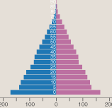
An interactive and animated graphic shows changes in the age structure of the human population over a 150-year period, according to estimates and projections made by the United Nations. The controls at upper right allow forward and backward movement through time in steps of five years. Each bar in the population pyramid represents the size of a five-year cohort—the number of males and females aged 0–4, 5–9, and so on. As time passes and people age, each cohort migrates upward through the pyramid. Meanwhile the bars shrink horizontally, reflecting age-specific death rates; the bottommost stratum is replenished by births. Some notable demographic events are visible as the population evolves: a change in the slope of the sides of the pyramid in about 1990 and a slight narrowing of the base after 2050. The illustration is built with SVG (Scalable Vector Graphics) and a JavaScript library called D3, created by Michael Bostock. The data are from the United Nations Department of Economic and Social Affairs, World Population Prospects, the 2010 Revision (http://esa.un.org/unpd/wpp/).
For further explanation: "Computing Science: Pixels or Perish," American Scientist, Vol. 100, No. 2, March-April 2012, pages 106-111. HTML PDF
Illustration created by Brian Hayes.