Sifting through the election results last week, I noticed that the precinct where I used to live in Durham, North Carolina, voted 620 to 40 in favor of the Blue candidate in the U.S. Senate race. That’s a margin of just under 94 percent. A few nearby polling places were even more lopsided: One score was 288 to 7, which works out to 97.6 percent. Statewide, however, the contest was quite close; the Blues lost with 49.13 percent to the Reds’ 50.87 percent. (The percentages I’m giving here are based on votes for the two major parties only; published results are slightly different because they include votes for third-party candidates and write-ins.)
The combination of one-sided local results and a nearly even split in the statewide totals left me curious about the distribution of vote margins, or what we might call the political polarization spectrum. Are extreme ratios, like those in my old neighborhood, rare outliers? Or have we become a nation of segregated political communities, where you live with your own kind and stay away from places where the other side dominates?
The infographics group at The New York Times has produced a series of election maps that offer much geographic insight.
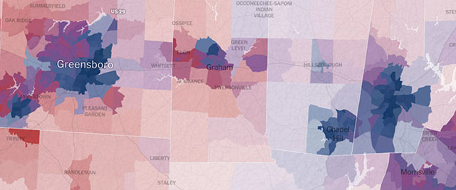
The North Carolina map shows deep blue city cores surrounded by ruddy or purplish suburbs. Rural areas, with lower population density, range from pink to baby blue. The maps are lovely—they transform ugly politics into luscious cartography—but they can’t give a quantitative answer to my question about political segregation and integration.
So off I went to the web site of the North Carolina Board of Elections, where I pulled down the latest report (still unofficial), giving vote totals for the state’s 2,726 precincts. After some vigorous data wrangling (Excel, Textmate, Python, Lisp, eyeballing), I had a histogram with 20 bins, classifying precincts according to their percentage of votes for the Red candidate.
Before I show the data, it’s worth pausing to think about what the distribution might be expected to look like. Suppose the state’s population were thoroughly mixed, with Red and Blue voters scattered at random. Then the precinct voting margins would follow a normal distribution, with most of the precincts near the 50-50 mark and only a few out in the far-right and far-left tails. The curve might look something like this:

Actually, that’s not quite what the curve would look like; it would be much narrower. Suppose you take 3,000 precincts with 1,000 voters each, and you paint the individual voters Red or Blue at random with probability 1/2. You would get a normal distribution with a mean of 500 and a standard deviation of about 16 voters (i.e., \(1/2\sqrt{1000}\)). Almost all of the precincts would lie within three standard deviations of the mean, or in other words between 450 and 550 Red voters. The histogram would be more like this:

Of course nobody who reads the newspaper would suggest that random mixing provides a good model of the American political landscape. Given the evidence of increasing polarization in the public, we might expect to find a two-humped camel, with a Red peak and a Blue peak, and not much of anybody in the middle:

Or maybe the distribution is even more extreme: an empty bowl, with every precinct drifting centrifugally toward the outer fringes of the political spectrum:

All right, I’ve stalled long enough; no more playing with toy distributions. Here’s the real deal—the histogram based on North Carolina precinct data for the recent Senate election:

The shape of this curve took me by surprise, mostly because of its strong asymmetry. Remember, the total numbers of Red and Blue voters in the state are roughly equal, but the apportionment of Reds and Blues in precincts turns out to be quite different. At the left edge of the graph there are 150 precincts where at least 90 percent of the voters chose the Blue candidate, but over on the right side there are only 8 precincts that voted at least 90 percent Red.
Please don’t misinterpret this graph. It doesn’t say that Blue voters are more extreme or more radicalized than Red ones. Nothing of the sort. It says that Blue voters tend to huddle together in more homogeneous communities. If you’re Blue and you want to be surrounded by like-minded voters, there are hundreds of places you can live. If you’re Red, you have lots of choices where you’ll be in the majority—more than 60 percent of the precincts satisfy that criterion—but you would have a hard time finding areas where you have few or no Blue neighbors.
The pattern seemed peculiar enough that I began to wonder if it might be unique to North Carolina. So I took a look at the Senate race in Virginia, which was even closer than the North Carolina contest. The Virginia pattern differs only in detail. Again we have an abundance of solidly Blue precincts, but very few solidly Red ones:

Could it be something about the South that produces this skew in the curve? I wanted to check the closely contested governor’s race in Massachusetts (where I live now), but the state hasn’t yet posted precinct-level results. Instead I looked at the Minnesota Senatorial election:

Here the raised shoulder on the Blue side is not nearly as dramatic, but the asymmetry is present. (Note that this race did not have a close finish; the Blues won by 10 percentage points.)
There are several ways we might try to explain these patterns—or explain them away. A glance at the Times maps, with their inky blue urban neighborhoods, 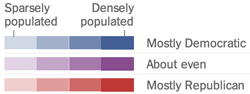 suggests it’s all about city living. But this impression is partly an artifact of the maps’ graphic scheme, which uses color to encode not just voting margin but also population density. As a result, strongly skewed votes in rural areas are not nearly as conspicuous as those in cities. In North Carolina there are several pale blue precincts in the countryside that have vote totals above 85 percent Blue. Minnesota exhibits the same pattern; indeed, one Iron Range precinct, in the far north of the state, recorded a clean sweep for the Blues, 218 to 0. In Virginia, on the other hand, all of the most strongly biased precincts seem to be urban. And it remains true that the vast majority of voters in lopsided precincts are city dwellers.
It’s also important to note that city districts are geographically much smaller than rural or suburban ones. Perhaps this fact alone could explain much of the Blue-Red difference. If we carved up the rural districts into areas the same size as the city precincts, would we find homogeneous clusters of voters? I have no data to answer that question one way or the other. But even if such clusters do exist, the situation remains asymmetric because the Blue voting blocks are larger in population by an order of magnitude.
Race is another factor that can’t be ignored. Those strongly Blue precincts in rural North Carolina are also largely black precincts. But race is not the whole story. Many of the Bluest urban districts are racially and ethnically diverse.
In the end, what’s most puzzling about the histograms is not just the existence of many pure Blue precincts but the near absence of pure Red ones. What accounts for this imbalance? It’s not hard to imagine social mechanisms that would separate people into affinity groups, but the simplest models are symmetrical. We need to find a factor that acts differently on the two parties.
I have not settled in my own mind what I think is going on here, but I would like to offer three possible mechanisms for consideration.
First, maybe Red voters and Blue voters differ in the criteria they apply when choosing a place to live. We might test this idea in a variant of the Schelling segregation model, in which people tend to go elsewhere when they have too few neighbors of their own kind. Perhaps Red voters refuse to live where the proportion of Reds is less than 1/3, but Blues are content to stay even where they are a tiny minority. Alternatively, we might suppose that when Blues reach a 2/3 majority, they drive out the remaining Reds, whereas Reds are willing to tolerate a Blue minority in their midst. In either case, the result is “Red flight” from strongly Blue areas but no countercurrent of Blue voters fleeing Red areas. I think this model might be capable of explaining the observations, but I have no idea how to explain the model. Is there any evidence for such an asymmetry in personal preferences and behavior?
The second possibility is that Blues are more effective than Reds in persuading their neighbors to support the local political majority. In other words, it’s not that Reds flee or are expelled from Blue areas; rather, they are converted into Blues. Then we have to ask: How come the Reds are unable to win over their own Blue neighbors?
My third candidate explanation is gerrymandering. Maybe what we’re seeing is not some natural tendency to form uniformly Blue communities but rather an attempt to draw the boundaries of precincts in a way that concentrates Blue voters in certain districts, leaving the rest of the precincts with a Red majority. To test this hypothesis we might compare states in which different parties dominate the state legislature and thus control the redistricting process. If the asymmetry really is caused by an attempt to hem in the minority party, we should see a mirror image in states where the other party is in power. The three states I’ve looked at so far are not a useful sample in this respect: North Carolina and Virginia both have Red legislatures, and Minnesota’s was also controlled by the Reds during the most recent redistricting cycle. Massachusetts will be a good test case when the numbers come out.
One last thought: In this essay I have written about Reds and Blues rather than Republicans and Democrats in an attempt to keep the focus on a mathematical question and to keep my distance from partisan passions. For the record, however, I don’t actually believe that politics is a game played by brightly colored teams. And I do take sides. Last Tuesday, in my opinion, the stinkers won.