Lopsided
by Brian Hayes
Published 10 November 2014
Sifting through the election results last week, I noticed that the precinct where I used to live in Durham, North Carolina, voted 620 to 40 in favor of the Blue candidate in the U.S. Senate race. That’s a margin of just under 94 percent. A few nearby polling places were even more lopsided: One score was 288 to 7, which works out to 97.6 percent. Statewide, however, the contest was quite close; the Blues lost with 49.13 percent to the Reds’ 50.87 percent. (The percentages I’m giving here are based on votes for the two major parties only; published results are slightly different because they include votes for third-party candidates and write-ins.)
The combination of one-sided local results and a nearly even split in the statewide totals left me curious about the distribution of vote margins, or what we might call the political polarization spectrum. Are extreme ratios, like those in my old neighborhood, rare outliers? Or have we become a nation of segregated political communities, where you live with your own kind and stay away from places where the other side dominates?
The infographics group at The New York Times has produced a series of election maps that offer much geographic insight.
Portion of a New York Times map showing voting patterns in the 2014 U.S. Senate election in North Carolina. Durham is the blue inkblot near the right edge. Graphics by Amanda Cox, Mike Bostock, Derek Watkins, and Shan Carter.
The North Carolina map shows deep blue city cores surrounded by ruddy or purplish suburbs. Rural areas, with lower population density, range from pink to baby blue. The maps are lovely—they transform ugly politics into luscious cartography—but they can’t give a quantitative answer to my question about political segregation and integration.
So off I went to the web site of the North Carolina Board of Elections, where I pulled down the latest report (still unofficial), giving vote totals for the state’s 2,726 precincts. After some vigorous data wrangling (Excel, Textmate, Python, Lisp, eyeballing), I had a histogram with 20 bins, classifying precincts according to their percentage of votes for the Red candidate.
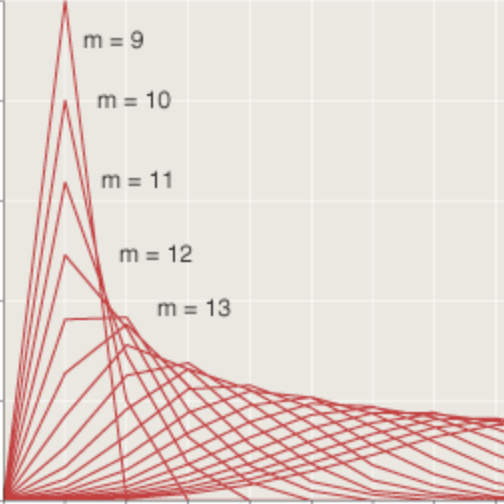
Before I show the data, it’s worth pausing to think about what the distribution might be expected to look like. Suppose the state’s population were thoroughly mixed, with Red and Blue voters scattered at random. Then the precinct voting margins would follow a normal distribution, with most of the precincts near the 50-50 mark and only a few out in the far-right and far-left tails. The curve might look something like this:

Actually, that’s not quite what the curve would look like; it would be much narrower. Suppose you take 3,000 precincts with 1,000 voters each, and you paint the individual voters Red or Blue at random with probability 1/2. You would get a normal distribution with a mean of 500 and a standard deviation of about 16 voters (i.e., \(1/2\sqrt{1000}\)). Almost all of the precincts would lie within three standard deviations of the mean, or in other words between 450 and 550 Red voters. The histogram would be more like this:

Of course nobody who reads the newspaper would suggest that random mixing provides a good model of the American political landscape. Given the evidence of increasing polarization in the public, we might expect to find a two-humped camel, with a Red peak and a Blue peak, and not much of anybody in the middle:

Or maybe the distribution is even more extreme: an empty bowl, with every precinct drifting centrifugally toward the outer fringes of the political spectrum:

All right, I’ve stalled long enough; no more playing with toy distributions. Here’s the real deal—the histogram based on North Carolina precinct data for the recent Senate election:

The shape of this curve took me by surprise, mostly because of its strong asymmetry. Remember, the total numbers of Red and Blue voters in the state are roughly equal, but the apportionment of Reds and Blues in precincts turns out to be quite different. At the left edge of the graph there are 150 precincts where at least 90 percent of the voters chose the Blue candidate, but over on the right side there are only 8 precincts that voted at least 90 percent Red.
Please don’t misinterpret this graph. It doesn’t say that Blue voters are more extreme or more radicalized than Red ones. Nothing of the sort. It says that Blue voters tend to huddle together in more homogeneous communities. If you’re Blue and you want to be surrounded by like-minded voters, there are hundreds of places you can live. If you’re Red, you have lots of choices where you’ll be in the majority—more than 60 percent of the precincts satisfy that criterion—but you would have a hard time finding areas where you have few or no Blue neighbors.
The pattern seemed peculiar enough that I began to wonder if it might be unique to North Carolina. So I took a look at the Senate race in Virginia, which was even closer than the North Carolina contest. The Virginia pattern differs only in detail. Again we have an abundance of solidly Blue precincts, but very few solidly Red ones:

Could it be something about the South that produces this skew in the curve? I wanted to check the closely contested governor’s race in Massachusetts (where I live now), but the state hasn’t yet posted precinct-level results. Instead I looked at the Minnesota Senatorial election:

Here the raised shoulder on the Blue side is not nearly as dramatic, but the asymmetry is present. (Note that this race did not have a close finish; the Blues won by 10 percentage points.)
There are several ways we might try to explain these patterns—or explain them away. A glance at the Times maps, with their inky blue urban neighborhoods,  suggests it’s all about city living. But this impression is partly an artifact of the maps’ graphic scheme, which uses color to encode not just voting margin but also population density. As a result, strongly skewed votes in rural areas are not nearly as conspicuous as those in cities. In North Carolina there are several pale blue precincts in the countryside that have vote totals above 85 percent Blue. Minnesota exhibits the same pattern; indeed, one Iron Range precinct, in the far north of the state, recorded a clean sweep for the Blues, 218 to 0. In Virginia, on the other hand, all of the most strongly biased precincts seem to be urban. And it remains true that the vast majority of voters in lopsided precincts are city dwellers.
It’s also important to note that city districts are geographically much smaller than rural or suburban ones. Perhaps this fact alone could explain much of the Blue-Red difference. If we carved up the rural districts into areas the same size as the city precincts, would we find homogeneous clusters of voters? I have no data to answer that question one way or the other. But even if such clusters do exist, the situation remains asymmetric because the Blue voting blocks are larger in population by an order of magnitude.
Race is another factor that can’t be ignored. Those strongly Blue precincts in rural North Carolina are also largely black precincts. But race is not the whole story. Many of the Bluest urban districts are racially and ethnically diverse.
In the end, what’s most puzzling about the histograms is not just the existence of many pure Blue precincts but the near absence of pure Red ones. What accounts for this imbalance? It’s not hard to imagine social mechanisms that would separate people into affinity groups, but the simplest models are symmetrical. We need to find a factor that acts differently on the two parties.
I have not settled in my own mind what I think is going on here, but I would like to offer three possible mechanisms for consideration.
First, maybe Red voters and Blue voters differ in the criteria they apply when choosing a place to live. We might test this idea in a variant of the Schelling segregation model, in which people tend to go elsewhere when they have too few neighbors of their own kind. Perhaps Red voters refuse to live where the proportion of Reds is less than 1/3, but Blues are content to stay even where they are a tiny minority. Alternatively, we might suppose that when Blues reach a 2/3 majority, they drive out the remaining Reds, whereas Reds are willing to tolerate a Blue minority in their midst. In either case, the result is “Red flight” from strongly Blue areas but no countercurrent of Blue voters fleeing Red areas. I think this model might be capable of explaining the observations, but I have no idea how to explain the model. Is there any evidence for such an asymmetry in personal preferences and behavior?
The second possibility is that Blues are more effective than Reds in persuading their neighbors to support the local political majority. In other words, it’s not that Reds flee or are expelled from Blue areas; rather, they are converted into Blues. Then we have to ask: How come the Reds are unable to win over their own Blue neighbors?
My third candidate explanation is gerrymandering. Maybe what we’re seeing is not some natural tendency to form uniformly Blue communities but rather an attempt to draw the boundaries of precincts in a way that concentrates Blue voters in certain districts, leaving the rest of the precincts with a Red majority. To test this hypothesis we might compare states in which different parties dominate the state legislature and thus control the redistricting process. If the asymmetry really is caused by an attempt to hem in the minority party, we should see a mirror image in states where the other party is in power. The three states I’ve looked at so far are not a useful sample in this respect: North Carolina and Virginia both have Red legislatures, and Minnesota’s was also controlled by the Reds during the most recent redistricting cycle. Massachusetts will be a good test case when the numbers come out.
One last thought: In this essay I have written about Reds and Blues rather than Republicans and Democrats in an attempt to keep the focus on a mathematical question and to keep my distance from partisan passions. For the record, however, I don’t actually believe that politics is a game played by brightly colored teams. And I do take sides. Last Tuesday, in my opinion, the stinkers won.
Responses from readers:
Please note: The bit-player website is no longer equipped to accept and publish comments from readers, but the author is still eager to hear from you. Send comments, criticism, compliments, or corrections to brian@bit-player.org.
Publication history
First publication: 10 November 2014
Converted to Eleventy framework: 22 April 2025


well, it’s well-known here in NC that the state was hugely gerrymandered when Republicans re-districted the state after taking over the legislature in 2010 (how the re-districting hasn’t been struck down by the courts is beyond my comprehension) — they’ve done this elsewhere as well, wherever they gain control of state legislatures… part of their long-term plan for hijacking control of state government… having already destroyed the middle class, they’re now actively in the process of destroying working majorities, and governing as little more than a cabal. That’s not an exaggeration, that’s their national plan, and it’s disgusting.
let’s be fair, both parties gerrymander pretty hard.
Let’s be fair: you’re wrong.
REPUBLICANS OVERWHELMINGLY have used gerrymandering over the past decade, disenfranchising voters in huge numbers:
http://election.princeton.edu/2012/12/30/gerrymanders-part-1-busting-the-both-sides-do-it-myth/
The Republican efforts at gerrymandering districts in NC and other states (and the Democratic ones in states like Illinois and Maryland) are well known. But gerrymandering precincts? I’d never really heard of that, to be honest!
It doesn’t seem like anywhere as effective a tool to shore up one’s power either, because it’s still going to be how you combine lots of precincts into one district that’s actually going to determine what kind of candidate will be elected there. So gerrymandering precincts would seem to be ‘useful’ only if the precinct happens to be on the edge of a district, where a change in precinct borders would also change the overall district’s border, but even then you’d be talking about very minor shifts in the balance of the district-wide vote.
I can see how gerrymandering precincts would ‘work’, for the oppressive party, in rural areas in terms of making it hard for voters of the opposing party to get to the polling station. (E.g. drawing rural black voters into a district where the polling station is far away). But that’s not what this post’s about.
Would be really interesting to hear about concrete examples of how precincts were gerrymandered, with what effect.
Really interesting… but I don’t think gerrymandering is the root cause because you’re looking at the precinct level and not the district level. I’d imagine the precincts to be relatively compact and un-gerrymandered. It’s the grouping of these precincts together to create districts that forms the gerrymander.
As you allude to above, I think this is probably a combination of urban density patterns and the way precincts are created. Districts have nearly the same number of voters, but is there the same requirement for precincts? The precinct system is mainly designed to facilitate voting so I could see geographical area being the primary determinant of precinct boundaries. Even though urban precincts are small, they probably still have many more people than the rural precincts which have to be capped at a maximum geographic extant to minimize the distance to polling places. This could generate fewer larger, bluer urban precincts and many more smaller, pinker urban precincts.
Even with the unequal population sizes, to get the distributions you show there would need to be some asymmetry in the urban/rural voting patterns. While it’s easy to establish that urban voters are bluer, this plot seems to show that as density increases, the spread of blue vote share decreases. While the general trend shows increasing blueness with density, the top quartile of districts are solidly blue with few red districts while the lower 3 quartiles are more evenly spread with a red bias. Of course, that’s grouped by district so it could be skewed by gerrymandering. Combining this density pattern with the precinct distributions should give the distribution you see.
As for why these patterns exist, I don’t think that either people of either group are more persuasive than the others. Instead, I think it’s the density itself - When you live in high-density areas, close to all your neighbors and are exposed to a wide range of people you’re forced to humanize them leading to a greater acceptance of the social justice, equal rights, and anti-poverty initiatives that are the mainstay of the blues.
Gerrymandering is definitely a big problem at the district level, however, and I wonder what the district-level distributions look like. NC’s 12th district holds the title of “Most Gerrymandered” and the rest of the state follows closely behind. I actually wouldn’t expect the gerrymandered distributions to look much different from what you show. I would expect it to look a bit more bi-modal, however, with a sharper peak on the low end of the blue side and a smaller, wider peak in the middle of the red side, assuming the reds were in control of the redistricting. So maybe there is something to the gerrymandering explanation especially if it requires drawing the precincts in such a way as to appropriately form the districts. Of course some redrawing of precincts has to occur during gerrymandering. For example, in Kentucky, there are ghost precincts that have no voters but exist to keep electoral districts contiguous. This would definitely affect the precinct voting distributions in some way.
I was a voter in the NC 12th, so I’m well aware of its tortured history. The experience led me to write a column on the redistricting process.
It’s true that districts rather than precincts are the main target of gerrymandering. But in most states precincts are the atomic building blocks of districts: A district is an assembly of whole precincts. Thus the district cannot have a greater skew than the skewiest precinct in it. (Lately NC and some other states have been splitting a few precincts, meaning that voters at the same polling place get different ballots. This lifts the constraint skewishness and offers still further opportunities for mischief.)
That said, I’m not trying to sell the idea that gerrymandering is the root cause of the asymmetry; it’s just one hypothesis. Your alternative suggestion that city life makes us nicer people is something I’d really love to believe, but I’d like more evidence.
In any case, thanks for the very thoughtful response.
Ahh, I remember that… Must’ve been why I thought of it ;-)
Yeah, I agree - I was mainly addressing my opening remark about gerrymandering to the first commenter. I think it’s more the other way around - gerrymanderers use the underlying skewness to create advantageous districts.
You point out that there’s two separate questions you’re trying to answer:
1) Is this underlying distribution real? If you randomly take, say 10 sq mi areas or compact groupings of X thousand people, are majority Blue areas more Blue than majority Red areas are Red?
Looking at precinct-level data should somewhat eliminate gerrymandering as a cause if you can presume that precincts are geographically compact . If so, then your results reflect an underlying skewness (somewhat) independent of gerrymandering. I think you imply this above, I was only trying to make it explicit. (The actual populations of the precincts might also toy with the distributions).
I think the underlying distribution is real and that the “geographic compactness” of these blue regions in urban areas also means that, even without gerrymandering, you can get a preponderance of representatives from the Red side.
Maybe we just need to go proportional representation for each state…
2) What causes the underlying distribution?
This obviously has nothing to do with gerrymandering and we can all speculate as to the reasons -
I didn’t say nicer, just Bluer - there’s plenty of jackarse liberals out there too…
I’m not sure if there’s a ton of evidence to support the hypothesis that city life makes people Blue, but there are things like the “homosexual child/sibling/niece/etc” effect where having gay family members correlates to support of gay marriage. I wouldn’t be surprised if this extends beyond immediate families and is broader than just sexual orientation issues.
It may be too difficult to retrieve the data, but if you could go back to say the year 2000 and prior (well before GOP-inclined gerrymandering occurred on a large-scale basis), and re-run that data I imagine you’d find quite a difference (pre- and post- gerrymandered districts).
The notion that city-life makes people “nicer” I think runs counter to most people’s experience — perhaps though city-life increases “tolerance” (I’m not even sure of that). In terms of NC (and perhaps all the south) one thing about the more dense, metropolitan areas is that they have a higher proportion of displaced “Yankees” (who tend to come from more liberal/Democratic locales), than do the more rural areas.
Both parties have been gerrymandering for quite awhile. Chistopher Ingram looked at the change in shapes of the districts over 60 years. There’s a general increase in gerrymander index over the whole time period, but lots of variation by year and state. Granted, this is just based on district shape and not demographics, but I think it shows that there’s no clear trend that starts in 2001 (107th Congress).
Like I mention above, I don’t think they’re nicer, only more tolerant, as you point out. It’s difficult (but possible) to be highly intolerant and surrounded by those you hate day in and day out.
Also, I’ve never bought into the stereotypes of “rude city-folk” and “nice country-folk”. I wouldn’t be surprised if there was quite a bit of confirmation bias involved in “most-people’s experience” regarding this trope. Has anyone looked into this?
I don’t buy this as an explanation, at least not to explain difference between the south and elsewhere - Isn’t it true that most metropolitan areas (with possible exceptions like Detroit and maybe other Rust-belt cities) have higher proportions of non-natives, both Americans and immigrants? The US has been urbanizing for a long time now and it can’t be just growth within the cities.
On the other hand, a general “Blue flight” to cities is a potential cause for the observed distribution (or the reverse, “Red flight” from the cities). Brian mentions the Schelling segregation model - maybe there’s an appropriate set of parameters or modification to this model that could explain the skewed distribution.
You can approximate your histogram pretty easily with “Black people are 95% Democratic, White people are about 30% Democratic. Black people live in neighborhoods that are 85% black on average, white people live in neighborhoods that are 10% black on average”. This also, not coincidentally, basically matches polling data.
It’s just important to remember with election data that while North Carolina has a lot of Hispanics in Census data, North Carolina Hispanics have very low citizenship rates and even lower turnout rates. If you look at SoS turnout statistics by race for 2010, over 97% of voters in 2010 were either white or black. So a lot of these seemingly diverse precincts are actually mostly black voters.
There’s some variance in white vote geographically, but I suspect that most of the variance is swamped by racial demographics of the precinct. This really isn’t a story about assortive mating so much as it is politics devolving into racial identity politics.
Quick back of the envelope regression, racial demographics of 2010 voters in an precinct explain about 72% of the variance in 2010 election results.
I’m curious about your numbers on race and party preference. Even in the 2012 Obama-Romney election, the black vote did not reach 95% Dem. (According to Pew.) And for white voters the split was something like 51-40 in favor of Romney. But maybe there’s a better source for such numbers that tells a different story?
Not that I doubt that race is a key variable both in voting patterns and residential patterns.
Public polls generally underestimate the black vote because a non-trivial percentage of black respondents are actually white people who are coded incorrectly (Bayes rule is weird). This is a big reason why if you look at state by state exit polls in 2008, you’ll see that Obama’s share of the black vote is much higher in very black states like Mississippi (http://www.cnn.com/ELECTION/2008/results/polls/#val=MSP00p1 , 98% Obama, 33% black) than in states like Iowa (http://www.cnn.com/ELECTION/2008/results/polls/#val=IAP00p1 , 93% Obama, 3% black).
The other thing is that while white voters overall were about 40% Democratic nationally, white people in North Carolina are considerably more conservative than nation-wide. This is the main reason why North Carolina is generally a swing state: It’s almost twice as black as the country overall but has unusually conservative white people. (Mississippi is the most extreme version of this, being 3-4X as black as the country overall but having almost zero white Democratic voters)
One way to confirm this is to do an ecological regression of Obama_vote=b_1*black_percent_of_voters+b2*white_percent_of_voters+b3*other_percent_of_voters. If you do this regression in North Carolina, the coefficients that come out are b_1=.98, b_2=.304, and b_3=.87 (Which is sort of distorted by the Lumberton Indian reservation, who have an interesting history as Native Americans with considerable black ancestry).
Also, http://www.cnn.com/election/2014/results/state/NC/senate#exit-polls has Hagan at 33% of white voters and 96% of black voters. Which makes sense, you’d expect her to both overperform with whites relative to Obama and underperform with African Americans.
Found the district in northern Minnesota with 218 Dem votes and 0 votes for the GOP. :-) It wasn’t entirely a clean sweep because it looks like there were 5 votes for third-party/write-in candidates. It was more to the West than I expected - not really Iron Range territory anymore. Maybe more about Native American voters?
… Yeah, I looked up the area on Google Maps. The whole precinct lies within the Red Lake Reservation. The other three inhabited precincts in the reservation went for Franken with 93.6%, 94.9% and 91.0% of the vote. (There’s a fourth precinct of about a hundred square miles that had just one voter - a very lonely Republican.) Wikipedia says:
In short, the near-total sweep of Democrats in that instance is definitely tied in with race/ethnicity, perhaps providing a very tangential data point supporting David Shor’s comment about how most of the variance patterns is probably to do with racial demographics.
Regarding redistricting in Minnesota, we did have a GOP legislature, but we had a Democratic governor who vetoed their gerrymandering plan. The lines we ended up with were drawn by a court, which came up with a non=partisan plan. So comparing us to gerrymandered states might be a good illustration of the difference between gerrymandering and self-packing, because we are packed in urban areas. Unlike most states, we still have a portion of our rural areas that are heavily white but still Democratic, the northeastern part of the state that includes the Iron Range, Duluth, and the North Shore of Lake Superior. And as another commenter mentioned, the Indian reservations vote Democratic.
This might have already been said in the comments, but I suspect more successful gerrymandering by Republicans has played some part in this. This could be verified by looking at this distribution and how it changes over time - before and after deliberate gerrymandering.
Very interesting, thanks so much for doing this!!
Cathy
You have created a fascinating paper.
In my state, Pennsylvania, Ds tend to bunch up in the cities and near suburbs, leaving huge swaths of the state heavily R. Legislative districts - federal and state - are equalized in order to minimize this source of voting inequality. Wards are roughly equalized within any one township or city. But precincts are a different story.
Do you have any measure of the differences or patterns in the population of precincts within the states you studied?
Your assertions that a voting populations ‘political’ vote intentions should approximate to a binomial curve, are used by this group http://uwdatasci.wordpress.com/2011/12/13/graphing-russias-election-fraud/ to examine some results from a possibly dubious election in Russia. They seam to be able to distinguish the different type of potential vote rigging.