John von Neumann was a prodigy and a polymath. He made notable contributions in pure mathematics, physics, game theory, economics, and the design of computers. He also came up with the first algorithm for generating pseudorandom numbers with a digital computer. That last invention, however, is seldom counted among his most brilliant accomplishments.
The von Neumann algorithm is known as the middle-square method. You start with an n-digit number called the seed, which becomes the first element of the pseudorandom sequence, designated \(x_0\). Squaring \(x_0\) yields a number with 2n digits (possibly including leading zeros). Now select the middle n digits of the squared value, and call the resulting number \(x_1\). The process can be repeated indefinitely, each time squaring \(x_i\) and taking the middle digits as the value of \(x_{i+1}\). If all goes well, the sequence of \(x\) values looks random, with no obvious pattern or ordering principle. The numbers are called pseudorandom because there is in fact a hidden pattern: The sequence is completely predictable if you know the algorithm and the seed value.
Program 1, below, shows the middle-square method in action, in the case of \(n = 4\). Type a four-digit number into the seed box at the top of the panel, press Go, and you’ll see a sequence of eight-digit numbers, with the middle four digits highlighted. (If you press the Go button without entering a seed, the program will choose a random seed for you—using a pseudorandom-number generator other than the one being demonstrated here!)
(Source code on GitHub.)
Program 1 also reveals the principal failing of the middle-square method. If you’re lucky in your choice of a seed value, you’ll see 40 or 50 or maybe even 80 numbers scroll by. The sequence of four-digit numbers highlighted in blue should provide a reasonably convincing imitation of pure randomness, bouncing around willy-nilly among the integers in the range from 0000 to 9999, with no obvious correlation between a number and its nearby neighbors in the list. But this chaotic-seeming behavior cannot last. Sooner or later—and all too often it’s sooner—the sequence becomes repetitive, cycling through some small set of integers, such as 6100, 2100, 4100, 8100, and back to 6100. Sometimes the cycle consists of a single fixed point, such as 0000 or 2500, repeated monotonously. Once the algorithm has fallen into such a trap, it can never escape. In Program 1, the repeating elements are flagged in red, and the program stops after the first full cycle.
The emergence of cycles and fixed points in this process should not be surprising; as a matter of fact, it’s inevitable. The middle-square function maps a finite set of numbers into itself. The set of four-digit decimal numbers has just \(10^4 = 10{,}000\) elements, so the algorithm cannot possibly run for more than 10,000 steps without repeating itself. What’s disappointing about Program 1 is not that it becomes repetitive but that it does so prematurely, never coming anywhere near the limit of 10,000 iterations.
The middle-square system of Program 1 has three cycles, each of length four, as well as five fixed points. Figure 1 reveals the fates of all 10,000 seed values.

Each of the numbers printed in a blue lozenge is a terminal value of the middle-square process. Whenever the system reaches one of these numbers, it will thereafter remain trapped forever in a repeating pattern. The arrays of red dots show how many of the four-digit seed patterns feed into each of the terminal numbers. In effect, the diagram divides the space of 10,000 seed values into 17 watersheds, one for each terminal value. Once you know which watershed a seed belongs to, you know where it’s going to wind up.
The watersheds vary in size. The area draining into terminal value 6100 includes more than 3,100 seeds, and the fixed point 0000 gathers contributions from almost 2,000 seeds. At the other end of the scale, the fixed point 3792 has no tributaries at all; it is the successor of itself but of no other number.
For a clearer picture of what’s going on in the watersheds, we need to zoom in close enough to see the individual rills and streams and rivers that drain into each terminal value. Figure 2 provides such a view for the smallest of the three watersheds that terminate in cycles.

The four terminal values forming the cycle itself are again shown as blue lozenges; all the numbers draining into this loop are reddish brown. The entire set of numbers forms a directed graph, with arrows that lead from each node to its middle-square successor. Apart from the blue cycle, the graph is treelike: A node can have multiple incoming arrows but only one outgoing arrow, so that streams can merge but never split. Thus from any node there is only one path leading to the cycle. This structure has another consequence: Since some nodes have multiple inputs, other nodes must have none at all. They are shown here with a heavy outline.
The ramified nature of this graph helps explain why the middle-square algorithm tends to yield such short run lengths. The component of the graph shown in Figure 2 has 86 nodes (including the four members of the repeating cycle). But the longest pathways following arrows through the graph cover just 15 nodes before repetition sets in. The median run length is just 10 nodes.
A four-digit random number generator is little more than a toy; even if it provided the full run length of 10,000 numbers, it would be too small for modern applications. Working with “wider” numerals allows the middle-square algorithm to generate longer runs, but the rate of increase is still disappointing. For example, with eight decimal digits, the maximum potential cycle length is 100 million, but the actual median run length is only about 2,700. More generally, if the maximum run length is \(N\), the observed median run length seems to be \(c \sqrt{N}\), where \(c\) is a constant less than 1. This relationship is plotted in Figure 3, on the left for decimal numbers of 4 to 12 digits and on the right for binary numbers of 8 to 40 bits.

The graphs make clear that the middle-square algorithm yields only a puny supply of random numbers compared to the size of the set from which those numbers are drawn. In the case of 12-digit decimal numbers, for example, the pool of possibilities has \(10^{12}\) elements, yet a typical 12-digit seed yields only about 300,000 random numbers before getting stuck in a cycle. That’s only a third of a millionth of the available supply.
Von Neumann came up with the middle-square algorithm circa 1947, while planning the first computer simulations of nuclear fission. This work was part of a postwar effort to build ever-more-ghastly nuclear weapons. Random numbers were needed for a simulation of neutrons diffusing through various components of a bomb assembly. When a neutron strikes an atomic nucleus, it can either bounce off or be absorbed; in some cases absorption triggers a fission event, splitting the nucleus and releasing more neutrons. The bomb explodes only if the population of neutrons grows rapidly enough. The simulation technique, in which random numbers determined the fates of thousands of individual neutrons, came to be known as the Monte Carlo method.
The simulations were run on ENIAC, the pioneering vacuum-tube computer built at the University of Pennsylvania and installed at the Army’s Aberdeen Proving Ground in Maryland. The machine had just been converted to a new mode of operation. ENIAC was originally programmed by plugging patch cords into switchboard-like panels; the updated hardware allowed a sequence of instructions to be read into computer memory from punched cards, and then executed.
The first version of the Monte Carlo program, run in the spring of 1948, used middle-square random numbers with eight decimal digits; as noted above, this scheme yields a median run length of about 2,700. A second series of simulations, later that year, had a 10-digit pseudorandom generator, for which the median run length is about 30,000.
When I first read about the middle-square algorithm, I assumed it was used for these early ENIAC experiments and then supplanted as soon as something better came along. I was wrong about this.
One of ENIAC’s successors was a machine at the Los Alamos Laboratory called MANIAC.
Whereas ENIAC did decimal arithmetic, MANIAC was a binary machine. Each of its internal registers and memory cells could accommodate 40 binary digits, which Jackson and Metropolis called bigits.
Here is the program listing for the middle-square subroutine:
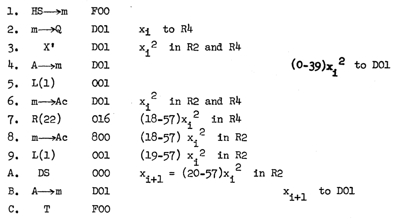
The entries in the leftmost column are line numbers; the next column shows machine instructions in symbolic form, with arrows signifying transfers of information from one place to another. The items in the third column are memory addresses or constants associated with the instructions, and the notations to the right are explanatory comments. In line 3 the number \(x_i\) is squared, with the two parts of the product stored in registers R2 and R4. Then a sequence of left and right shifts (encoded L(1), R(22), and L(1), isolate the middle bigits, numbered 20 through 57, which become the value of \(x_{i+1}\).
MANIAC’s standard subroutine was probably still in use at Los Alamos as late as 1957. In that year the laboratory published A Practical Manual on the Monte Carlo Method for Random Walk Problems by E. D. Cashwell and C. J. Everett, which describes a 38-bit middle-square random number generator that sounds very much like the same program. Cashwell and Everett indicate that standard practice was always to use a particular seed known to yield a run length of “about 750,000.”
Another publication from 1957 also mentions a middle-square program in use at Los Alamos. The authors were W. W. Wood and F. R. Parker, who were simulating the motion of molecules confined to a small volume; this was one of the first applications of a new form of the Monte Carlo protocol, known as Markov chain Monte Carlo. Wood and Parker note: “The pseudo-random numbers were obtained as appropriate portions of 70 bit numbers generated by the middle square process.” This work was done on IBM 701 and 704 computers, which means the algorithm must have been implemented on yet another machine architecture.
John W. Mauchly, one of ENIAC’s principal designers, also spread the word of the middle-square method. In a 1949 talk at a meeting of the American Statistical Association he presented a middle-square variant for the BINAC, a one-off predecessor of the UNIVAC line of computers. I have also seen vague, anecdotal hints suggesting that some form of the middle-square algorithm was used on the UNIVAC 1 in the early 1950s at the Lawrence Livermore laboratory.
I have often wondered how it came about that one of the great mathematical minds of the 20th century conceived and promoted such a lame idea. It’s even more perplexing that the middle-square algorithm, whose main flaw was recognized from the start, remained in the computational toolbox for at least a decade. How did they even manage to get the job done with such a scanty supply of randomness?
With the benefit of further reading, I think I can offer some plausible guesses in answer to these questions. It helps to keep in mind the well-worn adage of L. P. Hartley: “The past is a foreign country. They do things differently there.”
If you are writing a Monte Carlo program today, you can take for granted a reliable and convenient source of high-quality random numbers. Whenever you need one, you simply call the function random(). The syntax differs from one programming language to another, but nearly every modern language has such a function built in. Moreover, it can be counted on to produce vast quantities of randomness—cosmic cornucopias of the stuff. A generator called the Mersenne Twister, popular since the 1990s and the default choice in several programming languages, promises \(2^{19997} - 1\) values before repeating itself.
Of course no such software infrastructure existed in 1948. In those days, the place to find numbers of all kinds—logarithms, sines and cosines, primes, binomial coefficients—was a lookup table. Compiling such tables was a major mathematical industry. Indeed, the original purpose of ENIAC was to automate the production of tables for aiming artillery. The reliance on precomputed tables extended to random numbers. In the 1930s two pairs of British statisticians created tables of 15,000 and 100,000 random decimal digits; a decade later the RAND Corporation launched an even larger endeavor, generating a million random digits. In 1949 the RAND table became available on punched cards (50 digits to a card, 20,000 cards total); in 1955 it was published in book form. (The exciting opening paragraphs are reproduced in Figure 4.)
It would have been natural for the von Neumann group to adapt one of the existing tables to meet their needs. They avoided doing so because there was no room to store the table in computer memory; they would have to read a punched card every time a number was needed, which would have been intolerably slow. What they did instead was to use the middle-square procedure as if it were a table of a few thousand random numbers.
In the preliminary stages of the project, the group chose a specific seed value (not disclosed in any documents I’ve seen), then generated 2,000 random iterates from this seed. They checked to be sure the program had not entered a cycle, and they examined the numbers to confirm that they satisfied various tests of randomness. At the start of a Monte Carlo run, the chosen seed was installed in the middle-square routine, which then supplied random numbers as needed until the 2,000th request was satisfied. At that point the algorithm was reset and restarted with the same seed. In this way the simulation could continue indefinitely, cycling through the same set of numbers in the same order, time after time. The second round of simulations worked much the same way, but with a block of 3,000 numbers from the 10-digit generator.
Reading about this reuse of a single, small block of numbers, I could not suppress a tiny gasp of horror. Even if those 2,000 numbers pass basic tests of randomness, the concatenation of the sequence with multiple copies of itself is surely ill-advised. Suppose you are using the random numbers to estimate the value of \(\pi\) by choosing random points in a square and determining whether they fall inside an inscribed circle. Let each random number specify the two coordinates of a single point. After running through the 2,000 middle-square values you will have achieved a certain accuracy. But repeating the same values is pointless: It will never improve the accuracy because you will simply be revisiting all the same points.
We can learn more about the decisions that led to the middle-square algorithm from the proceedings of a 1949 symposium on Monte Carlo methods. The symposium was convened in Los Angeles by a branch of the National Bureau of Standards. It served as the public unveiling of the work that had been going on in the closed world of the weapons labs. Von Neumann’s contribution was titled “Various Techniques Used in Connection With Random Digits.”
Von Neumann makes clear that the middle-square algorithm was not a spur-of-the-moment, off-the-cuff choice; he considered serveral alternatives. Hardware was one option. “We . . . could build a physical instrument to feed random digits directly into a high-speed computing machine,” he wrote. “The real objection to this procedure is the practical need for checking computations. If we suspect that a calculation is wrong, almost any reasonable check involves repeating something done before. . . . I think that the direct use of a physical supply of random digits is absolutely inacceptable for this reason and for this reason alone.”
The use of precomputed tables of random numbers would have solved the replication problem, but, as noted above, von Neumann dismissed it as too slow if the numbers had to be supplied by punch card. Such a scheme, he said, would rely on “the weakest portion of presently designed machines—the reading organ.”
Von Neumann also mentions one other purely arithmetic procedure, originally suggested by Stanislaw Ulam: iterating the function \(f(x) = 4x(1 – x)\), with the initial value \(x_0\) lying between 0 and 1. This formula is a special case of a function called the logistic map, which 25 years later would become the jumping off point for the field of study known as chaos theory. The connection with chaos suggests that the function might well be a good source of randomness, and indeed if \(x_0\) is an irrational real number, the successive \(x_i\) values are guaranteed to be uniformly distributed on the interval (0, 1), and will never repeat. But that guarantee applies only if the computations are performed with infinite precision.
Two other talks at the Los Angeles symposium also touched on sources of randomness. Preston Hammer reported on an evaluation of the middle-square algorithm performed by a group at Los Alamos, using IBM punch-card equipment. Starting from the ten-digit (decimal) seed value 1111111111, they produced 10,000 random values, checking along the way for signs of cyclic repetition; they found none. (The sequence runs for 17,579 steps before descending into the fixed point at 0.) They also applied a few statistical tests to the first 3,284 numbers in the sequence. “These tests indicated nothing seriously amiss,” Hammer concluded—a rather lukewarm endorsement.
Another analysis was described by George Forsythe (the amanuensis for von Neumann’s paper). His group at the Bureau of Standards studied the four-digit version of the middle-square algorithm (the same as Program 1), tracing 16 trajectories. Twelve of the sequences wound up in the 6100-2100-4100-8100 loop. The run lengths ranged from 11 to 104, with an average of 52. All of these results are consistent with those shown in Figure 1. Presumably, the group stopped after investigating just 16 sequences because the computational process—done with punch cards and desk calculators—was too arduous for a larger sample. (With a modern laptop, it takes about 40 milliseconds to determine the fates of all 10,000 four-digit seeds.)
Forsythe and his colleagues also looked at a variant of the middle-square process. Instead of setting \(x_{i+1}\) to the middle digits of \(x_i^2\), the variant sets \(x_{i+2}\) to the middle digits of \(x_i \times x_{i+1}\). One might call this the middle-product method. In a variant of the variant, the two factors that form the product are of different sizes. Runs are somewhat longer for these routines than for the squaring version, but Forsythe was less than enthusiastic about the results of statistical tests of uniform distribution.
Von Neumann was undeterred by these ambivalent reports. Indeed, he argued that a common failure mode of the middle-square algorithm—“the appearance of self-perpetuating zeros at the ends of the numbers \(x_i\)”—was not a bug but a feature. Because this event was easy to detect, it might guard the Monte Carlo process against more insidious forms of corruption.
Amid all these criticisms of the middle-square method, I wish to insert a gripe of my own that no one else seems to mention. The middle-square algorithm mixes up numbers and numerals in a way that I find disagreeable. In part this is merely a matter of taste, but the conflating of categories does have consequences when you sit down to convert the algorithm into a computer program.
I first encountered the distinction between numbers and numerals at a tender age; it was the subject of chapter 1 in my seventh-grade “New Math” textbook. I learned that a number is an abstraction that counts the elements of a set or assigns a position within a sequence. A numeral is a written symbol denoting a number. The decimal numeral 6 and the binary numeral 110 both denote the same number; so does the Roman numeral VI and the Peano numeral S(S(S(S(S(S(0)))))). Mathematical operations apply to numbers, and they give the same results no matter how those numbers are instantiated as numerals. For example, if \(a + b = c\) is a true statement mathematically, then it will be true in any system of numerals: decimal 4 + 2 = 6, binary 100 + 10 = 110, Roman IV + II = VI.
In the middle-square process, squaring is an ordinary mathematical operation: \(n^2\) or \(n \times n\) should produce the same number no matter what kind of numeral you choose for representing \(n\). But “extract the middle digits” is a different kind of procedure. There is no mathematical operation for accessing the individual digits of a number, because numbers don’t have digits. Digits are components of numerals, and the meaning of “middle digits” depends on the nature of those numerals. Even if we set aside exotica such as Roman numerals and consider only ordered sequences of digits written in place-value notation, the outcome of the middle-digits process depends on the radix, or base. The decimal numeral 12345678 and the binary numeral 101111000110000101001110 denote the same number, but their respective middle digits 3456 and 000110000101 are not equal.
It appears that von Neumann was conscious of the number-numeral distinction. In a 1948 letter to Alston Householder he referred to the products of the middle-square procedure as “digital aggregates.” What he meant by this, I believe, is that we should not think of the \(x_i\) as magnitudes or positions along the number line but rather as mere collections of digits, like letters in a written word.
This nice philosophical distinction has practical consequences when we write a computer program to implement the middle-square method. What is the most suitable data type for the \(x_i\)? The squaring operation makes numbers an obvious choice. Multiplication and raising to integer powers are basic functions offered by almost any programming language—but they apply only to numbers. For extracting the middle digits, other data structures would be more convenient. If we collect a sequence of digits in an array or a character string—an embodiment of von Neumann’s “digital aggregate”—we can then easily select the middle elements of the sequence by their position, or index. But squaring a string or an array is not something computer systems know how to do.
The JavaScript code that drives Program 1 resolves this conflict by planting one foot in each world. An \(x\) value is initially represented as a string of four characters, drawn from the digits 0 through 9. When it comes time to calculate the square of \(x\), the program invokes a built-in JavaScript procedure, parseInt, to convert the string into a number. Then \(x^2\) is converted back into a string (with the toString method) and padded on the left with as many 0 characters as needed to make the length of the string eight digits. Extracting the middle digits of the string is easy, using a substring method. The heart of the program looks like this:
function mid4(xStr) {
	const xNum = parseInt(xStr, 10);       // convert string to number
	const sqrNum = xNum * xNum;            // square the number
	let sqrStr = sqrNum.toString(10);      // back to decimal string
	sqrStr = padLeftWithZeros(sqrStr, 8);  // pad left to 8 digits
	const midStr = sqrStr.substring(2, 6); // select middle 4 digits
	return midStr;
}
The program continually shuttles back and forth between arithmetic operations and methods usually associated with textual data. In effect, we abduct a number from the world of mathematics, do some extraterrestrial hocus-pocus on it, and set it back where it came from.
I don’t mean to suggest it’s impossible to implement the middle-square rule with purely mathematical operations. Here is a version of the function written in the Julia programming language:
function mid4(x)
	return (x^2 % 1000000) ÷ 100
end
In Julia the % operator computes the remainder after integer division; for example, 12345678 % 1000000 yields the result 345678. The ÷ operator returns the quotient from integer division: 345678 ÷ 100 is 3456. Thus we have extracted the middle digits just by doing some funky grade-school arithmetic.
We can even create a version of the procedure that works with numerals of any width and any radix, although those parameters have to be specified explicitly:
function midSqr(x, radix, width)            # width must be even
	modulus = radix^((3 * width) ÷ 2)
	divisor = radix^(width ÷ 2)
	return (x^2 % modulus) ÷ divisor
end
This program is short, efficient, and versatile—but hardly a model of clarity. If I encountered it out of context, I would have a hard time figuring out what it does.
There are still more ways to accomplish the task of plucking out the middle digits of a numeral. The mirror image of the all-arithmetic version is a program that eschews numbers entirely and performs the computation in the realm of digit sequences. To make that work, we need to write a multiplication procedure for indexable strings or arrays of digits.
The MANIAC program shown above takes yet another approach, using a single data type that can be treated as a number one moment (during multiplication) and as a sequence of ones and zeros the next (in the left-shift and right-shift operations).
Let us return to von Neumann’s talk at the 1949 Los Angeles symposium. Tucked into his remarks is the most famous of all pronouncements on pseudorandom number generators:
Any one who considers arithmetical methods of producing random digits is, of course, in a state of sin. For, as has been pointed out several times, there is no such thing as a random number—there are only methods to produce random numbers, and a strict arithmetic procedure of course is not such a method.
Today we live under a new dispensation. Faking randomness with deterministic algorithms no longer seems quite so naughty, and the concept of pseudorandomness has even shed its aura of paradox and contradiction. Now we view devices such as the middle-square algorithm not as generators of de novo randomness but as amplifiers of pre-existing randomness. All the genuine randomness resides in the seed you supply; the machinations of the algorithm merely stir up that nubbin of entropy and spread it out over a long sequence of numbers (or numerals).
When von Neumann and his colleagues were designing the first Monte Carlo programs, they were entirely on their own in the search for an algorithmic source of randomness. There was no body of work, either practical or theoretical, to guide them. But that soon changed. Just three months after the Los Angeles symposium, a larger meeting on computation in the sciences was held at Harvard.
After reviewing the drawbacks of the middle-square method, Lehmer proposed the following simple function for generating a stream of pseudorandom numbers, each of eight decimal digits:
\[x_{i+1} = 23x_i \bmod 10000001\]
For any seed value in the range \(0 \lt x_0 \lt 10000001\) this formula generates a cyclic pseudorandom sequence with a period of 5,882,352, more than 2,000 times the median length of eight-digit middle-square sequences. And there are advantages apart from the longer runs. The middle-square algorithm produces lollipop loops, with a stem traversed just once before the system enters a short loop or becomes stuck at a fixed point. Only the stem portion is useful for generating random numbers. Lehmer’s algorithm, in contrast, yields long, simple, stemless loops; the system follows the entire length of 5,882,352 numbers before returning to its starting point.

Simple loops also make it far easier to detect when the system has in fact begun to repeat itself. All you have to do is compare each \(x_i\) with the seed value, \(x_0\), since that initial value will always be the first to repeat. With the stem-and-loop topology, cycle-finding is tricky. The best-known technique, attributed to Robert W. Floyd, is the hare-and-tortoise algorithm. It requires \(3n\) evaluations of the number-generating function to identify a cycle with run length \(n\).
Lehmer’s algorithm is an example of a linear congruential generator, with the general formula:
\[x_{i+1} = (ax_i + b) \bmod m.\]
Linear congruential algorithms have the singular virtue of being governed by well-understood principles of number theory. Just by inspecting the constants in the formula, you can know the complete structure of cycles in the output of the generator. Lehmer’s specific recommendation (\(a = 23\), \(b = 0\), \(m = 10000001\)) is no longer considered best practice, but other members of the family are still in use. With a suitable choice of constants, the generator achieves the maximum possible period of \(m - 1\), so that the algorithm marches through the entire range of numbers in a single long cycle.
At this point we come face to face with the big question: If the middle-square method is so feeble and unreliable, why did some very smart scientists persist in using it, even after the flaws had been pointed out and alternatives were on offer? Part of the answer, surely, is habit and inertia. For the veterans of the early Monte Carlo studies, the middle-square method was a known quantity, a path of least resistance. For those at Los Alamos, and perhaps a few other places, the algorithm became an off-the-shelf component, pretested and optimized for efficiency. People tend to go with the flow; even today, most programmers who need random numbers accept whatever function their programming language provides. That’s certainly my own practice, and I can offer an excuse beyond mere laziness: The default generator may not be ideal, but it’s almost certainly better than what I would cobble together on my own.
Another part of the answer is that the middle-square method was probably good enough to meet the needs of the computations in which it was used. After all, the bombs they were building did blow up.
Many simulations work just fine even with a crude randomness generator. In 2005 Richard Procassini and Bret Beck of the Livermore lab tested this assertion on Monte Carlo problems of the same general type as the neutron-diffusion studies done on ENIAC in the 1940s. They didn’t include the middle-square algorithm in their tests; all of their generators were of the linear congruential type. But their main conclusion was that “periods as low as \(m = 2^{16} = 65{,}536\) are sufficient to produce unbiased results.”
Not all simulations are so easy-going, and it’s not always easy to tell which ones are finicky and which are tolerant. Simple tasks can have stringent requirements, as with the estimation of \(\pi\) mentioned above. And even with repetitions, subtle biases or correlations can skew the results of Monte Carlo studies in ways that are hard to foresee. Thirty years ago an incident that came to be known as the Ferrenberg affair revealed flaws in random number generators that were then considered the best of their class. So I’m not leading a movement to revive the middle-square method.
I would like to close with two oddities.
First, in discussing Figure 1, I mentioned the special status of the number 3792, which is an isolated fixed point of the middle-square function. Like any other fixed point, 3792 is its own successor: \(3792^2\) yields 14,379,264, whose four middle digits are 3792 again. Unlike other fixed points, 3792 is not the successor of any other number among the 10,000 possible seeds. The only way it will ever appear in the output of the process is if you supply it as the input—the seed value.
In 1954 Nicholas Metropolis encountered the same phenomenon when he plotted the fates of all 256 seeds in the eight-bit binary middle-square generator. Here is his graph of the trajectories:
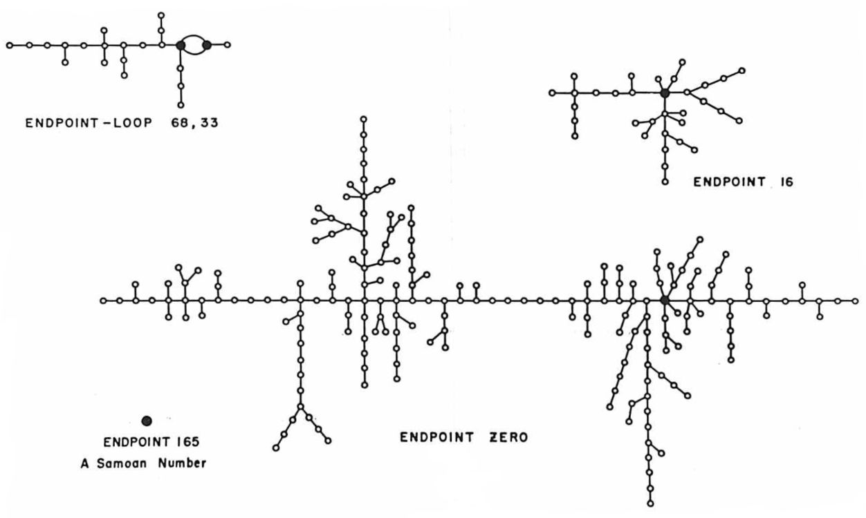
At the lower left is the isolated fixed point 165. In binary notation this number is 10100101, and its square is 0110101001011001, so it is indeed a fixed point. Metropolis comments: “There is one number, \(x = 165\), which, when expressed in binary form and iterated, reproduces itself and is never reproduced by any other number in the series. Such a number is called ‘samoan.’” The diagram also includes this label.
The mystery is: Why “samoan”? Metropolis offers no explanation. I suppose the obvious hypothesis is that an isolated fixed point is like an island, but if that’s the intended sense, why not pick some lonely island off by itself in the middle of an ocean? St. Helena, maybe. Samoa is a group of islands, and not particularly isolated. I have scoured the internets for other uses of “samoan” in a mathematical context, and come up empty. I’ve looked into whether it might refer not to the island nation but to the Girl Scout cookies called Samoas (but they weren’t introduced until the 1970s). I’ve searched for some connection with Margaret Mead’s famous book Coming of Age in Samoa. No clues. Please share if you know anything!
On a related note, when I learned that both the eight-bit binary and the four-digit decimal systems each have a single “samoan,” I began to wonder if this was more than coincidence. I found that the two-digit decimal function also has a single isolated fixed point, namely \(x_0 = 50\). Perhaps all middle-square functions share this property? Wouldn’t that be a cute discovery? Alas, it’s not so. The six-digit decimal system is a counterexample.
The second oddity concerns a supposed challenge to von Neumann’s priority as the inventor of the middle-square method. In The Broken Dice, published in 1993, the French mathematician Ivar Ekeland tells the story of a 13th-century monk, “a certain Brother Edvin, from the Franciscan monastery of Tautra in Norway, of whom nothing else is known to us.” Ekeland reports that Brother Edvin came up with the following procedure for settling disputes or making decisions randomly, as an alternative to physical devices such as dice or coins:
The player chooses a four-digit number and squares it. He thereby obtains a seven- or eight-digit number of which he eliminates the two last and the first one or two digits, so as to once again obtain a four-digit number. If he starts with 8,653, he squares this number (74,874,409) and keeps the four middle digits (8,744). Repeating the operation, he successively obtains:
8,653 8,744 4,575 9,306 6,016
Thus we have a version of the middle-square method 700 years before von Neumann, and only 50 years after the introduction of Indo-Arabic numerals into Europe. The source of the tale, according to Ekeland, is a manuscript that has been lost to the world, but not before a copy was made in the Vatican archives at the direction of Jorge Luis Borges, who passed it on to Ekeland.
The story of Brother Edvin has not yet made its way into textbooks or the scholarly literature, as far as I know, but it has taken a couple of small steps in that direction. In 2010 Bill Gasarch retold the tale in a blog post titled “The First pseudorandom generator- probably.” And the Wikipedia entry for the middle-square method presents Ekeland’s account as factual—or at least without any disclaimer expressing doubts about its veracity.
To come along now and insist that Brother Edvin’s algorithm is a literary invention, a fable, seems rather unsporting. It’s like debunking the Tooth Fairy. So I won’t do that. You can make up your own mind. But I wonder if von Neumann might have welcomed this opportunity to shuck off responsibility for the algorithm.