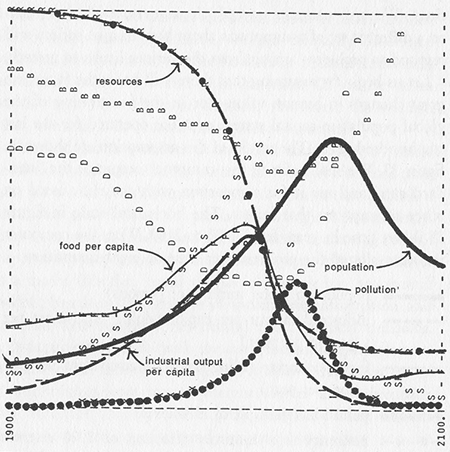
Forty years ago I had my first close encounter with mathematical models of doomsday. The Limits to Growth, published in the spring of 1972, offered a grim vision of environmental and economic collapse, based on the implacable logic of a computer simulation called World3. For extra nerd-cred authenticity, the results of the simulation were set forth in crude black-and-white graphs reproduced directly from line-printer output.
I wrote about The Limits to Growth and World3 back in 1993. Now I have revisited the subject in my newly published American Scientist column. Buried deep within the new column is a note mentioning that I’ve been working to re-implement the World3 model in JavaScript. “The result of this exercise is at http://bit-player.org/limits,” the column says.
If you follow that link, you’ll find it’s true: There’s a rudimentary version of the model you can play with (if you have the right browser). [Update 2020-08-19: The source code for the model is on GitHub.]
But I have to tell you, it was a near thing. When the magazine was shipped to the printers three weeks ago, the program was unfinished. Two weeks ago, it was finally running but giving weird results. A week ago the output was still nonsense. Since then I’ve had more anxious moments, late nights, and occasions to ponder the foolishness of publicly announcing vaporware. For a while it looked like I might have to admit defeat and write a sheepish apology for promising something I couldn’t deliver. Never again, I said to myself. And yet, when it’s all over, I get such a kick out of building a thing like this.
Herewith a few notes, mostly technical, on the building process.
What the model models. For background on World3—where the project came from, who did it, and whether you should worry about the model’s bleak predictions—please see either of my columns. Very briefly, the model traces interactions among five main components of the global ecosystem and economy: the human population, agriculture, industry, nonrenewable resources and pollution. If you could strip the model down to its mathematical essentials, it would be a system of coupled differential equations, something like the Lotka-Volterra equations for predator-prey populations. But the model is actually formulated in the language of “system dynamics,” a simulation methodology invented in the 1950s by Jay W. Forrester of MIT, with heavy influence from control theory and servomechanisms.
The key elements of a system dynamics model are represented by levels and rates, or less formally vats and valves. Here’s the population section of the World3 model:
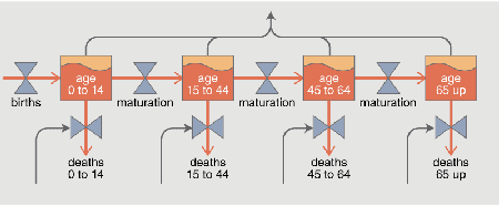
The orange rectangles are levels, which integrate the inflow and outflow of people. The rates of flow are determined by the valves, represented here as hourglass-shaped icons (a graphic device borrowed from control theory and industrial engineering).
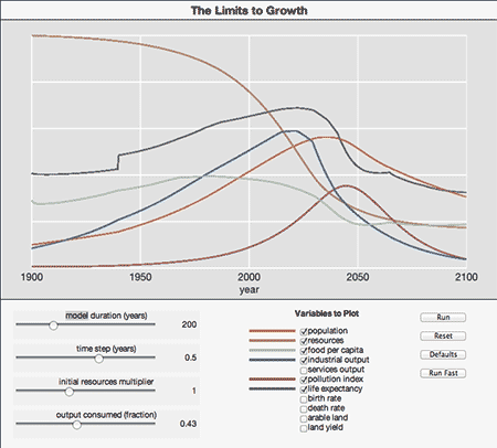
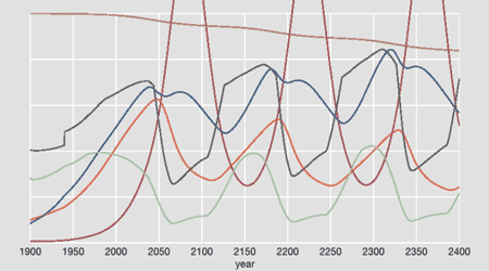
Twiddling the knobs. If you go and play with the model, most of the controls should be pretty obvious. The original World3 model extended over 200 years, from 1900 to 2100; the model duration slider can extend the horizon out to 2400. The time step slider controls the integration interval (the variable dt within the model); if you set it to a value greater than 1 year, you’re likely to see spurious short-period oscillations caused by undersampling. The initial resources multiplier affords control over a variable that turns out to be crucial in determining the fate of World3. Note that the resources curve in the graph shows the fraction of resources remaining, so it always begins at the same initial value; the slider setting effectively determines the rate of depletion. The final slider, output consumed, provides access to another variable that can greatly alter the outcome of the simulation. This quantity is the fraction of industrial output that is diverted into consumption, defined as anything nonproductive; the output not consumed is reinvested in agriculture, industry and the extraction of natural resources. High consumption acts as a damping or friction term, curtailing the positive feedbacks that lead to much of the future unpleasantness in the model. As I snidely commented in 1993: “The model seems to be telling us to invest less in farms and factories and to spend more on frippery and fast cars. Armaments also fall into the category of nonproductive spending, so perhaps we need a good vigorous war every few decades.”
A few snapshots of model behavior. My purpose in writing this program was not really to explore the behavior of the World3 model; for that there are several more versatile and more trustworthy implementations out there (including at least one that runs within a web page). I just wanted to understand what’s inside the box. Nevertheless, now that the model is running, I may as well point out a few of its tricks.
Here’s the spurious oscillation mentioned above, with dt = 2:
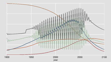
A quite different kind of oscillation appears when the initial stock of natural resources is set to a very high value (32×):
These oscillations, with complex waveforms and a period of roughly 150 years, are not caused by integration error but probably represent a natural behavioral mode of the model itself (analogous to the population cycles seen in predator-prey models).
We get a much calmer vision of the future by setting the consumption fraction to 0.51, rather than the World3 default of 0.43:
Siphoning off some of the capital that would otherwise fuel rapid growth tames the overshoot-and-collapse regime of the standard run. However, the outcome is hardly utopian. Life expectancy and food per capita remain permanently low; so does industrial output, which can be taken as a proxy for wealth.
Putting World3 in a web browser. The original World3 model ran on mainframe hardware—IBM 360 and 370 machines. Now it fits into a web browser on a laptop or an iPad. I try to keep my sang froid about such things, but the fact is I’m just plain astounded by the march of progress.
I should emphasize that the entire JavaScript computation is happening on your computer, not my server. The program is downloaded once and then executed locally each time you press the Run button. And it’s not even much of a computational burden. The gradual unfolding of the graphs across the years is a deliberate animation effect, not a reflection of actual computation speed. (The Run Fast button is meant to eliminate artificial delays, but it doesn’t quite achieve that yet.)
DYNAMO and toposorting. The 1972 version of World3 was written in a language called DYNAMO, created a decade earlier by Phyllis Fox and Alexander Pugh, who were then part of Forrester’s group at MIT. In lexical and syntactic structure DYNAMO is what you’d expect of a language from the punch-card era—six-letter variable names and ALL CAPS—but in other respects it’s an interesting early experiment, with a programming style that falls somewhere between procedural and declarative.
One feature is particularly noteworthy. In DYNAMO a model is defined by a set of “equations” (really assignment statements) that can be written down in any order but have to be executed in a sequence that takes into account the way one equation depends on others, so that every variable is evaluated before it is used. The DYNAMO compiler reordered the equations automatically. This was an early application of topological sorting; the first efficient algorithms for this process were developed circa 1960, in connection with PERT project-scheduling methods.
Topological sorting takes a directed graph and reduces it to a linear list of nodes satisfying the following constraint: If the graph includes a directed edge u → v, then u appears before v in the list. This ordering is possible only if the graph is acyclic, with no loops of directed edges. As it happens, the network of equations for the World3 model is not acyclic. Here’s one section of the network that violates the no-loops rule:
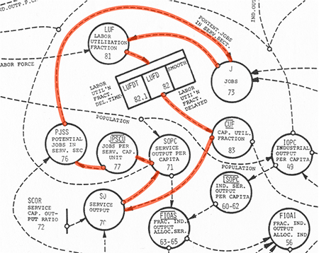
If you try to assign a value to Labor Utilization Fraction (near the upper left), you’ll see that you first have to know the value of Jobs; before you can evaluate Jobs, you need to know Potential Jobs in Service Sector; etc. Continuing to trace through the red arrows reveals that before you can calculate Labor Utilization Fraction, you need to know Labor Utilization Fraction. Uh oh. The model can be made computable only by artificially interrupting such loops. In this instance the break is made by assigning an arbitrary initial value to the variable Labor Utilization Fraction Delayed.
From DYNAMO to JavaScript. In a 1989 memoir, Forrester tells this story about the origins of system dynamics:
An expert computer programmer, Richard Bennett, worked for me when I was writing the 1958 article, “Industrial Dynamics—A Major Breakthrough for Decision Makers,” for the Harvard Business Review…. For that article I needed computer simulations and asked Bennett just to code up the equations so we could run them on our computer. However, Dick Bennett was a very independent type. He said he would not code the program for that set of equations but would make a compiler that would automatically create the computer code.
Bennett’s policy in this matter was sensible and wise; I foolishly ignored it. I didn’t want a general-purpose compiler for system-dynamics models; I just wanted to implement this particular model. So I didn’t bother to structure the code in a way that would separate the model equations from the algorithms that process those equations. Big mistake.
My original plan was to write a prototype version in Lisp (my native tongue) and then redo it in JavaScript for wider distribution. I abandoned that idea when I ran short of time—another mistake. I was ignoring a Brooksism: Plan to throw one away; you will anyhow. The program now running is the one I need to throw away. The code is a mess. Please avert your eyes.
I don’t blame JavaScript for this situation. This is the third Javascript project I’ve taken on in the past few months, and I’m finding the whole ecosystem—JavaScript itself plus HTML5 and CSS3, along with the developer tools built into Google Chrome—quite a pleasant place to work and play.
My basic strategy was to make a line-for-line translation of DYNAMO statements into JavaScript. A typical DYNAMO equation looks like this:
SC.K = SC.J + (DT)(SCIR.JK - SCDR.JK).
SC is service capital, a level (or vat) variable; SCIR and SCDR are rate (or valve) variables representing the service capital investment rate and the service capital depreciation rate; DT is the numerical integration period; juxtaposed parentheses indicate multiplication. And what about the appended letters J, K and JK? They are “timescripts”: J designates the previous moment, K the current moment and JK the interval between J and K. All this notation carries over into JavaScript with remarkably little fuss. If we represent a variable such as SC as a JavaScript object, the timescript notation is unchanged, with SC.J and SC.K denoting properties of the object SC.
Apart from transcribing the equations, it’s also necessary to provide half a dozen special operations such as smoothing, delaying and clipping signals. And there is a kludgy “table” facility for piecewise linear approximations of arbitrary functions.
Canvas vs. SVG. My last JavaScript project used Scalable Vector Graphics, so for this one I decided to try the main alternative, the HTML “canvas” element. Drawing on the canvas is very fast, but that’s about the only nice thing I can find to say about it. The canvas is simply a rectangular array of pixels, and drawn objects have no structure apart from the pixels that compose them. The curves making up a World3 graph cannot be moved or rescaled or otherwise altered without redrawing the entire graph. The animation effect, in which all the curves seem to gradually elongate, is an illusion: At each time step the entire curve is redrawn from the beginning. Thus drawing a curve of 400 segments actually calls for 80,200 operations.
SVG offers friendlier facilities. Not only can you draw objects piece by piece, but the objects retain their identity as objects; they become part of the DOM, the document object model. You can address them individually, change their colors and other properties, transform their geometry. It would be easy, for example, to highlight and label a curve on mouseover.
Firefox is the new Internet Explorer. (But so is the new Internet Explorer.) Making stuff for the web has become a lot more fun in the past year or two, thanks in large measure to the WHATWG process. There’s an accelerated pace of change in the standards community, and browser makers have been quickly implementing the latest proposals. For this project I needed not only the canvas element but also the “range” input element, which is supposed to create a slider-type control widget. In the Chrome, Safari and Opera browsers both of these components worked out of the box. Missing from that list of compatible browsers is Internet Explorer—the perennial Think Different browser. Also missing is Firefox, which is a little more surprising. It turns out that sliders have been on the agenda of the Firefox development crew for six years, but they remain unimplemented.
With mixed feelings, I installed a polyfill that allows the slider code to run in Firefox. (Thanks Frank Yan!) My feelings are mixed because this sort of spackling does nothing to encourage the Firefox developers to address the problem.
The big bug. Getting the program to the point where it would run at all was a tedious chore (150 equations to be retyped from a marginally legible printout), but was otherwise unremarkable. After I fixed a few typos and misplaced semicolons, the code compiled and ran without throwing error messages. Then the real challenge began. The output looked nothing like the graphs published in The Limits to Growth. My World3 was a much nicer place, with gradual population growth and a slow but steady gain in industrial output and food production. Try as I might, I could not get the world system to collapse in ruins the way it’s supposed to.
This went on for more than a week.
Yes, I did consider the possibility that my program was correct and the dozens of other implementations over the past 40 years were all wrong. But I’m not quite that much of an egomaniac.
What was the bug that caused me so much grief? JavaScript experts will see the error immediately. In one of those initialization routines needed to break a cycle in the graph of dependencies, I had written something like this:
if (typeof(v) == Number) { return v }.
The problem is that (typeof(v) == Number) will return false no matter what the type of v happens to be. If v is not a number, the predicate is obviously false. If v is a number, the result of typeof(v) is not Number but "number". As a Lisp guy, I just can’t get used to JavaScript’s stringiness. (I could have said (v.constructor == Number), but I didn’t.)
Glitches. Given this evidence of my slapdash coding and testing practices, it’s fair to ask how many bugs infest the rest of the program and whether any of the results should be trusted.
An obvious validation strategy is to set all parameters to default values and then compare the output of the program with that of the original 1972 model. That’s not so easy. The graphs published in The Limits to Growth have no numerical scales (apart from markers for the endpoints of the time axis). Hence all I can do is check that the peaks and valleys have the right phase relationships. My eyeball says most of them match reasonably well, but this methodology does not inspire great confidence.
Some smaller-scale features of the curves also demand attention.
One conspicuous oddity is not a bug—or at least not my bug. Take a look at this detail of a graph of population (orange), birth rate (yellow), death rate (purple) and life expectancy (gray):
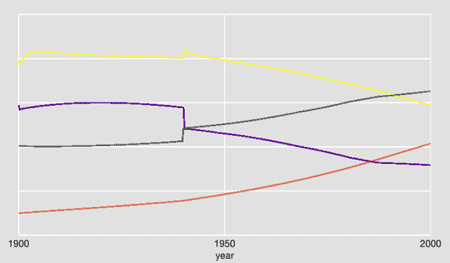
It looks like something really strange happened in 1940. And in World3 something did: There’s an abrupt switch between two table functions, changing the effect of health services on lifespan. The death rate plunges; there’s a brief blip in the birth rate; life expectancy ratchets upward and then keeps growing steadily. The abruptness of the transition looks highly unrealistic, but this is not the result of a programming error. It’s part of the model specification.
On the other hand, the little blips in the birth and death curves at the very start of the simulation are not part of the model specification. I think I understand where they come from: It’s an initialization problem. The initial birth and death rates are not in equilibrium with other elements of the model, and it takes several iterations to eliminate the imbalances. As far as I can tell, however, these glitches do not appear in the 1972 output, so I must have misunderstood something about the model structure or the initialization procedure. I’m still looking into it.
It’s in the nature of writing software—or writing English prose, for that matter—that as soon as you finish a project, you see all the mistakes and missed opportunities with great clarity, and you feel that if you could just start over and do it all again, you’d finally get it right. I’m feeling that impulse right now, and I may act on it. But in light of my recent experience, I’m not making any promises.
Update 2016-08-12: Neil S. Grant, a student at the University of Cambridge, has helpfully reported a bug in my implementation of the World3 model. Grant is writing his own version of the model and noted that some of his results were different from mine. He traced the source of the discrepancy to a transcription error in a table named “urbanIndustrialLandPerCapita.” The correct data read [0.005, 0.008, 0.015, 0.025, 0.04, 0.055, 0.07, 0.08, 0.09], but I had typed the third value as 0.15 (off by an order of magnitude). I have now corrected the code.
The error caused a noticeable shift in certain variables. In the composite graph below, the correct curves are shown in full-intensity color, and the erroneous curves are fainter. The largest discrepancy is in the dark brown curve, rising to a plateau at upper right, which represents arable land.

My thanks to Grant for discovering, identifying, and reporting the bug.
Neat. When I was in 9th or 10th grade (1983 or so) I tried to write a similar program for a science fair project based on a book I found in the school library which I have forgotten the name of (I remember it frequently mentioned the “Club of Rome” which struck me as a strange thing at the time. Maybe you’re looking at the same source?) I think there was also an article in Popular Computing around the same time that was what gave me the idea. I wrote my program for a ti99/4a with a whopping 16kb of RAM in ti’s “Extended BASIC’. I remember I had to get my dad to help me with writing a subroutine to interpolate between the data points in various graphs I culled from that book, whatever it was called.
My simulation, if I remember right, ended up with the population initially climbing a bit then taking a nose dive around 2000 or so, but then sort of recovering and then oscillating like a sine wave. My conclusion at the time was, well, garbage in, garbage out. Your program is undoubtedly quite a bit better than what my 13 or 14 year old self came up with.
Er, actually, now that I go back and look at your graphs, you got the sine wave thing too! Interesting. Well, not sure it’s the same sine wave behavior that I got, of course, probably it’s not, if I had to guess, because I had to simplify the model a bit and leave some things out due to limited memory, and my own limited brainpower and time. Pretty sure that code is lost forever, at best it’s on some old cassette tape in a closet that I’ll never get around to trying to do anything with.
Excuse me for shouting, but never, never, never, NEVER use “==” in JavaScript. It is neither EQ nor EQL nor =. In fact, it is not even transitive! Always, always use “===”, which is how you spell EQL in JavaScript. And the same for “!==” rather than “!=”.
Here’s a good example of “==” intransitivity resulting from bogus type coercion:
var a = “16″;
var b = 16;
var c = “0×10″;
alert(a == b && b == c && a != c); // alerts true
To deal with this and other issues, you can use JSLint, a lint(1) for JavaScript. It’s indispensable.
There are JavaScript libraries to make working with Canvas elements a lot more like working with DOM objects (or scene graphs), so you can think at a higher level of abstraction than pixels. Fabric.js, EaselJS, and Cake.js come to mind; no doubt there are others.
@John Cowan: I appreciate the advice, but I believe there’s more to be said than just “never, never, never.” Yes, JavaScript’s overeager type coercion plays badly with the == operator. But misusing the identity operator === as an equality operator also risks introducing easy-to-overlook errors, as in the well-known example “abc” === new String(“abc”), which yields false.
Equality and identity are slippery concepts (see “Identity Crisis”). The ambiguities can’t be swept away with simple rules.
Allow me to point out as well that the bug that bit me has nothing to do with this issue. Using === would not have saved me.
Nice job!
Thanks for very much for implementing this. I’ve been re-reading these books and having the model to play with has helped comprehension considerably. Two quick conjectures about the oscillations you mention. The first, for higher dt, might reflect that the underlying set of equations form a stiff system, leading to instability in the solution as the time step is increased. On the second, long term oscillations with higher resources, this effectively simulates a renewable (well, slowly non-renewable) resource-based world very much like the classic Lotka-Volterra where neither predator nor prey completely eliminate one another and hence cycle as each recovers with given delays. In this LtG case however we have pollution recovering rapidly and so all the rest follow suit because there is enough resource and time to deal with it. In fact, another way of thinking about the rise and fall of empires during agrarian times (say 500BC to 1850AD) was that they had a renewable resource (grain) as their energy supply and what cycles there are might represent responses (wars) to the Malthusian pressures that built up and released over time. Then we discovered oil/coal…. LtG effectively explores a single boom-bust cycle based on that underlying limited resource. And, just to finish the wild speculation: If we move to a (more-or-less) renewable energy system (solar or even fusion) humanity can look forward to these cycles again.
Nice piece! Very helpful if you are trying to assess this ‘mother of all models’ almost fifty years later. But can you help me? I have tried with three browers to find the equations and I don’t. So if you see this, please give me a hand!
Göran
I’d like to help, but I don’t understand which equations you can’t find. Can you give me hint about where in the article you don’t see them?
Please, where is the code source again? I could not find it on GitHub, and your link is wrong BTW - Thanks
Sorry. Link fixed. Source code at: https://github.com/bit-player/limits
What if you tested the model with more historical data that could run out a longer time to test the predictions. If you use, say, ancient Rome. Choose a date of some importance, say 100 CE, well into the peace and prosperity of the Pax Romana but before the distress of the third century. Much like Ian Morris’ works, the Measure of Civilization and Why the West Rules for Now, some quantifiable data can be gleaned from the historical and archaeological record that could be used as input for the model. Then the simulation could be run out in different scenarios for a 100, 200, 300, 400, and 500 year predictive models. Modeling the different scenarios could then be cross referenced with known historical outcomes. It might be just as useful for historians/archaeologists as it would a test for the model as it could provide new questions not yet conceived which might beg answers.
Brian,
It is a delight to find you have a website and have implemented the Limits to growth equations. You implemented World 3 by hardwiring the equations. I am doing something a bit different. My goal is to run the original card deck on a Dynamo Compiler simulator I am writing. At 1300 lines of JavaScript I can load and run the short card deck from the Dynamo Users Manual. I have been working on the project for about a month. It sorts variables and implements the core equations using function pointers and arrays as arguments. What you have done will be a great help.
I have been interested in resource depletion issues for a long time, and have been a ‘believer’ in the limits to growth model since it was published. Whatever that means, I don’t have to explain because I have watched your lecture.
https://www.youtube.com/watch?v=47-deZ8uT-w
Your video is on my You-Tube channel and has had 2.2k views so far. I put it up on my You-Tube channel a couple of years ago. When I posted your video it was from my interest in collapse, environmentalism and such. I forgot how I found it and I did not Google who you were until today. My interest in building the Dynamo simulated renewed my interest, and I re-watched the video.
I have Forester’s Book and The Dynamo Users Manual. An original copy of Limits To Growth is supposed to be in the mail on the way to me. The second edition is of little use to the project.
I would greatly appreciate getting my paws on a copy of the original LTG card deck if you have a copy. My goal is to have a page on my own website where the original card deck can be run, and where a user can load their own files. I want users to be able to write their own models.
Thank You,
Keith Hayes