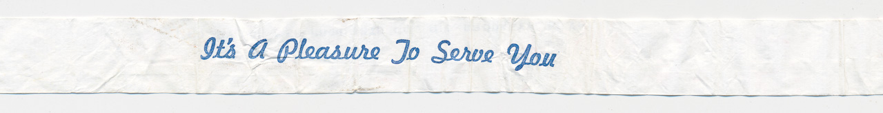
Packing up the household for a recent move, I was delving into shoeboxes, photo albums, and file folders that had not been opened in decades. One of my discoveries, found in an envelope at the back of a file drawer, was the paper sleeve from a drinking straw, imprinted with a saccharine message:
This flimsy slip of paper seems like an odd scrap to preserve for the ages, but when I pulled it out of the envelope, I knew instantly where it came from and why I had saved it.
The year was 1967. I was 17 then; I’m 71 now. Transposing those two digits takes just a flick of the fingertips. I can blithely skip back and forth from one prime number to the other. But the span of lived time between 1967 and 2021 is a chasm I cannot so easily leap across. At 17 I was in a great hurry to grow up, but I couldn’t see as far as 71; I didn’t even try. Going the other way—revisiting the mental and emotional life of an adolescent boy—is also a journey deep into alien territory. But the straw wrapper helps—it’s a Proustian aide memoire.
In the spring of 1967 I had a girlfriend, Lynn. After school we would meet at the Maple Diner, where the booths had red leatherette upholstery and formica tabletops with a boomerang motif. We’d order two Cokes and a plate of french fries to share. The waitress liked us; she’d make sure we had a full bottle of ketchup. I mention the ketchup because it was a token of our progress toward intimacy. On our first dates Lynn had put only a dainty dab on her fries, but by April we were comfortable enough to reveal our true appetites.
One afternoon I noticed she was fiddling intently with the wrapper from her straw, folding and refolding. I had no idea what she was up to. A teeny paper airplane she would sail over my head? When she finished, she pushed her creation across the table:

What a wallop there was in that little wad of paper. At that point in our romance, the words had not yet been spoken aloud.
How did I respond to Lynn’s folded declaration? I can’t remember; the words are lost. But evidently I got through that awkward moment without doing any permanent damage. A year later Lynn and I were married.
Today, at 71, with the preserved artifact in front of me, my chief regret is that I failed to take up the challenge implicit in the word game Lynn had invented. Why didn’t I craft a reply by folding my own straw wrapper? There are quite a few messages I could have extracted by strategic deletions from “It’s a pleasure to serve you.”
itsapleasuretoserveyou ==> I love you.
itsapleasuretoserveyou ==> I please you.
itsapleasuretoserveyou ==> I tease you.
itsapleasuretoserveyou ==> I pleasure you.
itsapleasuretoserveyou ==> I pester you.
itsapleasuretoserveyou ==> I peeve you.
itsapleasuretoserveyou ==> I salute you.
itsapleasuretoserveyou ==> I leave you.
Not all of those statements would have been suited to the occasion of our rendezvous at the Maple Diner, but over the course of our years together—17 years, as it turned out—there came a moment for each of them.
How many words can we form by making folds in the straw-paper slogan? I could not have answered that question in 1967. I couldn’t have even asked it. But times change. Enumerating all the foldable messages now strikes me as an obvious thing to do when presented with the straw wrapper. Furthermore, I have the computational means to do it—although the project was not quite as easy as I expected.
A first step is to be explicit about the rules of the game. We are given a source text, in this case “It’s a pleasure to serve you.” Let us ignore the spaces between words as well as all punctuation and capitalization; in this way we arrive at the normalized text “itsapleasuretoserveyou”. A word is foldable if all of its letters appear in the normalized text in the correct order (though not necessarily consecutively). The folding operation amounts to an editing process in which our only permitted act is deletion of letters; we are not allowed to insert, substitute, or permute. If two or more foldable words are to be combined to make a phrase or sentence, they must follow one another in the correct order without overlaps.
So much for foldability. Next comes the fraught question: What is a word? Linguists and lexicographers offer many subtly divergent opinions on this point, but for present purposes a very simple definition will suffice: A finite sequence of characters drawn from the 26-letter English alphabet is a word if it can legally be played in a game of Scrabble. I have been working with a word list from the 2015 edition of Collins Scrabble Words, which has about 270,000 entries. (There are a number of alternative lists, which I discuss in an appendix at the end of this article.)
Scrabble words range in length from 2 to 15 letters. The upper limit—determined by the size of the game board—is not much of a concern. You’re unlikely to meet a straw-paper text that folds to yield words longer than sesquipedalian. The absence of 1-letter words is more troubling, but the remedy is easy: I simply added the words a, I, and O to my copy of the Scrabble list.
My first computational experiments with foldable words searched for examples at random. Writing a program for random sampling is often easier than taking an exact census of a population, and the sample offers a quick glimpse of typical results. The following Python procedure generates random foldable sequences of letters drawn from a given source text, then returns those sequences that are found in the Scrabble word list. (The parameter k is the length of the words to be generated, and reps specifies the number of random trials.)
def randomFoldableWords(text, lexicon, k, reps):
    normtext = normalize(text)
    n = len(normtext)
    findings = []
    for i in range(reps):
        indices = random.sample(range(n), k)
        indices.sort()
        letters = ""
        for idx in indices:
            letters += normtext[idx]
        if letters in lexicon:
            findings.append(letters)
    return findings
Here are the six-letter foldable words found by invoking the program as follows: randomFoldableWords(scrabblewords, 6, 10000).
please, plater, searer, saeter, parter, sleety, sleeve, parser, purvey, laster, islets, taster, tester, slarts, paseos, tapers, saeter, eatery, salute, tsetse, setose, salues, sparer
Note that the word saeter (you could look it up—I had to) appears twice in this list. The frequency of such repetitions can yield an estimate of the total population size. A variant of the mark-and-recapture method, well-known in wildlife ecology, led me to an estimate of 92 six-letter foldable Scrabble words in the straw-wrapper slogan. The actual number turns out to be 106.
Samples and estimates are helpful, but they leave me wondering, What am I missing? What strange and beautiful word has failed to turn up in any of the samples, like the big fish that never takes the bait? I had to have an exhaustive list.
In many word games, the tool of choice for computer-aided playing (or cheating) is the regular expression, or regex. A regex is a pattern defining a set of strings, or character sequences; from a collection of strings, a regex search will pick out those that match the pattern. For example, the regular expression ^.*love.*$ selects from the Scrabble word list all words that have the letter sequence love somewhere within them. There are 137 such words, including some that I would not have thought of, such as rollover and slovenly. The regex ^.*l.*o.*v.*e.*$ finds all words in which l, o, v, and e appear in sequence, whether of not they are adjacent. The set has 267 members, including such secret-lover gems as bloviate, electropositive, and leftovers.
A solution to the foldable words problem could surely be crafted with regular expressions, but I am not a regex wizard. In search of a more muggles-friendly strategy, my first thought was to extend the idea behind the random-sampling procedure. Instead of selecting foldable sequences at random, I’d generate all of them, and check each one against the word list.
The procedure below generates all three-letter strings that can be folded from the given text, and returns the subset of those strings that appear in the Scrabble word list:
def foldableStrings3(lexicon, text):
    normtext = normalize(text)
    n = len(normtext)
    words = []
    for i in range(0, n-2):
        for j in range(i+1, n-1):
            for k in range(j+1, n):
                s = normtext[i] + normtext[j] + normtext[k]
                if s in lexicon:
                    words.append(s)
    return(words)
At the heart of the procedure are three nested loops that methodically step through all the foldable combinations: For any initial letter text[i] we can choose any following letter text[j] with j > i; likewise text[j] can be followed by any text[k] with k > j. This scheme works perfectly well, finding 348 instances of three-letter words. I speak of “instances” because some words appear in the list more than once; for example, pee can be formed in three ways. If we count only unique words, there are 137.
Following this model, we could write a separate routine for each word length from 1 to 15 letters, but that looks like a dreary and repetitious task. Nobody wants to write a procedure with loops nested 15 deep. An alternative is to write a meta-procedure, which would generate the appropriate procedure for each word length. I made a start on that exercise in advanced loopology, but before I got very far I realized there’s an easier way. I was wondering: In a text of n letters, how many foldable substrings exist—whether or not they are recognizable words? There are several ways of answering this question, but to me the most illuminating argument comes from an inclusion/exclusion principle. Consider the first letter of the text, which in our case is the letter I. In the set of all foldable strings, half include this letter and half exclude it. The same is true of the second letter, and the third, and so on. Thus each letter added to the text doubles the number of foldable strings, which means the total number of strings is simply \(2^n\). (Included in this count is the empty string, made up of no letters.)
This observation suggests a simple algorithm for generating all the foldable strings in any n-letter text. Just count from \(0\) to \(2^{n} - 1\), and for each value along the way line up the binary representation of the number with the letters of the text. Then select those letters that correspond to a 1 bit, like so:
                    itsapleasuretoserveyou
                    0000100000110011111000
And so we see that the word preserve corresponds to the binary representation of the number 134392.
Counting is something that computers are good at, so a word-search procedure based on this principle is straightforward:
def foldablesByCounting(lexicon, text):
    normtext = normalize(text)
    n = len(normtext)
    words = []
    for i in range(2**n - 1):
        charSeq = ''
        positions = positionsOf1Bits(i, n)
        for p in positions:
            charSeq += normtext[p]
        if charSeq in lexicon:
            words.append(charSeq)
    return(words)
The outer loop (variable i) counts from \(0\) to \(2^{n} - 1\); for each of these numbers the inner loop (variable p) picks out the letters corresponding to 1 bits. The program produces the output expected. Unfortunately, it does so very slowly. For every character added to the text, running time roughly doubles. I haven’t the patience to plod through the \(2^{22}\) patterns in “itsapleasuretoserveyou”; estimates based on shorter phrases suggest the running time would be more than three hours.
In the middle of the night I realized my approach to this problem was totally backwards. Instead of blindly generating all possible character strings and filtering out the few genuine words, I could march through the list of Scrabble words and test each of them to see if it’s foldable. At worst I would have to try some 270,000 words. I could speed things up even more by making a preliminary pass through the Scrabble list, discarding all words that include characters not present in the normalized text. For the text “It’s a pleasure to serve you,” the character set has just 12 members: aeiloprstuvy. Allowing only words formed from these letters slashes the Scrabble list down to a length of 12,816.
To make this algorithm work, we need a procedure to report whether or not a word can be formed by folding the given text. The simplest approach is to slide the candidate word along the text, looking for a match for each character in turn:
                    taste
                    itsapleasuretoserveyou

                     taste
                    itsapleasuretoserveyou

                     t aste
                    itsapleasuretoserveyou

                     t a    ste
                    itsapleasuretoserveyou

                     t a    s   te
                    itsapleasuretoserveyou

                     t a    s   t  e
                    itsapleasuretoserveyou
If every letter of the word finds a mate in the text, the word is foldable, as in the case of taste, shown above. But an attempt to match tastes would fall off the end of the text looking for a second s, which does not exist.
The following code implements this idea:
def wordIsFoldable(word, text):
    normtext = normalize(text)
    t = 0                      # pointer to positions in normtext
    w = 0                      # pointer to positions in word
    while t < len(normtext):
        if word[w] == normtext[t]:  # matching chars in word and text
            w += 1                  # move to next char in word
        if w == len(word):          # matched all chars in word
            return(True)            # so: thumbs up
        t += 1                 # move to next char in text
    return(False)              # fell off the end: thumbs down
All we need to do now is embed this procedure in a loop that steps through all the candidate Scrabble words, collecting those for which wordIsFoldable returns True.
There’s still some waste motion here, since we are searching letter-by-letter through the same text, and repeating the same searches thousands of times. The source code (available on GitHub as a Jupyter notebook) explains some further speedups. But even the simple version shown here runs in less than two tenths of a second, so there’s not much point in optimizing.
I can now report that there are 778 unique foldable Scrabble words in “It’s a pleasure to serve you” (including the three one-letter words I added to the list). Words that can be formed in multiple ways bring the total count to 899.
And so we come to the tah-dah! moment—the unveiling of the complete list. I have organized the words into groups based on each word’s starting position within the text. (By Python convention, the positions are numbered from 0 through \(n-1\).) Within each group, the words are sorted according to the position of their last character; that position is given in the subscript following the word. For example, tapestry is in Group 1 because it begins at position 1 in the text (the t in It’s), and it carries the subscript 19 because it ends at position 19 (the y in you).
This arrangement of the words is meant to aid in contructing multiword phrases. If a word ends at position \(m\), the next word in the phrase must come from a group numbered \(m+1\) or greater.
Group 0: i0 it1 is2 its2 ita3 isle6 ilea7 isles8 itas8 ire11 issue11 iure11 islet12 io13 iso13 ileus14 ios14 ires14 islets14 isos14 issues14 issuer16 ivy19
Group 1: ta3 tap4 tae6 tale6 tape6 te6 tala7 talea7 tapa7 tea7 taes8 talas8 tales8 tapas8 tapes8 taps8 tas8 teas8 tes8 tapu9 tau9 talar10 taler10 taper10 tar10 tear10 tsar10 taleae11 tare11 tease11 tee11 tapet12 tart12 tat12 taut12 teat12 test12 tet12 tret12 tut12 tao13 taro13 to13 talars14 talers14 talus14 taos14 tapers14 tapets14 tapus14 tares14 taros14 tars14 tarts14 tass14 tats14 taus14 tauts14 tears14 teases14 teats14 tees14 teres14 terts14 tests14 tets14 tres14 trets14 tsars14 tuts14 tasse15 taste15 tate15 terete15 terse15 teste15 tete15 toe15 tose15 tree15 tsetse15 taperer16 tapster16 tarter16 taser16 taster16 tater16 tauter16 tearer16 teaser16 teer16 teeter16 terser16 tester16 tor16 tutor16 tav17 tarre18 testee18 tore18 trove18 tutee18 tapestry19 tapstry19 tarry19 tarty19 tasty19 tay19 teary19 terry19 testy19 toey19 tory19 toy19 trey19 troy19 try19 too20 toro20 toyo20 tatou21 tatu21 tutu21
Group 2: sap4 sal5 sae6 sale6 sea7 spa7 sales8 sals8 saps8 seas8 spas8 sau9 sar10 sear10 ser10 slur10 spar10 spear10 spur10 sur10 salse11 salue11 seare11 sease11 seasure11 see11 sere11 sese11 slae11 slee11 slue11 spae11 spare11 spue11 sue11 sure11 salet12 salt12 sat12 saut12 seat12 set12 slart12 slat12 sleet12 slut12 spart12 spat12 speat12 spet12 splat12 spurt12 st12 suet12 salto13 so13 salets14 salses14 saltos14 salts14 salues14 sapless14 saros14 sars14 sass14 sauts14 sears14 seases14 seasures14 seats14 sees14 seres14 sers14 sess14 sets14 slaes14 slarts14 slats14 sleets14 slues14 slurs14 sluts14 sos14 spaes14 spares14 spars14 sparts14 spats14 spears14 speats14 speos14 spets14 splats14 spues14 spurs14 spurts14 sues14 suets14 sures14 sus14 salute15 saree15 sasse15 sate15 saute15 setose15 slate15 sloe15 sluse15 sparse15 spate15 sperse15 spree15 saeter16 salter16 saluter16 sapor16 sartor16 saser16 searer16 seater16 seer16 serer16 serr16 slater16 sleer16 spaer16 sparer16 sparser16 spearer16 speer16 spuer16 spurter16 suer16 surer16 sutor16 sav17 sov17 salve18 save18 serre18 serve18 slave18 sleave18 sleeve18 slove18 sore18 sparre18 sperre18 splore18 spore18 stere18 sterve18 store18 stove18 salary19 salty19 sassy19 saury19 savey19 say19 serry19 sesey19 sey19 slatey19 slaty19 slavey19 slay19 sleety19 sley19 slurry19 sly19 soy19 sparry19 spay19 speary19 splay19 spry19 spurrey19 spurry19 spy19 stey19 storey19 story19 sty19 suety19 surety19 surrey19 survey19 salvo20 servo20 stereo20 sou21 susu21
Group 3: a3 al5 ae6 ale6 ape6 aa7 ala7 aas8 alas8 ales8 als8 apes8 as8 alu9 alar10 aper10 ar10 alae11 alee11 alure11 apse11 are11 aue11 alert12 alt12 apart12 apert12 apt12 aret12 art12 at12 aero13 also13 alto13 apo13 apso13 auto13 aeros14 alerts14 altos14 alts14 alures14 alus14 apers14 apos14 apres14 apses14 apsos14 apts14 ares14 arets14 ars14 arts14 ass14 ats14 aures14 autos14 alate15 aloe15 arete15 arose15 arse15 ate15 alastor16 alerter16 alter16 apter16 aster16 arere18 ave18 aery19 alary19 alay19 aleatory19 apay19 apery19 arsey19 arsy19 artery19 artsy19 arty19 ary19 ay19 aloo20 arvo20 avo20 ayu21
Group 4: pe6 pa7 pea7 plea7 pas8 peas8 pes8 pleas8 plu9 par10 pear10 per10 pur10 pare11 pase11 peare11 pease11 pee11 pere11 please11 pleasure11 plue11 pre11 pure11 part12 past12 pat12 peart12 peat12 pert12 pest12 pet12 plast12 plat12 pleat12 pst12 put12 pareo13 paseo13 peso13 pesto13 po13 pro13 pareos14 pares14 pars14 parts14 paseos14 pases14 pass14 pasts14 pats14 peares14 pears14 peases14 peats14 pees14 peres14 perts14 pesos14 pestos14 pests14 pets14 plats14 pleases14 pleasures14 pleats14 plues14 plus14 pos14 pros14 pures14 purs14 pus14 puts14 parse15 passe15 paste15 pate15 pause15 perse15 plaste15 plate15 pose15 pree15 prese15 prose15 puree15 purse15 parer16 parr16 parser16 parter16 passer16 paster16 pastor16 pater16 pauser16 pearter16 peer16 perter16 pester16 peter16 plaster16 plater16 pleaser16 pleasurer16 pleater16 poser16 pretor16 proser16 puer16 purer16 purr16 purser16 parev17 pav17 perv17 pareve18 parore18 parve18 passee18 pave18 peeve18 perve18 petre18 pore18 preeve18 preserve18 preve18 prore18 prove18 parry19 party19 pastry19 pasty19 patsy19 paty19 pay19 peatery19 peaty19 peavey19 peavy19 peeoy19 peery19 perry19 pervy19 pesty19 plastery19 platy19 play19 ploy19 plurry19 ply19 pory19 posey19 posy19 prey19 prosy19 pry19 pursy19 purty19 purvey19 puy19 parvo20 poo20 proo20 proso20 pareu21 patu21 poyou21
Group 5: la7 lea7 las8 leas8 les8 leu9 lar10 lear10 lur10 lare11 lase11 leare11 lease11 leasure11 lee11 lere11 lure11 last12 lat12 least12 leat12 leet12 lest12 let12 lo13 lares14 lars14 lases14 lass14 lasts14 lats14 leares14 lears14 leases14 leasts14 leasures14 leats14 lees14 leets14 leres14 leses14 less14 lests14 lets14 los14 lues14 lures14 lurs14 laree15 late15 leese15 lose15 lute15 laer16 laser16 laster16 later16 leaser16 leer16 lesser16 lor16 loser16 lurer16 luser16 luter16 lav17 lev17 luv17 lave18 leave18 lessee18 leve18 lore18 love18 lurve18 lay19 leary19 leavy19 leery19 levy19 ley19 lory19 lovey19 loy19 lurry19 laevo20 lasso20 levo20 loo20 lassu21 latu21 lou21
Group 6: ea7 eas8 es8 eau9 ear10 er10 ease11 ee11 ere11 east12 eat12 est12 et12 euro13 ears14 eases14 easts14 eats14 eaus14 eres14 eros14 ers14 eses14 ess14 ests14 euros14 erose15 esse15 easer16 easter16 eater16 err16 ester16 erev17 eave18 eve18 easy19 eatery19 eery19 estro20 evo20
Group 7: a7 as8 ar10 ae11 are11 aue11 aret12 art12 at12 auto13 ares14 arets14 ars14 arts14 ass14 ats14 aures14 autos14 arete15 arose15 arse15 ate15 aster16 arere18 ave18 aery19 arsey19 arsy19 artery19 artsy19 arty19 ary19 ay19 aero20 arvo20 avo20 ayu21
Group 8: sur10 sue11 sure11 set12 st12 suet12 so13 sets14 sos14 sues14 suets14 sures14 sus14 see15 sese15 setose15 seer16 ser16 suer16 surer16 sutor16 sov17 sere18 serve18 sore18 stere18 sterve18 store18 stove18 sesey19 sey19 soy19 stey19 storey19 story19 sty19 suety19 surety19 surrey19 survey19 servo20 stereo20 sou21 susu21
Group 9: ur10 ure11 ut12 ures14 us14 uts14 use15 ute15 ureter16 user16 uey19 utu21
Group 10: re11 ret12 reo13 reos14 res14 rets14 ree15 rete15 roe15 rose15 rev17 reeve18 resee18 reserve18 retore18 rore18 rove18 retry19 rory19 rosery19 rosy19 retro20 roo20
Group 11: et12 es14 ee15 er16 ere18 eve18 eery19 evo20
Group 12: to13 te15 toe15 tose15 tor16 tee18 tore18 toey19 tory19 toy19 trey19 try19 too20 toro20 toyo20
Group 13: o13 os14 oe15 ose15 or16 ore18 oy19 oo20 ou21
Group 14: ser16 see18 sere18 serve18 sey19 servo20 so20 sou21
Group 15: er16 ee18 ere18 eve18 evo20
Group 16: re18 reo20
Group 17:
Group 18:
Group 19: yo20 you21 yu21
Group 20: o20 ou21
Group 21:
Naturally, I’ve tried out the code on a few other well-known phrases.
If Lynn and I had met at a different dining establishment, she might have found a straw with the statement, “It takes two hands to handle a Whopper.” There’s quite a diverse assortment of possible messages lurking in this text, with 1,154 unique foldable words and almost 2,000 word instances. Perhaps she would have chosen the upbeat “Inhale hope.” Or, in a darker mood, “I taste woe.”
If we had been folding dollar bills instead of straw wrappers, “In God We Trust” might have become the forward-looking proclamation, “I go west!” Horace Greeley’s marching order on the same theme, “Go west, young man,” gives us the enigmatic “O, wet yoga!” or, perhaps more aptly, “Gunman.”
Jumping forward from 1967 to 2021—from the Summer of Love to the Winter of COVID—I can turn “Wear a mask. Wash your hands.” into the plaintive, “We ask: Why us?” With “Maintain social distance,” the best I can do is “A nasal dance” or “A sad stance.”
And then there’s “Make America Great Again.” It yields “Meme rage.” Also “Make me ragtag.”
Appendix: The Word-List Problem.
In a project like this one, you might think that getting a suitable list of English words would be the easy part. In fact it seems to be the main trouble spot.
The Scrabble lexicon I’ve been relying on derives from a word list known as SOWPODS, compiled by two associations of Scrabble players starting in the 1980s. Current editions of the list are distributed by a commercial publisher, Collins Dictionaries. If I understand correctly, all versions of the list are subject to copyright (see discussion on Stack Exchange) and cannot legally be distributed without permission. But no one seems to be much bothered by that fact. Copies of the lists in plain-text format, with one word per line, are easy to find on the internet—and not just on dodgy sites that specialize in pirated material.
There are alternative lists without legal encumbrances. Indeed, there’s a good chance you already have one such list pre-installed on your computer. A file called words is included in most distributions of the Unix operating system, including MacOS; my copy of the file lives in usr/share/dict/words. If you don’t have or can’t find the Unix words file, I suggest downloading the Natural Language Toolkit, a suite of data files and Python programs that includes a lexicon almost identical to Unix words, as well as many other linguistic resources.
The Scrabble list has one big advantage over words: It includes plurals and inflected forms of verbs—not just test but also tests, tested, and testing. [Bad example; see comments below.] The words file is more like a list of dictionary head words, with only the stem form explicitly included. On the other hand, words has an abundance of names and other proper nouns, as well as abbreviations, which are excluded from the Scrabble list since they are not legal plays in the board game.
How about combining the two word lists? Their union has just under 400,000 entries—quite a large lexicon. Using this augmented list for the analysis of “It’s a pleasure to serve you,” my program finds an additional 219 foldable words, beyond the 778 found with the Scrabble list alone. Here they are:
aaru aer aerose aes alares alaster alea alerse aleut alo alose alur aly ao apa apar aperu apus aro arry aru ase asor asse ast astor atry aueto aurore aus ausu aute e eastre eer erse esere estre eu ey iao ie ila islay ist isuret itala itea iter ito iyo l laet lao larry larve lastre lasty latro laur leo ler lester lete leto loro lu lue luo lut luteo lutose ly oer ory ovey p parsee parto passo pastose pato pau paut pavo pavy peasy perty peru pess peste pete peto petr plass platery pluto poe poy presee pretry pu purre purry puru r reve ro roer roey roy s sa saa salar salat salay saltee saltery salvy sao sapa saple sapo sare sart saur sauty sauve se seary seave seavy seesee sero sert sesuto sla slare slav slete sloo sluer soe sory soso spary spass spave spleet splet splurt spor spret sprose sput ssu stero steve stre strey stu sueve suto sutu suu t taa taar tal talao talose taluto tapeats tapete taplet tapuyo tarr tarse tartro tarve tasser tasu taur tave tavy teaer teaey teart teasy teaty teave teet teety tereu tess testor toru torve tosy tou treey tsere tst tu tue tur turr turse tute tutory u uro urs uru usee v vu y
Many of the proper nouns in this list are present in the vocabulary of most English speakers: Aleut, Peru, Pluto, Slav; the same is true of personal names such as Larry, Leo, Stu, Tess. But the rest of the words are very unlikely to turn up in the smalltalk of teenage sweethearts. Indeed, the list is full of letter sequences I simply don’t recognize as English words. Please define isuret, ovey, spleet, or sput.
There are even bigger word lists out there. In 2006 Google extracted 13.5 million unique English words from public web pages. (The sheer number implies a very liberal definition of English and word.) A good place to start exploring this archive is Peter Norvig’s website, which offers a file with the 333,333 most frequent words from the corpus. The list begins as you might expect: the, of, and, to, a, in, for…; but the weirdness creeps in early. The single letters c, e, s, and x are all listed among the 100 most common “words,” and the rest of the alphabet turns up soon after. By the time we get to the end of the file, it’s mostly typos (mepquest, halloweeb, scholarhips), run-together words (dietsdontwork, weightlossdrugs), and hundreds of letter strings that have some phonetic or orthographic resemblance to Google or Yahoo! or both (hoogol, googgl, yahhol, gofool, yogol). (I suspect that much of this rubbish was scraped not from the visible text of web pages but from metadata stuffed into headers for purposes of search-engine optimization.)
Applying the Google list to the search for foldable words more than doubles the volume of results, but it contributes almost nothing to the stock of words that might form interesting messages. I found 1,543 new words, beyond those that are also present in the union of the Scrabble and Unix lists. In alphabetical order, the additions begin: aae, aao, aaos, aar, aare, aaro, aars, aart, aarts, aase, aass, aast, aasu, aat, aats, aatsr, aau, aaus, aav, aave, aay, aea, aeae…. I’m not going to be folding up any straw wrappers with those words for my sweetheart.
What we really need, I begin to think, is not a longer word list but a shorter and more discriminating one.