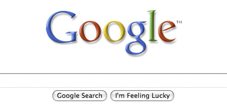
Sometime this morning, a web page that I visit occasionally changed its appearance from this:
to this:
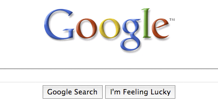
The images are grabbed from Firefox on OS X; same effect in Safari. Some CSS forensics reveals what’s gone wrong here: Google has added a “height:28px” property to the style for the two buttons, and boosted their type size from 13 pixels to 16. (Type inside the search box is also given the giant billboard treatment.) Apparently the height property prevents the browser from using those cute jelly-bean widgets for the buttons.
Can we strike a bargain, Google? I’ll let you take over the world and track my every movement; I’ll sign over all my copyrights and promise never to block your advertising, if you’ll just give me my widgets back. Go ahead and Be Evil; just Don’t Be Ugly.
Or am I going to have to override you in userContent.css?
Update: Marissa Mayer, Google’s Vice President for Search Products & User Experience, explains:
For us, search has always been our focus. And, starting today, you’ll notice on our homepage and on our search results pages, our search box is growing in size. Although this is a very simple idea and an even simpler change, we’re excited about it — because it symbolizes our focus on search and because it makes our clean, minimalist homepage even easier and more fun to use. The new, larger Google search box features larger text when you type so you can see your query more clearly. It also uses a larger text size for the suggestions below the search box, making it easier to select one of the possible refinements.
For Firefox users who find the “supersized” page a nonimprovement, I offer the following quick hack:
@-moz-document domain(google.com) {
  .lsb, .gac_sb {
	font-size:13px ! important;
	height:inherit ! important;
	}

  .lst, .gac_m {
	font-size:14px ! important;
	}

}
Add these lines to your userContent.css file (see the Customizing Mozilla site for further instructions). This seems to fix the widget problem and the input-field text size, but all the drop-down gadgetry is still a mess and maybe the dropdown menu of suggestions. This will break if Google’s next whim is to change the class names “lsb,” “lst,” etc. If anyone has a cleaner solution, please pass it on.