A few weeks ago, after taking a walk in the woods, I wrote about the puzzling diversity of forest trees. On my walk I found a dozen species sharing the same habitat and apparently competing for the same resources—primarily access to sunlight. An ecological principle says that one species should win this contest and drive out all the others, but the trees haven’t read the ecology textbooks.
In that essay I also mentioned three other questions about trees that have long been bothering me. In this sequel I want to poke at those other questions a bit more deeply.
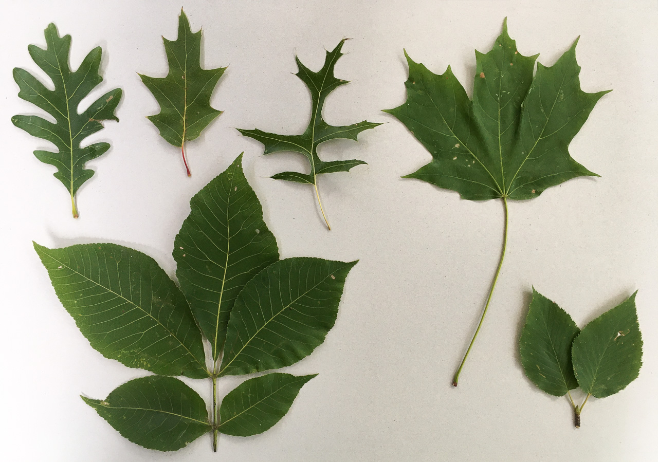
Top row: white oak (Quercus alba), red oak (Quercus rubra), pin oak (Quercus palustris), sugar maple (Acer saccharum). Bottom row: shagbark hickory (Carya ovata), sweet birch (Betula lenta). All specimens were collected along the Robert Frost Trail in Amherst, Massachusetts, from trees growing no more than 100 meters apart.
Botanists have an elaborate vocabulary for describing leaf shapes: cordate (like a Valentine heart), cuneate (wedgelike), ensiform (sword shaped), hastate (like an arrowhead, with barbs), lanceolate (like a spearhead), oblanceolate (a backwards spearhead), palmate (leaflets radiating like fingers), pandurate (violin shaped), reniform (kidney shaped), runcinate (saw-toothed), spatulate (spoonlike). That’s not, by any means, a complete list.
Steven Vogel, in his 2012 book The Life of a Leaf, enumerates many factors and forces that might have an influence on leaf shape. For example, leaves can’t be too heavy, or they would break the limbs that hold them aloft. On the other hand, they can’t be too delicate and wispy, or they’ll be torn to shreds by the wind. Leaves also must not generate too much aerodynamic drag, or the whole tree might topple in a storm.
Job One for a leaf is photosynthesis: gathering sunlight, bringing together molecules of carbon dioxide and water, synthesizing carbohydrates. Doing that efficiently puts further constraints on the design. As much as possible, the leaf should turn its face to the sun, maximizing the flux of photons absorbed. But temperature control is also important; the biosynthetic apparatus shuts down if the leaf is too hot or too cold.
Vogel points out that subtle features of leaf shape can have a measurable impact on thermal and aerodynamic performance. For example, convective cooling is most effective near the margins of a leaf; temperature rises with distance from the nearest edge. In environments where overheating is a risk, shapes that minimize this distance—such as the lobate forms of oak leaves—would seem to have an advantage over simpler, disklike shapes. But the choice between frilly and compact forms depends on other factors as well. Broad leaves with convex shapes intercept the most sunlight, but that may not always be a good thing. Leaves with a lacy design let dappled sunlight pass through, allowing multiple layers of leaves to share the work of photosynthesis.
Natural selection is a superb tool for negotiating a compromise among such interacting criteria. If there is some single combination of traits that works best for leaves growing in a particular habitat, I would expect evolution to find it. But I see no evidence of convergence on an optimal solution. On the contrary, even closely related species put out quite distinctive leaves.
Take a look at the three oak leaves in the upper-left quadrant of the image above. They are clearly variations on a theme. What the leaves have in common is a sequence of peninsular protrusions springing alternately to the left and the right of the center line. The variations on the theme have to do with the number of peninsulas (three to five per side in these specimens), their shape (rounded or pointy), and the depth of the coves between peninsulas. Those variations could be attributed to genetic differences at just a few loci. But why have the leaves acquired these different characteristics? What evolutionary force makes rounded lobes better for white oak trees and pointy ones better for red oak and pin oak?
Much has been learned about the developmental mechanisms that generate leaf shapes. Biochemically, the main actors are the plant hormones known as auxins; their spatial distribution and their transport through plant tissues regulate local growth rates and hence the pattern of development. (A 2014 review article by Jeremy Dkhar and Ashwani Pareek covers these aspects of leaf form in great detail.) On the mathematical and theoretical side, Adam Runions, Miltos Tsiantis, and Przemyslaw Prusinkiewicz have devised an algorithm that can generate a wide spectrum of leaf shapes with impressive verisimilitude. (Their 2017 paper, along with source code and videos, is at algorithmicbotany.org/papers/leaves2017.html.) With different parameter values the same program yields shapes that are recognizable as oaks, maples, sycamores, and so on. Again, however, all this work addresses questions of how, not why.
Another property of tree leaves—their size—does seem to respond in a simple way to evolutionary pressures. Across all land plants (not just trees), leaf area varies by a factor of a million—from about 1 square millimeter per leaf to 1 square meter. A 2017 paper by Ian J. Wright and colleagues reports that this variation is strongly correlated with climate. Warm, moist regions favor large leaves; think of the banana. Cold, dry environments, such as alpine ridges, host mainly tiny plants with even tinier leaves. So natural selection is alive and well in the realm of tree leaves; it just appears to have no clear preferences when it comes to shape.
Or am I missing something important? Elsewhere in nature we find flamboyant variations that seem gratuitous if you view them strictly in the grim context of survival-of-the-fittest. I’m thinking of the fancy-dress feathers of birds, for example. Cardinals and bluejays both frequent my back yard, but I don’t spend much time wondering whether red or blue is the optimal color for survival in that habitat. Nor do I expect the two species to converge on some shade of purple. Their gaudy plumes are not adaptations to the physical environment but elements of a communication system; they send signals to rivals or potential mates. Could something similar be going on with leaf shape? Do the various oak species maintain distinctive leaves to identity themselves to animals that help with pollination or seed dispersal? I rate this idea unlikely, but I don’t have a better one.
Surely this question is too easy! We know why trees grow tall. They reach for the sky. It’s their only hope of escaping the gloomy depths of the forest’s lower stories and getting a share of the sunshine. In other words, if you are a forest tree, you need to grow tall because your neighbors are tall; they overshadow you. And the neighbors grow tall because you’re tall. It’s is a classic arms race. Vogel has an acute commentary on this point:
In every lineage that has independently come up with treelike plants, a variety of species achieve great height. That appears to me to be the height of stupidity…. We’re looking at, almost surely, an object lesson in the limitations of evolutionary design….
A trunk limitation treaty would permit all individuals to produce more seeds and to start producing seeds at earlier ages. But evolution, stupid process that it is, hasn’t figured that out—foresight isn’t exactly its strong suit.
Vogel’s trash-talking of Darwinian evolution is meant playfully, of course. But I think the question of height-limitation treaties
Forest trees in the eastern U.S. often grow to a height of 25 or 30 meters, approaching 100 feet. It takes a huge investment of material and energy to erect a structure that tall. To ensure sufficient strength and stiffness, the girth of the trunk must increase as the \(\frac{3}{2}\) power of the height, and so the cross-sectional area \((\pi r^2)\) grows as the cube of the height. It follows that doubling the height of a tree trunk multiplies its mass by a factor of 16.
Great height imposes another, ongoing, metabolic cost. Every day, a living tree must lift 500 liters of water—weighing 500 kilograms—from the root zone at ground level up to the leaves in the crown. It’s like carrying enough water to fill four or five bathtubs from the basement of a building to the 10th floor.
Height also exacerbates certain hazards to the life and health of the tree. A taller trunk forms a longer lever arm for any force that might tend to overturn the tree. Compounding the risk, average wind speed increases with distance above the ground.
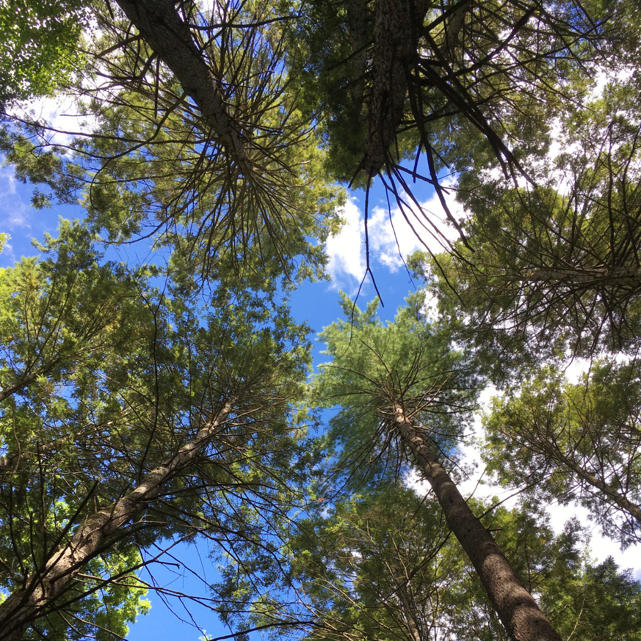
Standing on the forest floor, I tilt my head back and stare dizzily upward toward the leafy crowns, perched atop great pillars of wood. I can’t help seeing these plants on stilts as a colossal waste of resources. It’s even sillier than the needlelike towers of apartments for billionaires that now punctuate the Manhattan skyline. In those buildings, all the floors are put to some use. In the forest, the tree trunks are denuded of leaves and sometimes of branches over 90 percent of their length; only the penthouses are occupied.
If the trees could somehow get together and negotiate a deal—a zoning ordinance or a building code—they would all benefit. Perhaps they could decree a maximum height of 10 meters. Nothing would change about the crowns of the trees; the rule would simply chop off the bottom 20 meters of the trunk.
If every tree would gain from the accord, why don’t we see such amputated forests evolving in nature? The usual response to this why-can’t-everybody-get-along question is that evolution just doesn’t work that way. Natural selection is commonly taken to be utterly selfish and individualist, even when it hurts. A tree reaching the 10-meter limit would say to itself: “Yes, this is good; I’m getting plenty of light without having to stand on tiptoe. But it could be even better. If I stretched my trunk another meter or two, I’d collect an even bigger share of solar energy.” Of course the other trees reason with themselves in exactly the same way, and so the futile arms race resumes. As Vogel said, foresight is not evolution’s strong suit.
I am willing to accept this dour view of evolution, but I am not at all sure it actually explains what we see in the forest. If evolution has no place for cooperative action in a situation like this one, how does it happen that all the trees do in fact stop growing at about the same height? Specifically, if an agreement to limit height to 10 meters would be spoiled by rampant cheating, why doesn’t the same thing happen at 30 meters?
One might conjecture that 30 meters is a physiological limit, that the trees would grow taller if they could, but some physical constraint prevents it. Perhaps they just can’t lift the water any higher. I would consider this a very promising hypothesis if it weren’t for the sequoias and the coast redwoods in the western U.S. Those trees have not heard about any such physical barriers. They routinely grow to 70 or 80 meters, and a few specimens have exceeded 100 meters. Thus the question for the East Coast trees is not just “Why are you so tall?” but also “Why aren’t you taller?”
I can think of at least one good reason for forest trees to grow to a uniform height. If a tree is shorter than average, it will suffer for being left in the shade. But standing head and shoulders above the crowd also has disadvantages: Such a standout tree is exposed to stronger winds, a heavier load of ice and snow, and perhaps higher odds of lightning strikes. Thus straying too far either below or above the mean height may be punished by lower reproductive success. But the big question remains: How do all the trees reach consensus on what height is best?
Another possibility: Perhaps the height of forest trees is not a result of an arms-race after all but instead is a response to predation. The trees are holding their leaves on high to keep them away from herbivores. I can’t say this is wrong, but it strikes me as unlikely. No giraffes roam the woods of North America (and if they did, 10 meters would be more than enough to put the leaves out of reach). Most of the animals that nibble on tree leaves are arthropods, which can either fly (adult insects) or crawl up the trunk (caterpillars and other larvae). Thus height cannot fully protect the leaves; at best it might provide a deterrent. Tree leaves are not a nutritious diet; perhaps some small herbivores consider them worth a climb of 10 meters, but not 30.
To a biologist, a tree is a woody plant of substantial height. To a mathematician, a tree is a graph without loops. It turns out that math-trees and bio-trees have some important properties in common.
The diagram below shows two mathematical graphs. They are collections of dots (known more formally as vertices), linked by line segments (called edges).  A graph is said to be connected if you can travel from any vertex to any other vertex by following some sequence of edges. Both of the graphs shown here are connected. Trees form a subspecies of connected graphs. They are minimally connected: Between any two vertices there is exactly one
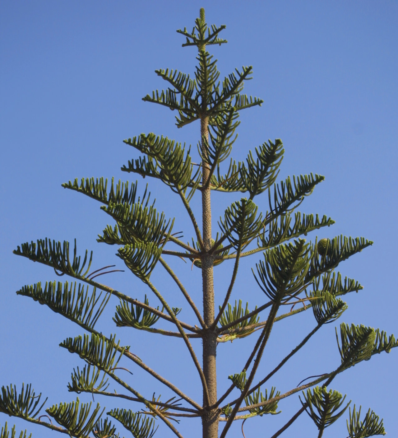
Here’s another way to describe a math-tree. It’s a graph that obeys the antimatrimonial rule: What branching puts asunder, let no one join together again. Bio-trees generally work the same way: Two limbs that branch away from the trunk will not later return to the trunk or fuse with each other. In other words, there are no cycles, or closed loops. The pattern of radiating branches that never reconverge is evident in the highly regular structure of the bio-tree pictured below. (The tree is a Norfolk Island pine, native to the South Pacific, but this specimen was photographed on Sardinia.)
Trees have achieved great success without loops in their branches. Why would a plant ever want to have its structural elements growing in circles?
I can think of two reasons. The first is mechanical strength and stability. Engineers know the value of triangles (the smallest closed loops) in building rigid structures. Also arches, where two vertical elements that could not stand alone lean on each other. Trees can’t take advantage of these tricks; their limbs are cantilevers, supported only at the point of juncture with the trunk or the parent limb. Loopy structures would allow for various kinds of bracing and buttressing.
The second reason is reliability. Providing multiple channels from the roots to the leaves would improve the robustness of the tree’s circulatory system. An injury near the base of a limb would no longer doom all the structures beyond the point of damage.
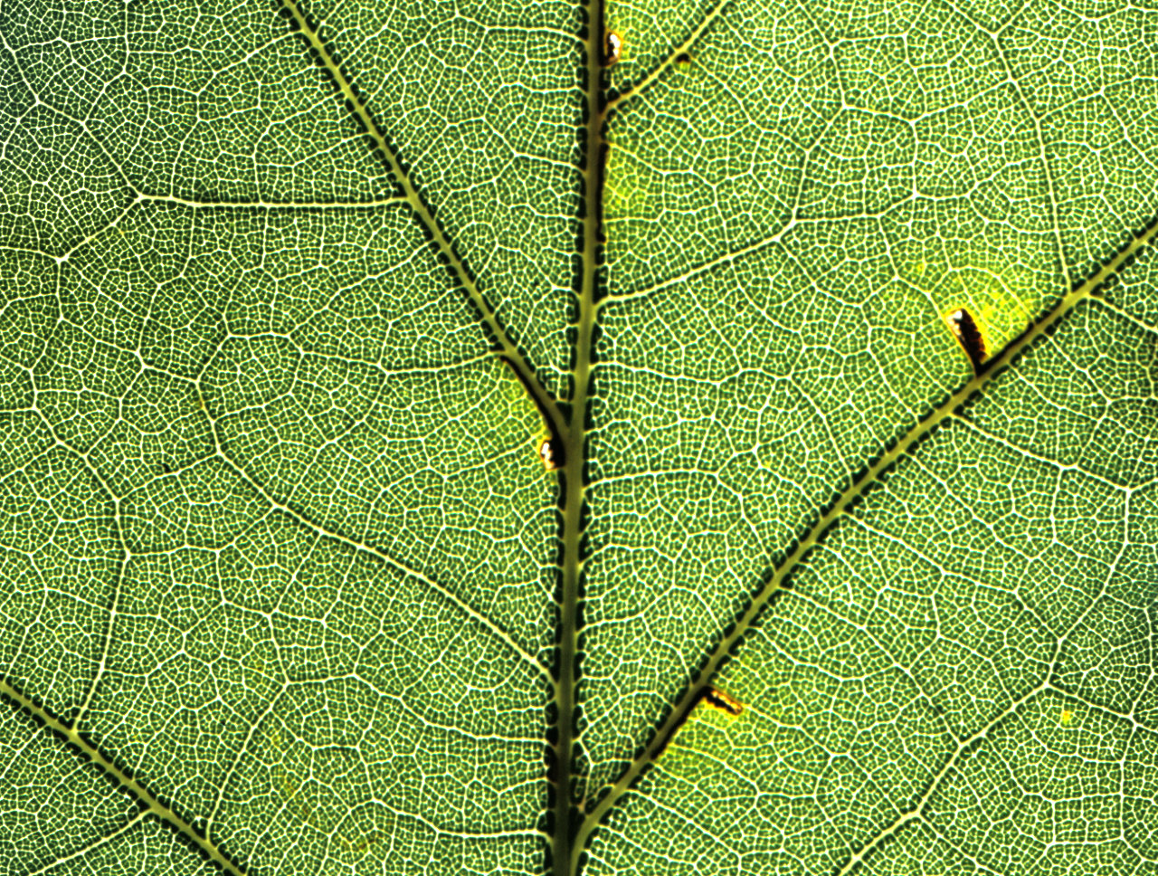
Networks with multiple paths between nodes are exploited elsewhere in nature, and even in other aspects of the anatomy of trees. The reticulated channels in the image below are veins distributing fluids and nutrients within a leaf from a red oak tree. The very largest veins (or ribs) have a treelike arrangement, but the smaller channels form a nested hierarchy of loops within loops. (The pattern reminds me of a map of an ancient city.) Because of the many redundant pathways, an insect taking a chomp out of the middle of this network will not block communication with the rest of the leaf.
The absence of loops in the larger-scale structure of trunk and branches may be a natural consequence of the developmental program that guides the growth of a tree. Aristid Lindenmayer, a Hungarian-Dutch biologist, invented a family of formal languages (now called L-systems) for describing such growth. The languages are rewriting systems: You start with a single symbol (the axiom) and replace it with a string of symbols specified by the rules of a grammar. Then the string resulting from this substitution becomes a new input to the same rewriting process, with each of its symbols being replaced by another string formed according to the grammar rules. In the end, the symbols are interpreted as commands for constructing a geometric figure.
Here’s an L-system grammar for drawing cartoonish two-dimensional trees:
     f  ⟶  f [r f] [l f]
     l  ⟶  l
     r  ⟶  r
The symbols f, l, and r are the basic elements of the language; when interpreted as drawing commands, they stand for forward, left, and right. The first rule of the grammar replaces any occurrence of f with the string f [l f] [r f]; the second and third rules change nothing, replacing l and r with themselves. Square brackets enclose a subprogram. On reaching a left bracket, the system makes note of its current position and orientation in the drawing. Then it executes the instructions inside the brackets, and finally on reaching the right bracket backtracks to the saved position and orientation.
Starting with the axiom f, the grammar yields a succession of ever-more-elaborate command sequences:
Stage 0:    f
Stage 1:    f [r f] [l f]
Stage 2:    f [r f] [l f] [r f [r f] [l f]] [l f [r f] [l f]]]
When this rewriting process is continued for a few further stages and then converted to graphic output, we see a sapling growing into a young tree, with a shape reminiscent of an elm.

L-systems like this one can produce a rich variety of branching structures. More elaborate versions of the same program can create realistic images of biological trees. (The Algorithmic Botany website at the University of Calgary has an abundance of examples.) What the L-systems can’t do is create closed loops. That would require a fundamentally different kind of grammar, such as a transformation rule that takes two symbols or strings as input and produces a conjoined result. (Note that in the stage 5 diagram above, two branches of the tree appear to overlap, but they are not joined. The graph has no vertex at the intersection point.)
If the biochemical mechanisms governing the growth and development of trees operate with the same constraints as L-systems, we have a tidy explanation for the absence of loops in the branching of bio-trees. But perhaps the explanation is a little too tidy. I’ve been saying that trees don’t do loops, and it’s generally true. But what about the tree pictured below—a crepe myrtle I photographed some years ago on a street in Raleigh, North Carolina? (It reminds me of a sinewy Henry Moore sculpture.)
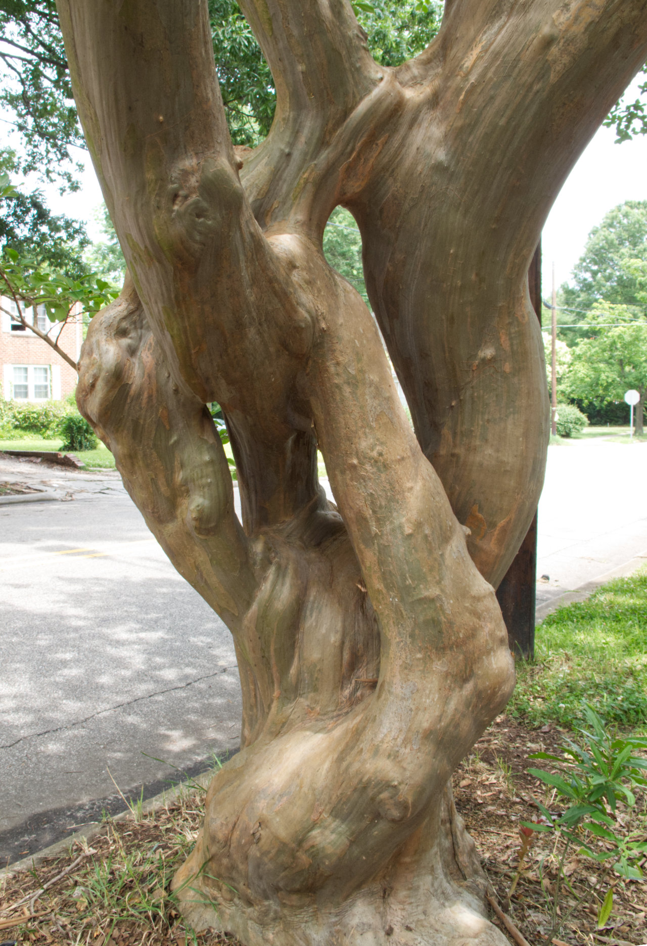
This plant is a tree in the botanical sense, but it’s certainly not a mathematical tree. A single trunk comes out of the ground and immediately divides. At waist height there are four branches, then three of them recombine. At chest height, there’s another split and yet another merger. This rogue tree is flouting all the canons and customs of treedom.
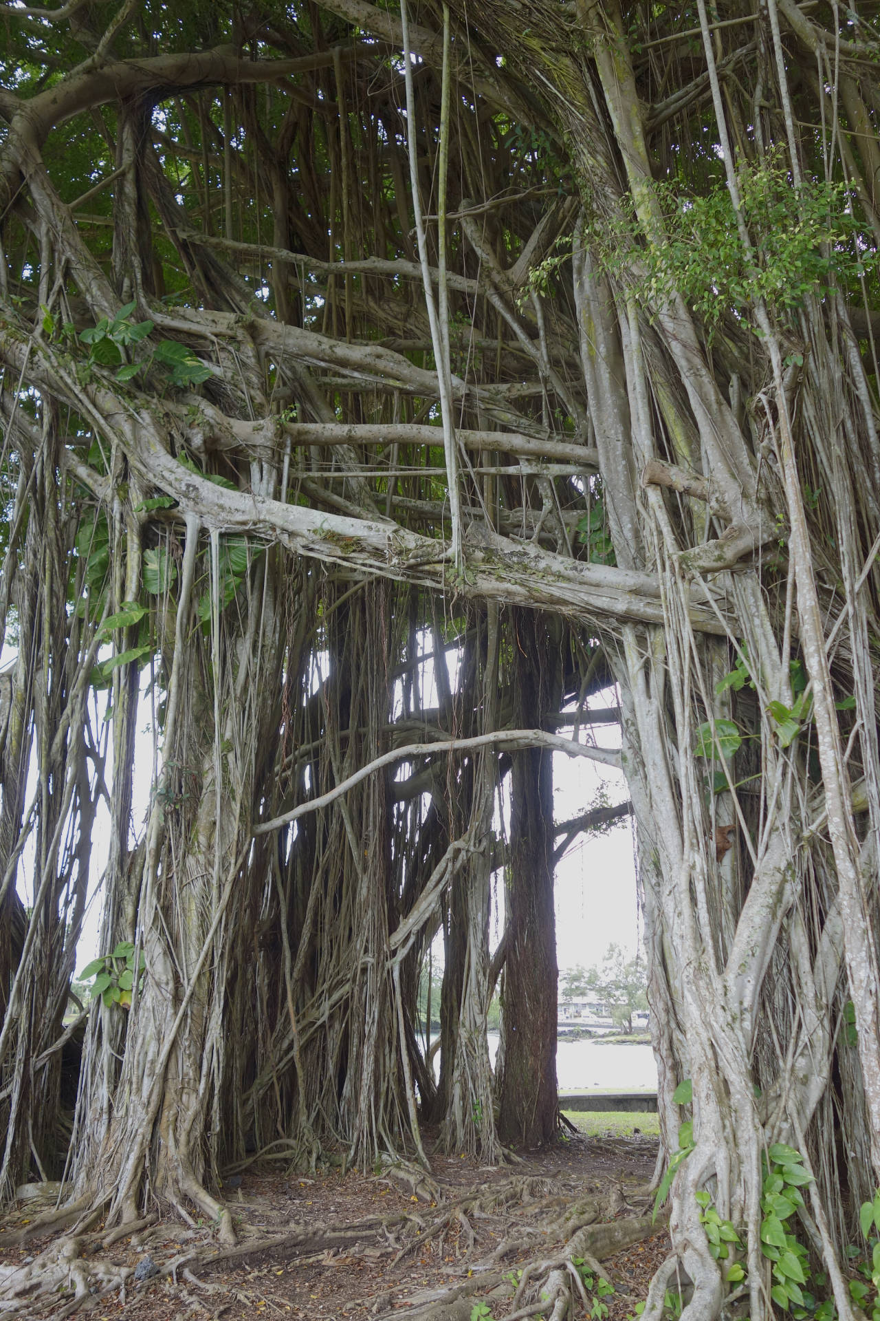
And the crepe myrtle is not the only offender. Banyan trees, native to India, have their horizontal branches propped up by numerous outrigger supports that drop to the ground. The banyan shown below, in Hilo, Hawaii, has a hollowed-out cavity where the trunk ought to be, surrounded by dozens or hundreds of supporting shoots, with cross-braces overhead. The L-system described above could never create such a network. But if the banyan can do this, why don’t other trees adopt the same trick?
In biology, the question “Why x?” is shorthand for “What is the evolutionary advantage of x?” or “How does x contribute to the survival and reproductive success of the organism?” Answering such questions often calls for a leap of imagination. We look at the mottled brown moth clinging to tree bark and propose that its coloration is camouflage, concealing the insect from predators. We look at a showy butterfly and conclude that its costume is aposematic—a warning that says, “I am toxic; you’ll be sorry if you eat me.”
These explanations risk turning into just-so stories,
And if we have a hard time imagining the experiences of animals, the lives of plants are even further beyond our ken. Does the flower lust for the pollen-laden bee? Does the oak tree grieve when its acorns are eaten by squirrels? How do trees feel about woodpeckers? Confronted with these questions, I can only shrug. I have no idea what plants desire or dread.
Others claim to know much more about vegetable sensibilities. Peter Wohlleben, a German forester, has published a book titled The Hidden Life of Trees: What They Feel, How They Communicate. He reports that trees suckle their young, maintain friendships with their neighbors, and protect sick or wounded members of their community. To the extent these ideas have a scientific basis, they draw heavily on work done in the laboratory of Suzanne Simard at the University of British Columbia. Simard, leader of the Mother Tree project, studies communication networks formed by tree roots and their associated soil fungi.
I find Simard’s work interesting. I find the anthropomorphic rhetoric unhelpful and offensive. The aim, I gather, is to make us care more about trees and forests by suggesting they are a lot like us; they have families and communities, friendships, alliances. In my view that’s exactly wrong. What’s most intriguing about trees is that they are aliens among us, living beings whose long, immobile, mute lives bear no resemblance to our own frenetic toing-and-froing. Trees are deeply mysterious all on their own, without any overlay of humanizing sentiment.
Further Reading
Dkhar, Jeremy, and Ashwani Pareek. 2014. What determines a leaf’s shape? EvoDevo 5:47.
McMahon, Thomas A. 1975. The mechanical design of trees. Scientific American 233(1):93–102.
Osnas, Jeanne L. D., Jeremy W. Lichstein, Peter B. Reich, and Stephen W. Pacala. 2013. Global leaf trait relationships: mass, area, and the leaf economics spectrum. Science 340:741–744.
Prusinkiewicz, Przemyslaw, and Aristid Lindenmayer, with James S. Hanan, F. David Fracchia, Deborah Fowler, Martin J. M. de Boer, and Lynn Mercer. 1990. The Algorithmic Beauty of Plants. New York: Springer-Verlag. PDF edition available at http://algorithmicbotany.org/papers/.
Runions, Adam, Martin Fuhrer, Brendan Lane, Pavol Federl, Anne-Gaëlle Rolland-Lagan, and Przemyslaw Prusinkiewicz. 2005. Modeling and visualization of leaf venation patterns. ACM Transactions on Graphics 24(3):702?711.
Runions, Adam, Miltos Tsiantis, and Przemyslaw Prusinkiewicz. 2017. A common developmental program can produce diverse leaf shapes. New Phytologist 216:401–418. Preprint and source code.
Tadrist, Loïc, and Baptiste Darbois Texier. 2016. Are leaves optimally designed for self-support? An investigation on giant monocots. arXiv:1602.03353.
Vogel, Steven. 2012. The Life of a Leaf. University of Chicago Press.
Wright, Ian J., Ning Dong, Vincent Maire, I. Colin Prentice, Mark Westoby, Sandra Díaz, Rachael V. Gallagher, Bonnie F. Jacobs, Robert Kooyman, Elizabeth A. Law, Michelle R. Leishman, Ülo Niinemets, Peter B. Reich, Lawren Sack, Rafael Villar, Han Wang, and Peter Wilf. 2017. Global climatic drivers of leaf size. Science 357:917–921.
Yamazaki, Kazuo. 2011. Gone with the wind: trembling leaves may deter herbivory. Biological Journal of the Linnean Society 104:738–747.
Young, David A. 2010 preprint. Growth-algorithm model of leaf shape. arXiv:1004.4388.