In the 1930s and 40s George Kingsley Zipf studied word frequencies in several languages and came up with a general observation: If you sort all the words from commonest to rarest, the frequency of the word at rank r is proportional to 1/r. This law has a distinctive graphical interpretation: Plotting the logarithm of frequency against the logarithm of rank yields a straight line with a slope of –1.
Do the Google n-grams obey Zipf’s law? When commenter Nick Black raised this question, I didn’t know the answer. Now I do.
Here’s a log-log plot of the number of occurrences of a word w as a function of w‘s rank among all words:
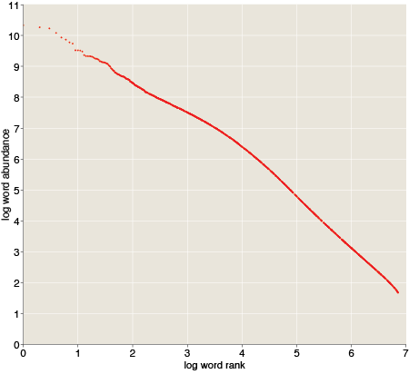
We don’t have a straight line here, but it’s not too far off. You can get a good fit with two piecewise straight lines—one line for the top 10,000 ranks and the other for the rest of the 7.4 million words.
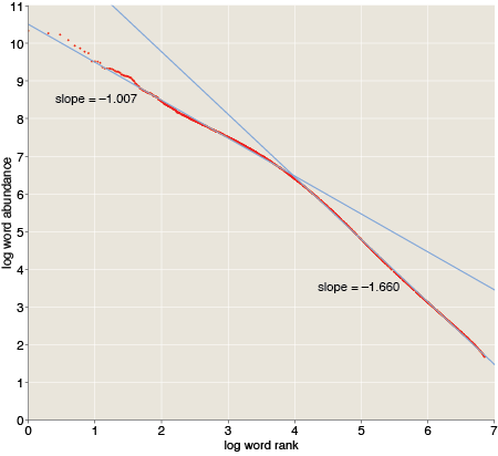
The upper part of the distribution is quite close to Zipf’s prediction, with a slope of –1.007. The lower part is steeper, with a slope of –1.66. Thus the communal vocabulary seems to be split into two parts, with a nucleus of about 10,000 common words and a penumbra of millions of words that show up less often. The two classes have different usage statistics.
I don’t have any clear idea of why language should work this way, but very similar curves have been observed before in other corpora. For example, Ramon Ferrer-i-Cancho and Ricard V. Solé report slopes of –1.06 and –1.97 in the British National Corpus, with the breakpoint again at roughly the rank 10,000. (Preprint here.)
Incidentally, the Zipf plot is truncated at the bottom because the n-gram data set excludes all words that occur fewer than 40 times. Extrapolating the line of slope –1.66 yields an estimate of how large the data set would have been if everything had been included: 77 million distinct n-grams.
How did you do the regression? Max likelihood or least squares? Also it would be nice if there were model comparison, i.e. checking against lognormal.
In general you shouldn’t use least squares to fit power laws, and as always, good fit does not mean best fit.
See: http://arxiv.org/abs/0706.1062 for a discussion the biases induced via least-squares regression and omitting model comparison
Or: http://go-to-hellman.blogspot.com/2011/03/statistician-cant-distinguish-library.html
How did you calculate the rank from the frequencies when words have identical frequencies? I had always assumed that one should assign the same rank to words that share the same frequency, which often results in a wider tail being present on scatterplots of Zipf’s law for a corpus.
@Chris:
I think the broadening of the tail that you describe happens when you don’t “assign the same rank to words that share the same frequency.” Thus you get a whole range of ranks (along the horizontal axis) that all map to the same word frequency (along the vertical axis). We’re not seeing this in the graph above for two reasons. First, the Google policy of cutting off the tail of the distribution at a count of 40 eliminates what may be as much as 90 percent of the data set. Second, even though the published data set is “only” 7.4 million words, I didn’t plot them all. It seemed a bit silly, printing 7.4 million dots on a graph that’s only 450 pixels wide. Rather than summing (i.e., binning) the results, I sampled them. The graph shows just 1,228 selected points.
How did I select them? I applied the following Lisp predicate to each of the 7.4 million ranked items:
(< (random 1.0) (/ k rank))
and accepted into the sample those items for which the predicate returned true. The parameter k controls the density of the sampling. For k=1 we get a uniform sampling of the Zipf distribution. For very large k (greater than the largest rank), all data items are included. I set k=100, which ensures that all items up to rank 100 are included in the set, but in the tail the result isn’t much different from k=1.
Is this the right way—or even an acceptable way—to plot a large data set with a heavy-tailed distribution? I don’t know; I just made it up on the spot. (See below for more on what I don’t know.)
@Kevin:
I’m truly grateful to you for pointing out so clearly my statistical naivete. In saying this I am not being sarcastic or grumpy; I really am a naive amateur who shouldn’t be swimming in these deep and troubled waters, and I welcome instruction. That paper by Clauset, Shalizi and Newman looks like just the sort of thing I need, and I intend to read it carefully. But when I’m done I’ll be only a slightly-less-naive amateur, and still in need of instruction.
In answer to your specific question, the fit was indeed done with least-squares. I could go back and try an MLE fit. I could also try a lognormal model. But the sad truth is, I don’t have much confidence that I wouldn’t make some other naive-amateur blunder along the way. So I’d like to propose a better idea. I have uploaded the rank-frequency data set, and I invite you (or anyone else who’s interested!) to show me how I should have carried out the analysis. I’ll be happy to post any interesting results.
Here’s the URL for the full data set (7,380,256 records, 87 MB):
http://bit-player.org/wp-content/uploads/2011/04/zipf-data.csv
And here’s the small sample I used to draw the graphs above (1,228 records, 16 kB):
http://bit-player.org/wp-content/uploads/2011/04/zipf-samples.csv
The format for both files is comma-separated values, i.e., each line takes the form “rank,frequency.” Both files begin:
1,21396850115
2,18399669358
3,16834514285
4,12042045526
Thanks much for your interest and help!
Ok, I’ll bite —
If the commonly used english corpus is about 2,000 words, and the number of words in the entire language is somewhere in the 50,000 to maybe 200,000 range, what are the words from 200,000 to 1,000,000? Wouldn’t it be possible (assuming your curve fitting is reasonable) that the elements upward of 100,000 aren’t linguistic words (ie, words you find in the dictionary), thus are subject to different frequency use? My first guess is these elements are not “words” in the traditional sense, but are misspellings and proper names, or possibly words in other languages. Perhaps you can give some examples in the second curve space, to aide our intuition?
Why would you random sample something that can be concretely measured?
@Brian Bulkowski:
With more than 7 million items, the data set obviously has to include a lot of “words” that lexicographers do not list in dictionaries. Some categories are obvious—numbers, punctuation, etc. But removing all that (specifically, excluding all items that have any character outside the set [a-z,A-Z]), reduces the overall size of the data set by only about 10 percent. Another important factor is case sensitivity. I have not yet created a case-folded version of the 1-gram files, but it would surely be less than half the size of the original. OCR errors are also important, but my best guess is that they don’t make up more than 15 percent of the total. Spelling errors are probably less important.
Does all this have any bearing on the shape of the rank-frequency curve? That’s a really good question, which I cannot answer. I’m interested in trying to help clean up certain aspects of the data set, and if I ever make any progress, perhaps that will offer some hints toward an answer.
I don’t at this moment have a stratified sample of convenient size. I’ll try to put something together.
@John Haugeland
Are you asking why I graphed only a sample of the data rather than the full set of 7.4 million words? Because plotting 7.4 million dots would produce an extremely unwieldy file and would be no more informative than the sample.
But perhaps that’s not what you were asking?
Uh. So wait, instead of using the extremely rare and futuristic technology of scaling an image down, you thought you would ruin the data by taking an undefined subset of it?
You seriously thought random sampling was the way to improve a graph?
@John Haugeland:
If I understand correctly, you are arguing that the right way to graph this data set is to start with an image large enough to distinguish all the data points, and then scale it down to a size that will fit on a web page.
These are ranked data, which means that every x coordinate is distinct. In other words, the set of x values covers every integer in the range from 1 through 7,380,256. Thus if we want to allocate a pixel to each data point, we need a pixel array with at least 7,380,256 columns. The minimum number of rows is not so obvious, but for readability of the graph we probably don’t want to depart too awfully far from squareness. A square image with 7,380,256 columns and 7,380,256 rows has 54,468,178,625,536 pixels—roughly 54 terapixels. That’s what I meant by an unwieldy file.
Now just because this method of drawing the graph is infeasible doesn’t mean that the method I chose is correct. As I indicated above, I have doubts of my own. Still, if you think I have “ruined the data,” you really ought to show me what a correct graph looks like. The full data set is just a click away in one of the comments above this. Please feel free to plot it by whatever means you think most appropriate, and send me the result. If my graph has given a misleading impression of the true shape of the distribution, I would welcome a chance to set the record straight.
The ngram viewer raised a question for me, after looking at the frequency of words such as obviate, hyperborean, etc. Is the inverse of the average/median frequency of unusual words that a person knows proportional to that person’s vocabulary? The sample is not random (one is not asked if one knows certain words), but perhaps this does not matter?