The new issue of American Scientist is out, both on newsstands and on the web. My “Computing Science” column takes up a topic I’ve already written about here on bit-player: the huge corpus of “n-grams” extracted from the Google Books scanning project and released to the public by a team from Harvard and Google. (The earlier bit-player items are titled “Googling the Lexicon” and “3.14.”)
After two blog posts and a magazine column, my faithful readers may have had enough of this subject—but not me. I can’t seem to get it out of my system. So I’m going to take this opportunity to publish some of the overflow matter that wouldn’t fit in the column. (And even this won’t be the end of the story. Stay tuned for still more n-grams.)
For the benefit of readers who have not been doting on my every word, here’s a precis. Google aims to digitize all the world’s printed books, and so far they have scanned about 15 million volumes (which is probably about one-eighth of the total). At Harvard, Erez Lieberman Aiden and Jean-Baptiste Michel, with a dozen collaborators, have been working with digitized text from a subset of 5,195,769 Google book scans. Because of copyright restrictions they cannot release the full text, but they have extracted lists of n-grams, or phrases of n words each, for values of n between 1 and 5. The 1-grams are individual words (or other character strings, such as numbers and punctuation marks); the 2-grams are two-word phrases, and so on. Each n-gram is accompanied by a time series giving the number of occurrences of that n-gram in each year from 1520 to 2008. (For more background and technical detail, see the Science article by Michel, et al.)
If you want to trace changes in the frequency of a specific word over time, Google has set up an online Ngram Viewer that makes this easy. But you can also download the data set, which allows for many other kinds of exploration. The cost is some heavy lifting of multigigabyte files. So far I have worked only with English text (six other languages are also covered) and only with 1-grams, which form the smallest part of the data set.
Here are some basic facts and figures on the English 1-grams:
| uncompressed file size (bytes) | 9,672,200,350 |
| number of distinct 1-grams | 7,380,256 |
| total 1-gram occurrences | 359,675,008,445 |
| number of distinct character codes | 484 |
| total character occurrences | 1,515,454,264,550 |
That’s a lot of verbiage.
It’s worth pausing for a comment on those 484 distinct character codes. We tend to think of English as being written with an alphabet of just 26 letters, or 52 if you count upper case and lower case separately. Then there are numbers and marks of punctuation, and miscellaneous symbols such as $ and +. The original ASCII code had 95 printable characters. How do you get up to 484? Well, even though these files are derived from English-language books, a fair amount of non-English turns up in them. There’s Greek and Cyrillic and a smattering of Asian languages, as well as all the accented versions of Latin characters seen in Romance and Germanic and Slavic languages. There’s even a little mathematical notation. It’s actually surprising that the data set spans only 484 symbols; this is a small subset of the full Unicode spectrum.
Here is the length distribution of the 7 million distinct 1-grams:
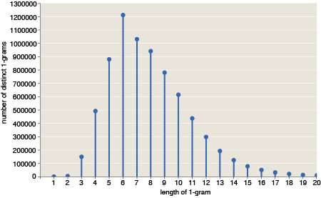
Note that the abundance of shorter words is combinatorially limited. With an “alphabet” of 484 symbols, there cannot possibly be more than 484 single-character words, or 4842 two-character words. But this constraint becomes unimportant beyond length 3; for words of five or six letters, only a tiny fraction of all possible combinations are actually observed.
The corresponding distribution for the 359 billion word occurrences looks rather different:
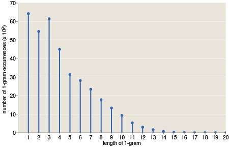
This is roughly what you’d expect to see for a language that encodes information efficiently. As in a Huffman coding, the shortest words are very common, and the sesquipedalian ones are rare. The overall trend is generally linear, and it is remarkably so in the range of lengths from 5 to 11 or 12. Is this a well-known fact? (It is not the shape I would have guessed.) Words of length three and four stand out above the linear trend line. And I should mention that the abundance of single-character words is boosted in this tabulation by the inclusion of punctuation marks, which would probably not be counted at all in other studies of word length.
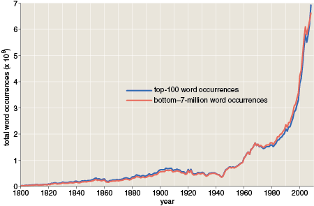
The graph below is one that appears in my American Scientist column. I reproduce it here because I want to call attention to some curious features of the curves.
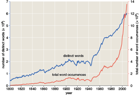
The graph shows the number of distinct words per year (blue) and the total word occurrences per year (red) over the past 200 years or so. I find it interesting that some major historical events are visible in this record. There are dips in both curves at the time of the American Civil War and during both World Wars of the 20th century. Presumably, book publishing languished during those years. There are also ripples that might be attributed to the crash of 1929 and the ensuing Great Depression, although they are less clear.
Other features of the curves don’t have such a ready-made historical explanation. I am particularly curious about the broad sag in the red curve (but not the blue one) from the late 1960s through the 1970s. Between 1967 and 1973, the number of word occurrences declined 12 percent, while the number of distinct words rose 1 percent. This is very strange: We continued to invent new words, but we didn’t make much use of them. Nowhere else do the two curves maintain opposite slopes for any extended period. I can’t explain it. I call it the great Nixonian slump.
I thought I might learn something about the slump by looking at a selection of specific words that exhibit this pattern of abundance—less frequent in the early 70s than in surrounding years. So I extracted about 70,000 of them and sorted them by overall abundance. In many ways it’s an interesting collection. At the very top of the list is Reagan, apparently in eclipse during the Nixon years. Then there’s a swarm of words connected with mechanical and automotive engineering: torque, rotor, stator, pinion, crankshaft, impeller, carburetor, alternator. All of these words might plausibly appear in the same books, so seeing them fade in and out together is not so surprising. Still, one would like to know what happened in book publishing to cause the decline. The 70s were a tough time for the auto industry; is that enough to explain it?
Looking for patterns in these words is fun, but the truth is I don’t believe they have anything to do with the overall Nixonian swoon. Most words have large fluctuations in abundance over a time scale of a decade or two; my extraction procedure merely identified a subset of words that happened to enter a trough at the same time. I could find similar sets for other periods.
In another attempt to explain the slump I divided the data set into halves. One half consists of the 100 most frequent words, which happen to account for almost exactly half of all word occurrences. The other 7,380,156 words make up the second half. Maybe the slump afflicted only common words, or only rare ones? The result was remarkably uninformative:
The two curves trace almost exactly the same time course. Or maybe that’s not so uninformative after all: It tells us that whatever phenomenon causes the slump, the effect is spread out over the entire vocabulary, not just words in a certain frequency range.
Here’s another just-so story I’ve been telling myself in an attempt to understand the Nixonian swoon. The 1960s is when phototypesetting began to displace the older technology of metal type. Suppose that some characteristic of early phototypeset books causes trouble for optical character recognition (OCR) systems. On reading such a book, the OCR program would report an exaggerated number of unique words (since instances of a given word could be read in various different erroneous ways) but the total number of word occurrences would remain constant (since every word is still recognized as some word). This isn’t exactly the pattern we’re seeing, but there’s one more factor to take into account. In the Harvard-Google data set, no word is included unless it appears at least 40 times. If the phototypeset text caused the OCR system to misread the same word in many different ways, some of those errors would fail to reach the 40-occurrence threshold and would just disappear. Thus the total occurrence count could decline even as the number of distinct words increased.
Lying awake in the middle of the night, I thought this story sounded really good. When I got up in the morning, I ran a test. If an unusual number of words are falling off the bottom of the distribution during the Nixon years, then we should also see a bulge just above the bottom, consisting of those words that just barely reached the threshold. But here’s the time series for the 15,518 words with exactly 40 occurrences:
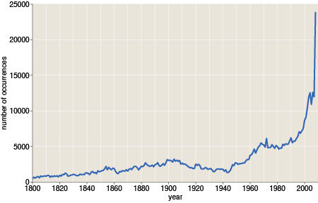
There’s no hump in the late 60s. On the contrary, the curve looks much like all the rest, with the same sorry sag. Isn’t it annoying when mere fact overturns a perfectly lovely theory?
But enough of the Watergate era. I have a few more loose ends to tie up.
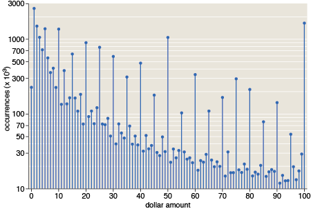
A graph in the magazine illustrates our collective fondness for round numbers—those divisible by 5 or 10. I remark in the text: “Dollar amounts are even more dramatically biased in favor of well-rounded numbers.” Here’s the evidence:
Dollar amounts mod $1 tell the same story:
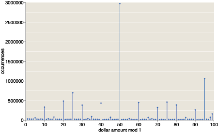
I was not surprised at the prominence of $X.25, $X.50 and $X.75, but in this graph I had expected also to see a strong signal from prices a penny less than a dollar. That signal is detectable but not conspicuous. Apparently, items mentioned in books—perhaps the books themselves—are more commonly priced at $X.95.
Finally, I want to mention two small but troublesome anomalies in the downloadable 1-gram files. The Google OCR algorithms treat most marks of punctuation as separate 1-grams. Thus we can count how many periods, colons and question marks appeared in printed books over the years. But the encoding of two of these symbols was garbled somewhere along the way. The most abundant 1-gram in the entire data set—with 21,396,850,115 occurrences, or about 6 percent of the total—is listed in the files as the double quotation mark. In fact it should be identified as the comma. (In the web interface to the online Ngram Viewer, the comma is a separator, which may have something to do with the confusion in the downloadable files. The character is correctly given as a comma in the private files of Aiden and Michel.)
The second problem entry is even weirder. Loaded into a text editor, it looks like this:
""" "
Closer examination with a binary editor shows that the space between the third and fourth quote marks consists of two control characters, with hexadecimal values 0×15 (NAK) and 0×12 (DC2). I make no sense of this, and Aiden and Michel have not yet been able to help. All the same, I think I know how to fix it. If the entry for the double quotation mark is actually a comma, then something else has to be the double quote. This bizarre character string looks like a good candidate.
015,012 in octal would be just cr/lf
It’s interesting to note that, with the exception of 2, 3, and 5, each prime number less than 100 is a “local minimum” in your occurence graph for the numbers 0-100. (BTW, is the label “dollar amounts” really correct?)
Barry: So we have a new sieve to find primes!
The label “dollar amount” means these are numbers that had a prefixed dollar sign in their original context. (The American Scientist article has a graph for other kinds of numbers.)
Just wondering: are you familiar with Zipf’s Law or the various results of Pareto? They’re pretty highly relevant here; I was surprised not to see them mentioned in this otherwise awesome article.
I am curious about the origin of the phrase “Sorry don’t feed the bulldog”. I thought is was an old phrase, but Ngram says “feed the bulldog” only goes back to the mid-1980s. Exxon is somewhere is the 1970s.
If you Ngram ‘Einstein’, you get a hiccup in the 1850s.
@nick black: I have no good excuse for neglecting to mention the Zipf distribution; it’s just one of several subjects I never got around to. Of course you’re right that it’s highly relevant: Zipf derived his law to describe word frequencies.
Sometime in the next few days I’ll see if I can put something together.
And what did ‘Internet” mean around 1900?
Jim,
The anomalies you’re seeing are from a mislabeling of the dates - books with the word ‘internet’ in them are obviously from around 2000 and not 1900. Similarly, books from the 1850s about Einstein are actually from the 1950s.