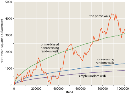
A couple of commenters have asked what software package I use to create the graphs that appear in bit-player posts–illustrations like the one below, which is a slightly improved version of something I posted last week. Let’s call it Figure 1.
Prompted by these inquiries, I immodestly ask myself: Why do my graphs look so darn good? I immodestly answer: It’s not because of any packaged software! I don’t need a cake mix, or even a recipe. These are home-baked graphs, made from scratch out of locally grown organic pixels.
I have strong opinions about the aesthetics of scientific illustrations, and I could certainly spout off about the design elements of Figure 1, such as that putty-colored background, just dark enough to allow drop-out white grid lines, yet neutral enough to avoid competing with the data curves, which also have a distinctive color scheme on which I could discourse at length. Yes, I can talk the Tufte talk. But I think the commenters were really asking how I create the graphs rather than why they’re so elegant, and so I’m going to focus here on the practical programming problem.
Most of my experience in drawing pictures with a computer comes from the world of print publishing, where the final product is ink on paper rather than pixels on a screen. Compared with the online environment, print has some advantages, notably higher resolution (up to 1,000 dots per centimeter) and precise control over typography and color. But print also has obvious limitations: On a magazine page, there are no mouseovers or clickable buttons, and you can’t make a square knot twirl in 3D.
Thirty years ago, the big challenge for computer-generated illustrations was not how to draw the picture but how to get it out of the computer and onto the printing press. You couldn’t just export a PDF and place it in a Quark or InDesign document; none of those things existed. The only practical option was to print out the artwork, photograph it, and “strip” the negative into the page-size film that would be used to make the press plate. Because of this emphasis on printouts, most of the effort went into programming the printer rather than the computer.
The figure below is the first published computer-generated illustration I had a hand in creating. It appeared in Scientific American in 1983.
The array of 282 tiny bar graphs was produced with an Epson MX-80 dot-matrix printer, using escape codes to fire combinations of the eight pins in the printhead. Of course the MX-80 was a black-and-white device. The two-color illustration was created from two separate printouts. Also, the Epson letterforms were replaced with typeset characters.
The world of computer-generated illustrations changed dramatically with the arrival of PostScript, the “page description language” created by John Warnock and his colleagues at Adobe Systems (based in part on earlier work at Evans and Sutherland and Xerox PARC). PostScript was designed as a complete programming language rather than just a file format or a set of drawing commands. And something else set it apart as well: attention to details of graphic design. With most earlier software (such as programs based on the Apple Quickdraw library), trying to create publishable figures was an exercise in frustration. For example, the apparent weight of a line would vary depending on its orientation: lighter when vertical or horizontal, heavier when diagonal. PostScript allows very precise control over such niceties of presentation. To take another example, where lines meet the edge of a graph, you don’t want to have to choose between falling short and overshooting; PostScript provides the tools needed to make it look right.
(The version in the rightmost panel is created by allowing the colored lines to extend outside the background box, and then applying a clipping mask that cuts off all objects at the boundary of the box.)
Obsessing over minute details like these may seem comically fussy, but I believe that neatness counts in these matters. To some extent, illustration is an art of illusion. Graphs and diagrams work best when you can look through them rather than at them. The viewer should be seeing the underlying information or abstraction–the array of correlation coefficients, the function y = f(x), or whatever–rather than noticing the mechanics of how the drawing was constructed. A ragged edge is the kind of distraction that destroys the illusion.
Although PostScript was a giant step forward from the MX-80 command set, in the early years it was still just another printer language, not a computer language. The only way I could execute a PostScript program was to send it to a laser printer and wait to see what came out. Sometimes it was a long wait. I had no way of running a PostScript program on the computer itself. (Ghostscript came later.)
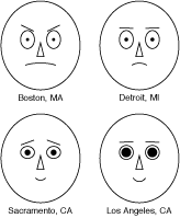 My first PostScript illustrations were created as hand-written PostScript programs; the same language was used both for doing the computations and for presenting the results. The faces at right were created in this way. (They were inspired by the work of Herman Chernoff and drawn to illustrate an American Scientist article by Robert Levine in 1990.) The dual role of the language caused me a moment of disorientation just now when I went looking for my records of this project. I found an EPS (encapsulated PostScript) file, which I knew was the finished illustration, but where was the source code? And then I remembered: It’s the same file! Open it up in Ghostscript or Adobe Illustrator and you see those silly faces smiling or scowling at you; open the same file in a text editor, and you see procedures for drawing elements of the faces:
   /draweyes
     { newpath
       dx dy eyewidth eyeheight 0 360 ellipse stroke
       ex ey eyewidth eyeheight 0 360 ellipse stroke
     } bind def
   /drawpupils
     { fx fy pupilsize pupilsize 0 360 ellipse fill
       gx gy pupilsize pupilsize 0 360 ellipse fill
     } bind def
Bill Casselman, the graphics editor of the Notices of the American Mathematical Society, still favors this direct-to-PostScript methodology. He has written an excellent guidebook, taking you from the basics of PostScript through an elaborate library for rendering three-dimensional objects.
But here I part company from Casselman; I’d rather not do all my computing in PostScript. It’s not that I have anything against the language itself, but the development environment is not to my taste. I therefore adopted the modus operandi of writing a program in my language of choice (usually some flavor of Lisp) and having that program write a PostScript program as its output. After doing this on an ad hoc basis a few times, it became clear that I should abstract out all the graphics-generating routines into a separate module. The result was a program I named lips (for Lisp-to-PostScript).
Most of what lips does is trivial syntactic translation, converting the parenthesized prefix notation of Lisp to the bracketless postfix of PostScript. Thus when I write (lineto x y) in Lisp, it comes out x y lineto in PostScript. The lips routines also take care of chores such as opening and closing files and writing the header and trailer lines required of a well-formed PostScript program.
But the lips interface is low-level, confined to drawing individual dots, line segments, rectangles and the like. Assembling a complete graph out of these primitives is tedious. For example, the grid of white lines in Figure 1 would have to be drawn one line at a time, with each line specified by a sequence of commands such as
    (newpath)
    (moveto u v)
    (lineto x y)
    (stroke)
Before you can issue those commands, you have to calculate u, v, x and y. Clearly, a higher-level front end is needed; like everyone else, I call mine plot.
At the core of any plotting program is a simple operation: mapping points from an abstract user space to coordinates in a rectangular pane, the page space. In Figure 1, the y axis runs from 0 to 5000; values in this range have to be scaled to the dimensions of the graph, which is about 300 PostScript points, or 11 centimeters. Mathematically, the transformation is straightforward. Indeed, if I wished I could leave all the arithmetic to the PostScript interpreter, simply passing in the appropriate matrix elements for scaling and translation. This is an attractive option; it would allow plot to work entirely in user space. But a few niggling details get in the way. Consider the tick marks along the y axis in Figure 1. Their vertical positions are conveniently expressed in user coordinates: one tick every 500 units. But what about the length of the ticks–their horizontal extent? This dimension is purely concerned with the appearance of the graph and has nothing to do with the content; it ought to be expressed in unscaled units of points or pixels.
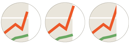
Here’s a possible solution: Let everything inside the rectangular frame of the graph–the area with the putty-colored background in Figure 1–go through the scaling engine, but define everything outside the frame, including the tick marks and the axis labels, directly in page coordinates. If you think this is the final answer, take a look at Figure 2:
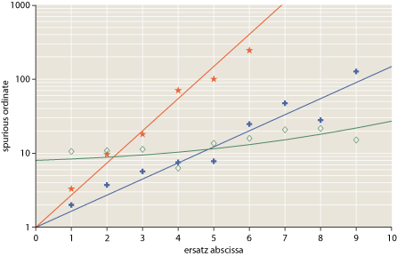
In this nonsensical graph (constructed just for this occasion), data points are indicated by stars, crosses and diamonds. The positions of those glyphs ought to be defined in user space, but the drawing commands that create the shapes are properly defined in page coordinates. If we tried to draw the glyphs in user space, their size and shape would vary with position in the graph.
What’s the best way to deal with this messy situation? Is there some tidy solution that will reconcile the two coordinate systems and allow all dimensions to be treated uniformly? I don’t believe so; it’s just in the nature of graphs to mix up elements from these two disparate realms. We look through a window into a world of data or mathematical abstractions, but we also draw our own little doodles on the window itself.
Of course there are solutions; they’re just not as pretty as I would like. My own strategy for coping is to attach extra information to each geometric point, indicating whether or not the x and y coordinates are to go through the scaling transformation. This is less troublesome than it might seem; from the user’s point of view, it’s almost always invisible.
In writing the lips and plot programs, I walk a path that is already worn smooth by many earlier footsteps. I don’t know who wrote the first computer program for plotting data, but it probably came soon after the first program for producing data. Today we have hundreds of clever, comprehensive, well-designed and well-maintained programs for plotting and graphing. Gnuplot is very capable; Grace is one I’ve never used but I’ve heard good things about it; Mathematica, Sage, R, MATLAB, Octave and the like all have elaborate graphics facilities built in; the Python world, as usual, has an overabundance of options; there are a few libraries for my beloved Lisp; you can even do dataviz online.
All of which raises the question of why I bother to roll my own. I’ll never keep up–or even catch up–with the efforts of major software companies or the huge community of open-source developers. In my own program, if I want something new–treemaps? vector fields? the third dimension?–nobody is going to code it for me. And, conversely, anything useful I might come up with will never benefit anyone but me.
The trouble is, every time I try working with an external graphics package, I run into a terrible impedance mismatch that gives me a headache. Getting what I want out of other people’s code turns out to be more work than writing my own. No doubt this reveals a character flaw: Does not play well with others.
In any case, the time for change is coming. My way of working is woefully out of date and out of fashion. PostScript is a technology that even Adobe seems to regard as outmoded. And making ultraprecise PostScript graphs is quite silly when their destination is the web; before I can put them online, I have to convert them to low-res PNG images. Furthermore, a PostScript-based workflow loses out on all the interactive richness of the web. These are deathly still images. How can I expect to earn any web cred when my work is not even clickable, much less multitouch-enabled?
If I continue in my stubborn, do-it-yourself mode, I could replace the PostScript back end with one that generates SVG. This wouldn’t be a major undertaking. But is SVG the right answer? It’s been around for more than a decade and you still don’t see much of it in the wild. And there are horrid browser incompatibilities. I suspect that Javascript (and JQuery) has a brighter future. And if I can get over my abreaction to libraries, there are plenty of options. Advice anyone?
Update 2010-03-13: Many thanks for all the thoughtful comments. Herewith a few comments on comments:
Ron Renaud’s graphs using Javascript in a canvas element are really very pretty, and they give me renewed hope that web graphics can measure up to a print standard. But is the world quite ready for the canvas? This is a blog, after all. Lots of people get to it with an RSS reader, not a web browser.
Zvika requests a link to a higher-resolution PNG. I don’t know how to do that. I can make a larger PNG, but the resolution–the dots per centimeter–is really determined by the screen you’re looking at. Which is not to say that larger illustrations wouldn’t be a good idea. When I redesign these pages, I want to allow more room for bigger pictures.
Gary Reuben suggests Python Matplotlib and the ggplot2 package for R. The latter is new to me, and very impressive. I want to go read more about it.
Several other readers favor SVG. I’m okay with that. It looks easy to change my current software to generate SVG output instead of (or in addition to) PostScript. The question remaining for me is whether SVG on the web is something that browsers (and, again, RSS readers) can swallow without choking.
John Haugland mentions PDF as the successor to PostScript. I couldn’t possibly survive without PDF these days, but I don’t see it as an ideal medium for illustrations embedded in web pages. Reading PDFs within a browser requires a plugin, which some people refuse to install. (I’m one of those people.) Furthermore, because PDF is a binary format based on a directory of offsets to tables, it’s more trouble to write PDF files than either PostScript of SVG.
Nate mentions Processing, the graphics and animation language created by Casey Reas and Ben Fry. I’ve written about this before at bit-player and elsewhere. I’m a big fan, but Processing is essentially a front end to Java, and I have reservations about embedding Java applets in web pages. John Ressig’s reimplementation of the language in Javascript overcomes that problem, and one of these days I’ll get around to doing something serious with it.
Finally, Marc asks for a look at my Lisp code. I’m always shy about sharing such unfinished things, but here it is.
Update 2010-03-28: When commenter Zvika asked for higher-resolution graphics, my reply was unhelpful; let me now try to say something more useful.
Even though I can’t do anything to improve screen resolution, I can, as Zvika notes, provide a larger version of each image. The Wikipedia way of doing this, which Zvika mentions, is to link to a separate HTML page, which replaces everything on the page you’re currently reading. As a test, I’ve done this with Figure 1 above; click on that figure and you’ll be whisked away to a supersized version of the graph. To get back here, you’ll have to use your browser’s “back” button.
Another approach, adopted by, for example, the New York Times, is a pop-up window. I’ve done this with Figure 2 above; click on it and a new window with a bigger version will open in front of this page.
Personally, I dislike both of these strategies. I want to see the words and the pictures at the same time in the same context. I suppose I could implement (or swipe) some glitzy Ajaxian solution that expands the artwork box within the window. But I still feel the right solution is to redesign the pages so that there’s room for larger illustrations in the first place. (Admittedly I’ve been meaning to do that for more than a year.)
There’s also a question about how best to make use of a more spacious picture box. In the supersized Figure 1, the transformation is much like an optical enlargement, projecting the same information at larger scale. The overall dimensions are doubled, and so is the width of each line, the size of the type, and so on. This is probably the answer for those troubled by visual deficiencies (including my own presbymyopic eyes).
In Figure 2 I have enlarged the illustration by 150 percent but kept all the individual graphic elements (line weights, labels, the glyphs that mark data points) the same size. This kind of rescaling allows information to be read from the graph with greater precision.
Perhaps a middle way is sensible here. Indeed, maybe type should scale as the square root of graph size?
I always use Mathematica, it exports to eps/SVG, renders to jpg/png (in the resolution you require) and probably anything else you would ever like.
Still there is some work to be done, like choosing the correct background color.
If i need to plot from Python - then I use MatplotLib package. Otherwise - I just make plots with OpenOffice Calc - still good for simple graphs :-)
I wrote my own Javascript/canvas code to render graphs. I think it would be worthwhile for you to do so as well. With the kind of attention to detail you have, writing “to the metal” with calls to canvas is the way to go rather than using a library.
I am particularly proud of the first graph on this page, for example.
http://rftgstats.com/
Things like custom icons, variance bars, and drawing meaningful contours are things you just won’t find in a high level library.
Before writing my own custom code, I used the flot javascript plotting library, which is pretty and quick, but not particularly customizable. Certainly, if I wanted a nice plot in 15 minutes rather than a gorgeous, domain tailored one in 3 hours, I’d use flot.
As long as you’re making high-quality PostScript images for your blog, could you perhaps have the image link to a higher-resolution PNG which would open in a new window? That way, the OCD-afflicted perfectionists among your readers (myself included, of course) could appreciate your meticulous drawing capabilities, which are all but lost in a 400×400 pixel image.
I use and would recommend the Python Matplotlib library (which I thought you had used to produce your Figure 1 above until I read further). It lets you control clipping, line curves and bevelling etc. for vector plots, and uses a high quality antialiasing engine for raster plots. Admittedly you’re pretty much forced to use Python rather than Lisp, but I gather you’re resigned to using something different.
I also think the R ggplot2 package looks nice
http://had.co.nz/ggplot2/
which you could also drive from Python via the RPy2 interface if you were so inclined.
I think that SVG is the right choice. Not because the format is good per se, but because it can be converted into whatever you want and it’s quite easy to traverse it with any language (as long as there is a library that can navigate trough XML).
I’ve used it extensively for my thesis. I then used a script that passed all text to LaTeX in order to take care of the typesetting (while the original image, with stripped text, was converted in pdf and placed as background).
SVG works everywhere except crappIE browsers. If you don’t care about outdated tech, then there’s no problem.
I used SVG for some graphs. Here is some example:
http://kaioa.com/b/0803/cat_capacity.svgz
It’s fairly compact. If you take a look at the response header you can see that it’s only 3,422 bytes in size (thanks to gzip compression). It automatically adjusts to the size of the view-port and it works in any semi-recent (non-IE) browser.
One interesting detail is that the graphs contain the raw unaltered data. E.g. “L 8,1614.482″ means with an initial capacity of 8 characters it took 1614.482 msecs to run the benchmark.
Also, I made my benchmarks output the path data directly. It’s a very simple format. M = move to, L = line to, and X/Y pairs.
“M 0,2130.2948 L 8,1614.482 L , …”
I only had to copy that stuff and paste it over in Inkscape’s XML editor. At the end I flipped and scaled it by applying some matrix.
I mean… I could have generated some CSV and then open it in Calc or Excel, but that’s just too boring. ;)
In my opinion, the modern dialect of PostScript - PDF - is the way to go. It provides all of the graphics primitives needed to do the work right, and it’s very reliably viewed on a wide variety of platforms, as well as very readily brought to print in both POD and offset printing contexts, and most importantly, the de facto viewer is extremely reliable in terms of rendering what the file presents.
The real problem with SVG is that it’s hard to get clients to view it reliably. To that end, there are a lot of tools which convert from +css to PDF, and some of the better ones (my favorite is PrinceXML) can embed SVG, giving you the expressive notation of SVG with the reliable viewing target of PDF. Above and beyond that, it gives you the really quite nice pagination of CSS3 and the convenient framing of a full HTML+CSS3 implementation.
It isn’t free, but if you want to bail on PostScript, PDF is the place to go. It’s PostScript 2 - it loses the programming language, but it’s a direct descendant of the old post-compile format. Look at the specification some time.
Ahhh, the MX-80. Fine printer.
I’m currently learning Lisp. Any chance of getting a look at your code?
A long time ago I learned enough PostScript to be dangerous, and about four or five times a year I find some reason to actually code up a diagram or graph using PostScript. I find ghostscript to be very good at converting PostScript to raster formats, for the web as well. The ability of GhostScript to read TrueType and PostScript fonts means that you can do some fun things, like typesetting checkerboard positions:
A checkerboard position from my checkers program Milhouse
I wonder if the Processing language (processing.org) might be of interest to you. This is a language with many graphical conveniences that doesn’t sacrifice control. When I first saw your graphics I thought they were created with Processing–it may be worth a look.
All of this talk about SVG and so forth is beyond me, but I wanted to thank you for permitting yourself the immodesty of praising Fig. 1. Now that you’ve mentioned it, I can appreciate the putty-colored background and white grid lines and may try to imitate those in the future.
On an unrelated note, I gave “Group Theory in the Bedroom” to a relative (a chemistry professor who likes math puzzles and such) a couple of years ago and he really liked it. Now I need to get him another present. Do you have any recommendations based on his enjoyment of that book?
What I meant was a larger image size (I guess resolution is an innacurate term). You could keep the images as is, but have them link to a larger image, so that when the user clicks on an image he will see a full-screen version. For example, this is more or less how images are handled in Wikipedia.
Making you WordPress theme wider in not that hard. It took me around a hour to find all the places. I even now have a post explaining how todo it.
http://simeonpilgrim.com/blog/2010/04/02/how-to-make-your-wordpress-theme-wider/
Nice graphs by the way.
You might enjoy my Common Lisp library Vecto, which is designed to mimic the PDF drawing model but output directly to a PNG. I use it all the time for scratch programs that produce charts or plots. For more a more elaborate use, see http://xach.com/moviecharts/
“But I think the commenters were really asking how I create the graphs rather than why they’re so elegant, and so I’m going to focus here on the practical programming problem.”
I’m interested in both aspects of your graphs. Could you make an article about the colors you use, etc?
Thanks!
SVG is definitely worth it. Better still, you can write your data in XML and use an XSLT to transform that into SVG.
Another option if you really want to control every pixel of graph - is to make PPM image file directly from LISP. PPM format is trivial and can be formated as ASCII text of RGB values:
http://en.wikipedia.org/wiki/Netpbm_format#PPM_example
The only problem i see here that ppm is not popular enough to be supported by browsers. But we can always use some graphics processing program (lets say GIMP) to convert PPM to PNG/JPG /other format.