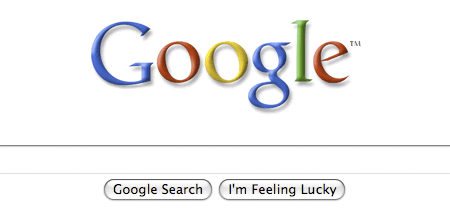
Sometime this morning, a web page that I visit occasionally changed its appearance from this:

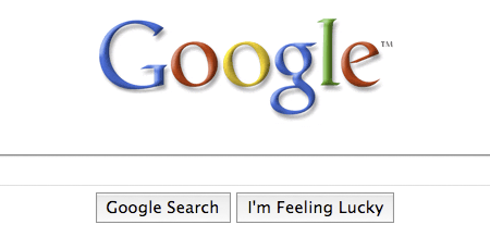
to this:

The images are grabbed from Firefox on OS X; same effect in Safari. Some CSS forensics reveals what’s gone wrong here: Google has added a “height:28px” property to the style for the two buttons, and boosted their type size from 13 pixels to 16. (Type inside the search box is also given the giant billboard treatment.) Apparently the height property prevents the browser from using those cute jelly-bean widgets for the buttons.
Can we strike a bargain, Google? I’ll let you take over the world and track my every movement; I’ll sign over all my copyrights and promise never to block your advertising, if you’ll just give me my widgets back. Go ahead and Be Evil; just Don’t Be Ugly.
Or am I going to have to override you in userContent.css?
Update: Marissa Mayer, Google’s Vice President for Search Products & User Experience, explains:
For us, search has always been our focus. And, starting today, you’ll notice on our homepage and on our search results pages, our search box is growing in size. Although this is a very simple idea and an even simpler change, we’re excited about it — because it symbolizes our focus on search and because it makes our clean, minimalist homepage even easier and more fun to use. The new, larger Google search box features larger text when you type so you can see your query more clearly. It also uses a larger text size for the suggestions below the search box, making it easier to select one of the possible refinements.
For Firefox users who find the “supersized” page a nonimprovement, I offer the following quick hack:
@-moz-document domain(google.com) {
  .lsb, .gac_sb {
	font-size:13px ! important;
	height:inherit ! important;
	}

  .lst, .gac_m {
	font-size:14px ! important;
	}

}
Add these lines to your userContent.css file (see the Customizing Mozilla site for further instructions). This seems to fix the widget problem and the input-field text size, but all the drop-down gadgetry is still a mess and maybe the dropdown menu of suggestions. This will break if Google’s next whim is to change the class names “lsb,” “lst,” etc. If anyone has a cleaner solution, please pass it on.

Wow, is that ugly (also on Safari). I never go to the Google home page, though, so…
I noticed this very thing, and it also upsets me. Fie, fie on you, Google!
Apple users hate accessibility? Obviously.
You should consider installing the Stylish extension for Firefox. I am opinionated about UI and I the stylesheets on half the sites I visit (especially Google) make my eyes hurt. Stylish is basically a management interface for userContent.css.. you can make your own edits or install any of hundreds of site-specific customizations available at userstyles.org.
Thanks for the pointer to Stylish. Very handy.
“it makes our clean, minimalist homepage even easier and more fun to use.”
I just tried a search with the new page and using it was exactly as much fun as it’s ever been.
Your complaints make this sound like its Google’s fault. I don’t think it is. They tried to improve their page by increasing the size of the most important elements, a perfectly reasonable thing to do. Unless Google added some invalid CSS, it’s the software on the Mac that failed.
A curious observation. I have a 5-year-old iBook, which I still occasionally fire up and use. I did so today and saw something odd when I went to Google: Your lost, lamented jelly-bean widgets!
If it’s of any value in pursuing the mystery, I was using Safari 1.3.2 on OS 10.3.9 (Panther? Puma? Alley Cat?).
Google is maintaining another homepage that is exactly the same as google.com, so far as I can tell, except it has the plain logo and the old-style buttons. http://www.freeholidaywifi.com/search/
I’ve noticed some other Google oddities lately. For the last month or more, it occasionally happens that when I go to Google, all that shows up at first is the logo, search box, and widgets; the other stuff across the top of the page and below the widgets does a slow fade in. And recently they sometimes don’t fade in until I move the cursor across the screen. About a week ago, I also saw a curious message just below the widgets, which faded away as the usual stuff faded in. The message said “This line intentionally left blank.” (I may have the wording slightly wrong, but it was something close to that — the sort of thing you see on official multi-page documents when they leave a page otherwise empty.) Finally, just this morning, Google opened with just the logo, the search box, and a line below the box saying something like “Press Enter to search” — i.e., no widgets at all! (I’m sorry, I’m again not certain of the exact wording. When I refreshed the screen I got the usual widgets.)
I doubt there’s any real mystery in any of this. But I thought some bit-player viewers might find these sightings amusing. I’m reminded of Yogi Berra’s famous remark, you can observe a lot by watching.
@Barry Cipra Nov 20: I’ve never seen anything like that. When you say “fade in,” do you mean that in the cinematic sense–the objects gradually emerge from the background? Or is it just that they appear only after a delay? The latter could be the result of a slow server or a congested link somewhere on the network, but the former would have to be deliberately implemented.
In appearance, the main Google page is famously spare and simple, but when you look at the source code, there’s quite a pile of stuff, including a few dozen scripts. The behavior of some of those scripts appears to depend on the date and time of day, on which browser you’re using, on whether or not you’ve installed widgets like the Google toolbar and possibly on where you are.
I bet somebody has worked out just what all those scripts are up to, but at this point they’re mysterioso to me. I do note a function named ‘google.fx.easeInAndOut’ which could well be doing fade ins and fade outs.
Hey Guys and Girls! Your problems are unimportant and booooooooooooring!