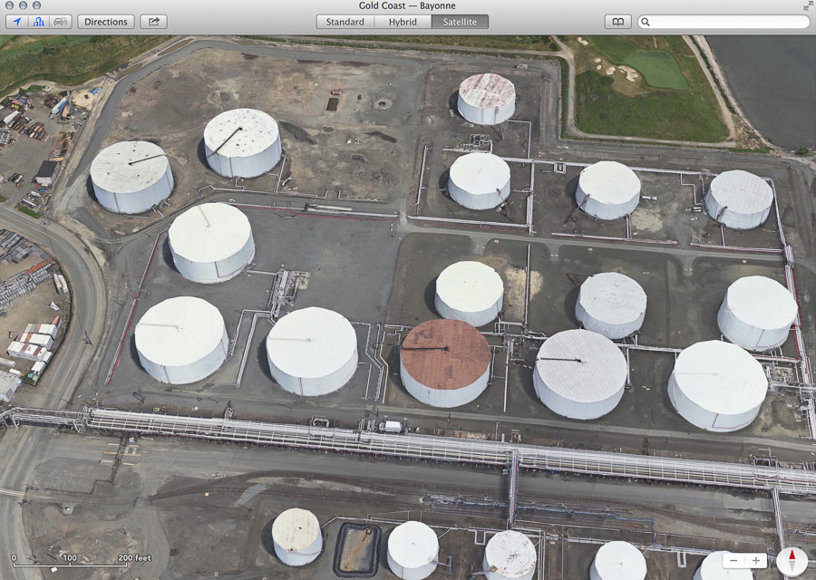
We must always be on the lookout for glitches in the Matrix—anomalies that give us a fleeting glimpse into the algorithms and data structures of the computer simulation that we call Reality. But there’s also the Maptrix, the alternative reality supplied by online mapping services. I spend a fair amount of time exploring that digital terrain, and lately I’ve noticed a few glitches. Exhibit 1 is a tank farm in Bayonne, New Jersey, near where Kill Van Kull enters New York Bay:

I’ve seen a lot of oil tanks over the years, but never before have I encountered such ragged, faceted approximations to cylindrical form. These lumpy, polyhedral tanks suggest that in this little corner of industrial New Jersey, π has a value somewhat smaller than 3.14.
But the π peculiarity is ephemeral. The image above was captured from a laptop screen at the instant the landscape was first rendered in the Apple Maps program. Moments later most of the defects were magically healed, and the illusion of solid, circular reality reasserted itself:
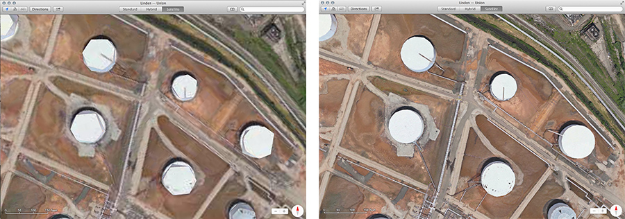
Here’s another example, from a tank farm in Carteret, New Jersey, just across the Arthur Kill from Staten Island. This time we’re looking down on the tanks from directly overhead. The image at left was captured as soon as the scene appeared on screen; at right is the rounded-out version that emerged a few second later. The software, again, is Apple Maps.
It’s not just Apple’s version of reality that has such anomalies. Here’s a sample from another source:
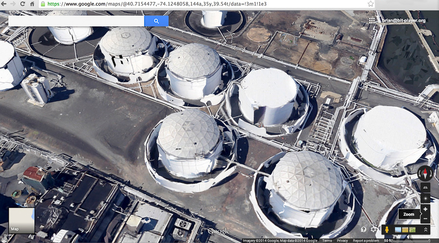
The mangled petroleum tanks in this image are in Kearny, New Jersey, a few miles north of Bayonne along the Passaic River. In this case the picture was taken by Google’s eye in the sky, not by Apple’s. The distortion is different, but no less disturbing. Now it’s not just the geometry of the cylinders that has gone goofy but also the topology. Some of those tanks won’t hold oil (or any other fluid); they have holes in them. And notice how the spill-containment walls surrounding the tanks also look moth-eaten.
Finally, returning to Apple Maps, and scrolling just half a mile northwest from the Carteret tanks, we cross the Rahway River into Linden, New Jersey, where we come upon this alarming scene:
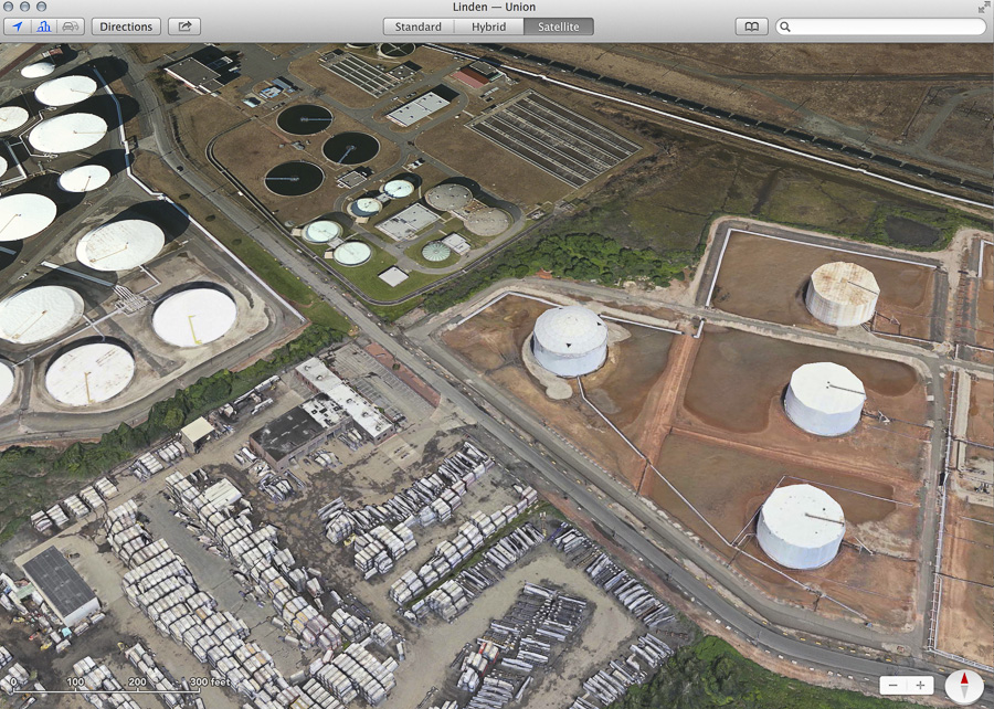
Toward the right side of the image we see more cylindrical tanks, some with faint, remnant traces of polyhedral approximation. But when your glance wanders to the upper left, you find that the world suddenly loses all depth. The tank farm over there, and the water treatment plant at the top of the frame, are merely painted on the landscape—trompe l’oeil structures that don’t trompe anyone.
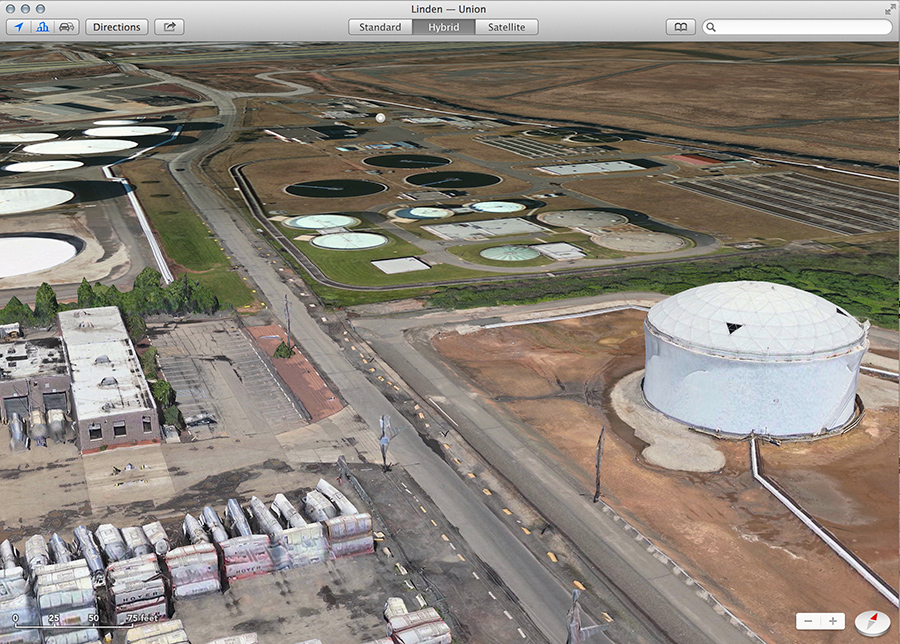
This image offers another view of the same Linden landscape, looking obliquely to the west or northwest. The road that runs through the scene from foreground to background, crossing the New Jersey Turnpike at the very top of the frame, is Tremley Point Road. Suppose you were driving west along that road. Just beyond the row of lumpy trees that extends from the left edge of the image toward the road, you would cross a mysterious boundary, leaving behind the pop-up 3D world and entering flatland. What would happen to you there? Would you be pancaked like those tanks, reduced to a two-dimensional object painted on the pavement, with a painted shadow to accompany you?
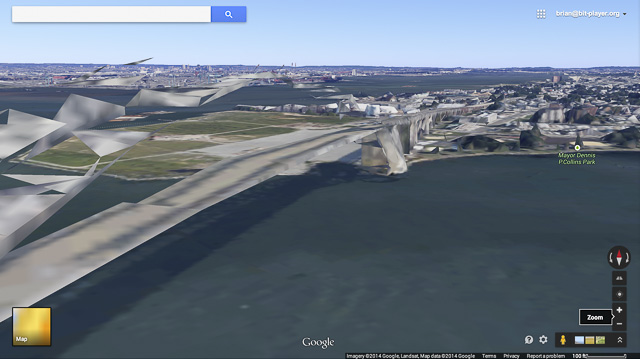
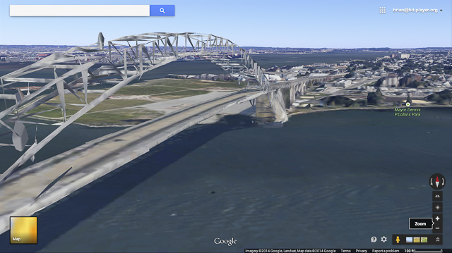
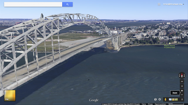
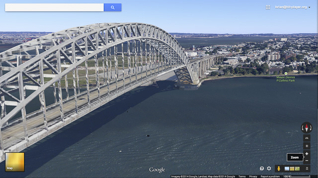
Leaving behind tank farms but still poking around in the same general neighborhood of northern New Jersey, I was able to record four stages in the “construction” of the Bayonne Bridge, which crosses Kill Van Kull between Bayonne and Staten Island. These are images from Google Maps, the first three captured at intervals of about a second, the last after a delay of a few seconds more:
In calling attention to these oddities in online map imagery, my aim is not to mock or belittle. To me, these maps are one of the marvels of the age. A century ago, it was a huge novelty and liberation to soar above the earth’s surface for the first time, and see the landscape spread out below as if it were a map. It’s no less remarkable that we have now transformed the experience of looking at a map into something like flying an airplane.
The first “satellite view” maps were just that: montages of images made from hundreds of miles above the earth’s surface, looking straight down. They portrayed the territory as an array of pixels, assigning an RGB value to every (lat, lon) pair on the surface of a sphere.
The next step was to add a digital elevation model, giving each point on the surface a z value as well as a color. This scheme allows us to gaze obliquely across the landscape and see a realistic rendering of mountains, river valleys, and other natural landforms. It works well as long as you don’t try to get too close: the model is well-suited to forests, but not to trees. And it doesn’t work well at all for manmade artifacts.
In representing engineered structures, one weakness of elevation maps is that any reasonable scheme for interpolating between sample points will tend to round over corners and sharp edges, so that buildings become lumpish mounds. Symmetries are also lost: the sampling fails to preserve the rectilinearity or circularity of the various objects we strew around the inhabited patches of the world. And the biggest problem with an elevation map is that it’s a mapping in the mathematical as well as the cartographic sense. The surface of the planet is defined by a smooth, single-valued function, assigning a unique elevation z to every (lat, lon) point on the sphere. Any line radiating from the center of the earth must cross that surface in exactly one point. As a result, there can be no vertical cliffs and no overhangs. Also no bridges. The surface defined by the elevation model can go under a bridge or over it, but not both.
The latest mapping programs are apparently addressing these issues by building explicit three-dimensional models of selected landscape features. I see evidence of several different techniques. The Bayonne Bridge model that assembles itself in the four frames above is clearly based on a triangulated mesh: all the surfaces making up of the envelope of the structure are decomposed into elementary triangles. The cylindrical tanks in the Apple Maps images seem to grow their circular form through an Archimedean process, in which a circle is defined as the limit of an n-gon as n goes to infinity. Elsewhere, I think we may be seeing some kind of spline curves or patches.
Having constructed the model and embedded it in the landscape, the next trick is to project the pixel pattern from a photograph onto the model surface, as a texture. This process too has a certain comical potential:
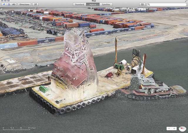
What we’re seeing here is apparently a tugboat nudging a barge equipped with a crane. The matching of surface pattern to three-dimensional form has gone badly awry, which gives the whole scene a toylike quality. I find it charming. In future years, when the Maptrix has become a hyperrealistic, real-time virtual world with day and night, weather and seasons—maybe with inhabitants who wave back at you—we’ll wax nostalgic over such quaint foibles.