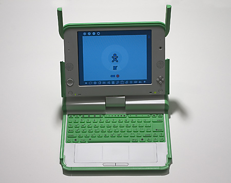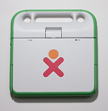
In this season of giving and getting, you’ve got to admire the marketing savvy of the One Laptop Per Child project. They named their introductory sales campaign “Give One, Get One.” The computers cost $200 apiece. For a donation of $400, you send one machine to a child somewhere far away (Afghanistan, Cambodia, Haiti, Mongolia and Rwanda are mentioned as possible destinations), and you get another for your own gadget-happy life.
The question that everyone seems to ask about OLPC is whether laptop computers are really what the children of Afghanistan, Cambodia, etc., need most urgently. Well, reason not the need! What I find most appealing (and most subversive) about the whole idea is that it leapfrogs over matters of brute survival. If children lack adequate food and shelter, is that grounds for denying them intellectual diversion and enrichment as well?
In connection with an earlier attempt to bring computers to children, Alan Kay wrote (pdf):
[A computer] can be like a piano: (a product of technology, yes), but one which can be a tool, a toy, a medium of expression, a source of unending pleasure and delight… and, as with most gadgets in unenlightened hands, a terrible drudge!!
So let’s not deny the world’s children either delight or drudgery. Once OLPC achieves its goal, I say we start a One Piano Per Village program.
But enough about giving. What about getting? What’s the new computer like?
They call it the XO. I’ve had mine for only a few days, and I’ve hardly begun to play with it, so all I can report here are first impressions. Basically, I think it’s brilliant, but I also wish the system software had been built on a somewhat different model.

The hardware is undeniably cute. No one will mistake it for a Sony Vaio or a Dell Inspiron. I wouldn’t be surprised if the XO becomes something of a fashion statement, the laptop to be seen with at Starbucks, or for liveblogging NANOG or SODA. I’ve heard complaints that the keyboard is too small for adult fingers, but typing on these little green keys can hardly be worse than thumbing a Treo or Blackberry. (Disclaimer: I type with two fingers, so I’m not much of a judge of keyboard ergonomics.)
If the styling has a whiff of Fisher-Price about it, there’s also some thoughtful ingenuity at work here, and designers of machines for grownups might learn something from it. The screen is gorgeous—crisp and bright in its standard color mode, with a secondary black-and-white mode that’s legible in full sunlight. The screen also swivels 360 degrees and can be laid face-up over the keyboard, so that the XO can be used as a tablet for reading e-books and the like.
There’s no disk drive; the machine has 256 megabytes of RAM and a gigabyte of flash memory for nonvolatile storage. Three USB ports and a slot for SD memory cards offer opportunities for supplemental storage. One consequence of the no-moving-parts architecture is that the computer is absolutely silent in use—no clicking or whirring from a disk drive, no fan noise.
The wifi transceiver is amazing. I never knew I had so many well-connected neighbors—people named linksys and netgear, for example. No other computer I’ve had in the house has ever detected any of these networks. Why is the wireless card in my other laptop (which cost an order of magnitude more, by the way) so wimpy in comparison? The XO can also form ad hoc “mesh” networks with other XOs, but evidently I’m the first XOwner in my neighborhood, so I haven’t been able to experiment with that capability.
When it comes to software, I can’t be quite so wholeheartedly enthusiastic. There are some bright spots. A set of four programs called TamTam provide first-rate tools for creating and playing music; the calculator is very elegantly done; there’s a cool built-in oscilloscope, and a “Write” program that seems just right for the intended audience. Also a Python interpreter named Pippi. And the software called Etoys is a highly ambitious system, willed into existence by Alan Kay and a bunch of his friends, which looks like a plaything but has a complete Smalltalk development environment inside.
Some other spots are not so bright. For one thing, the software is just not finished yet. Some basic capabilities (printing, a sleep mode) are not yet implemented, and there are various buttons that don’t yet have functions. The web browser is primitive (no tabs, very limited facilities for bookmarks). There’s an RSS reader that doesn’t seem to work. An update planned for early next year is supposed to fix some of these problems.
Anyway, software is always behind schedule; I can wait. As a matter of fact, I’d be happier if they had taken longer and built the software in a different way.
I have opined elsewhere that computing is in a horrible rut, unable to escape the grip of precedents established in the distant past. A case in point is the Unix operating system, which is now almost 40 years old but is still with us in the form of Linux and OS X. The longevity of Unix argues that it must be quite a solid product, and I won’t argue with that. On the other hand, it’s a sad commentary on progress in computer science if no one has had a better idea since 1969.
OLPC offered a rare opportunity. It was a chance to start fresh, to throw away the past, to build a computer that has no legacy code to run; there was no need to worry about backward compatibility. But that’s not the way the project evolved. The XO software turns out to be a sugar-coated version of the Linux operating system. I can understand the reasons for choosing this path. Building an entirely new software system from scratch would have slowed the project down, and it would have raised the risk of catastrophic failure. Adopting Linux provided a major head start and allowed the project to draw on a global community of experienced programmers. But the choice also had an opportunity cost. A multiuser operating system designed in the era of timesharing and dumb terminals, and tuned to the needs of professional programmers, is not an ideal match for a laptop built for kids.
When I say the XO software is sugar-coated Linux, that’s just what I mean: The user-interface layer is named Sugar. It’s an interesting program, which tries to escape the ubiquitous desktop metaphor by emphasizing community and interaction. Instead of launching a program or application, the user starts an “activity.” Many activities can be shared with other XOwners; for example, two XOs can be set up to use acoustic signals to measure the distance between them. One intriguing “feature” of Sugar is the absence of a conventional file system. You don’t create documents and then decide where to put them and what to name them. Pointers to all activities are saved automatically in reverse chronological order in a linear list called the journal.
The sugar layer is nifty, but it’s also perilously thin. Underneath lies the Unix command line, and at present there are many things that can be done only by reciting the proper command-line incantations (many of them preceded by a magic ‘sudo’). Will the kids master that kind of wizardry?
Maybe I shouldn’t worry; I’m sure they’re better equipped and quicker learners than I am. In any case, it’s their judgment that counts, not mine.