A few weeks ago I committed an act of deception. I needed a graph showing a few sets of data points, with curves fitted to them. This was strictly for show; neither the points nor the curves would mean anything; it just had to look good. So, out of laziness, I did it backwards: I drew a few arbitrary curves, chose some points on the curves, and then perturbed those points by small random displacements. The result is Figure 2 in Home Baked Graphics.
Apparently I have gotten away with this fakery, since no one has complained. But it nags at my conscience. The curves shown are not fitted to the given data points, but the other way around. And barring an extraordinary coincidence, we can’t expect the curves to give the best possible trend through the points.
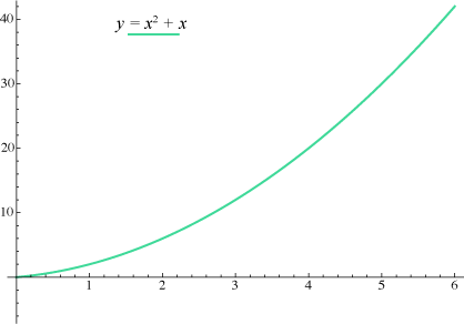
I began to wonder: What if you iterate this process? In other words, you start out by generating a curve, say a simple quadratic:
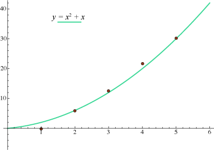
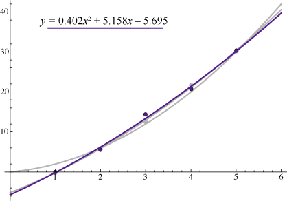
You select a few points on the curve, in this case the five points with x coordinates equal to {1, 2, 3, 4, 5}. You perturb the y coordinates of these points by choosing random variates from a normal distribution with unit standard deviation:
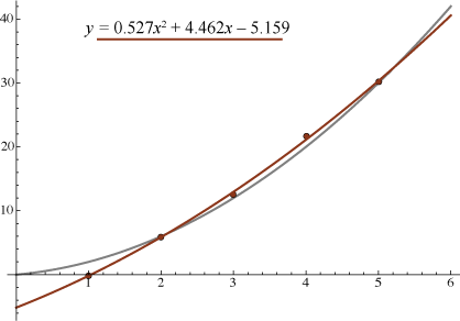
Now you do a least-squares fit to the five selected points, generating a new quadratic:
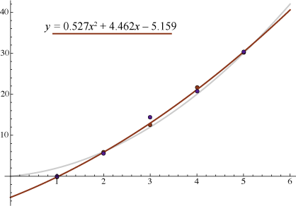
At this stage you can start over, selecting five points on the new curve and randomly displacing them:
And a least-squares fit to those five purple points yields yet another quadratic curve:
So what happens if we continue in this way, repeatedly jiggling a few points on a curve and then fitting a new curve to the jiggled points? There’s a seeming hint of convergence in the three curves we’ve seen so far. They look like they might be approaching some fixed trajectory. Could that possibly be true?
I’ll post an update in a few days to say what more I’ve been able to learn about this question. If you just can’t wait, click here for a sneak peek.
The promised update (2010-04-02): You can’t fool anybody in this crowd, not even circa April 1. Of course there is no convergence to a limiting curve.
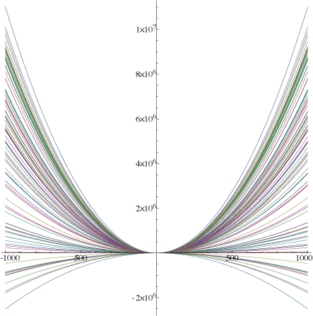
The butterfly above shows 100 quadratic curves, selected from 100,000 iterations of the least-squares fitting process, with that process applied at points whose x values are in the set {–5, –4, –3, –2, –1, 0, 1, 2, 3, 4, 5}. Clearly enough, the coefficients of the quadratic curves are wandering widely; in particular note that the x2 term can be either positive or negative, yielding curves that are concave upward or downward.
On the other hand, these are not just any old quadratic curves. They all have their apex (the point where f′(x) = 0) fairly close to the origin. Here’s a closer view:
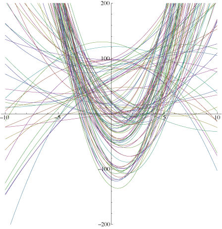
(When Ros glanced at this graph on the screen, her comment was: “Bad hair day.”) And here’s a tracing of the wandering of the apex (taken from a different, longer, run of the program):
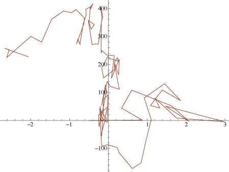
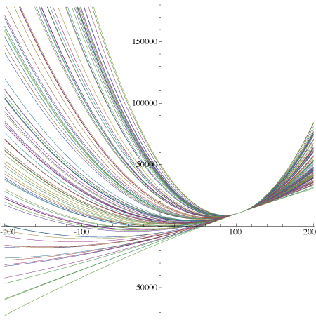
The path has the look of a classic random walk, but note that it’s confined to a narrow range of x values. What attractive force holds the apex in this region? It’s the decision to fit the curves to points in the interval –5 ≤ x ≤ 5. Here’s what happens if we instead fit to points in the range 100 ≤ x ≤ 110:
And note that without the symmetry-breaking x1 term, the curve would always be a parabola with its apex on the y axis; only the curve’s shape (or scale) and the height of the y intercept could vary.
This whole process of repeatedly fitting curves to data and then deriving new data from the fitted curves is weird and useless enough that it seems unlikely to appear anywhere in the universe outside my own idle mind. And yet…. Think of the Dow-Jones index, which is calculated as a weighted average of the prices of 30 selected stocks. They are not always the same 30 stocks. Indeed, recent years have seen quite a lot of turnover in the components of the Dow: AIG was replaced by Kraft Foods; General Motors was dropped in favor of Cisco Systems; Honeywell lost out to Chevron. Would it be too utterly cynical of me to suggest that what’s going on here resembles a process of fitting a curve to randomly chosen points, then choosing more points that lie near the curve?