The Thanksgiving holiday is upon us, but Anthony Fauci and the CDC and 79 percent of epidemiologists are urging us to forgo the big family gathering this year. I’m sure that’s sound advice, but I haven’t seen much quantitative analysis to back it up. How serious is the risk when we go over the river and through the woods to grandmother’s house? What are the public health consequences if the whole country sticks to the familiar ritual of too much food and football?
The tableau presented below is a product of my amateur efforts to address these questions. It’s a simple exercise in the mechanics of probability. I take a sample of the U.S. population, roughly 10,000 people, and randomly assign them to clusters of size \(n\), where \(n\) can range from 1 to 32. (In any single run of the model, \(n\) is fixed; all the groups are the same size.) Each cluster represents a Thanksgiving gathering. If a cluster includes someone infected with SARS-CoV-2, the disease may spread to the uninfected and susceptible members of the same group.
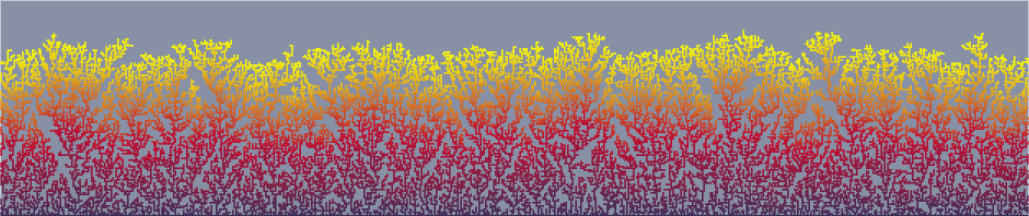
With the model’s default settings, \(n = 12\). The population sample consists of 9,900 people, represented as tiny colored dots arranged in 825 clusters of 12 dots each. Most of the dots are green, indicating susceptible individuals. Red dots are the infectious spreaders. Purple dots represent the unfortunates who are newly infected as a result of mingling with spreaders in these holiday get-togethers. I count the purple dots and estimate the rate of new infections per 100,000 population.
You can explore the model on your own. Twiddle with the sliders in the control panel, then press the “Go” button to generate a new sample population and a new cycle of infections. For example, by moving the group-size slider you can get a thousand clusters of 10 persons each, or 400 clusters of 25 each.
Before going any further with this discussion, I should make clear that the simulation is not offered as a prediction of how Covid-19 will spread during tomorrow’s Thanksgiving festivities. This is not a guide to personal risk assessment. If you play around with the controls, you’ll soon discover you can make the model say anything you wish. Depending on the settings you choose, the result can lie anywhere along the entire spectrum of possible outcomes, from nobody-gets-sick to everybody’s-got-it. There are settings that lead to impossible states, such as infection rates beyond 100 percent. Even so, I’m not totally convinced that the model is useless. It might point to combinations of parameters that would limit the damage.
The crucial input that drives the model is the daily tally of Covid cases for the entire country, expressed as a rate of new infections per 100,000 population. The official version of this statistic is published by the CDC; a few other organizations, including Johns Hopkins and the New York Times, maintain their own daily counts. The CDC report for November 24 cites a seven-day rolling average of 52.3 new cases per 100,000 people. For the model I set the default rate at 50, but the slider marked “daily new cases per 100,000 population” will accommodate any value between 0 and 500.
From the daily case rate we can estimate the prevalence of the disease: the total number of active cases at a given moment. In the model, the prevalence is simply 14 times the daily case rate. In effect, I am assuming (or pretending) that the daily rate is unchanging and that everyone’s illness lasts 14 days from the moment of infection to full recovery. Neither of these assumptions is true. In a model of ongoing disease propagation, where today’s events determine what happens next week, the steady-state approximation would be unacceptable. But this model produces only a snapshot on one particular day of the year, and so dynamics are not very important.
What we do need to consider in more detail is the sequence of stages in a case of Covid-19. The archetypal model in epidemiology has three stages: susceptible (S), infected (I), and recovered (R);
During the symptomatic phase, patients know they are sick and should be in quarantine; hence the letter Q. For the purposes of the model I assume that everyone in category Q will decline the invitation to Thanksgiving dinner.
A parameter of some importance is the duration of the presymptomatic infectious stage, since the red-dot people in that category are the only ones actually spreading the disease in my model of Thanksgiving gatherings. I made a foray into the medical literature to pin down this number, but what I learned is that after a year of intense scrutiny there’s still a lot we don’t know about Covid-19. The typical period from infection to the onset of symptoms (encompassing both the U and I stages of my model) is four or five days, but apparently it can range from less than two days to three weeks. The graph below is based on a paper by Conor McAloon and colleagues that aggregates results of eight studies carried out early in the pandemic (when it’s easier to determine the date of infection, since cases are rare and geographically isolated).
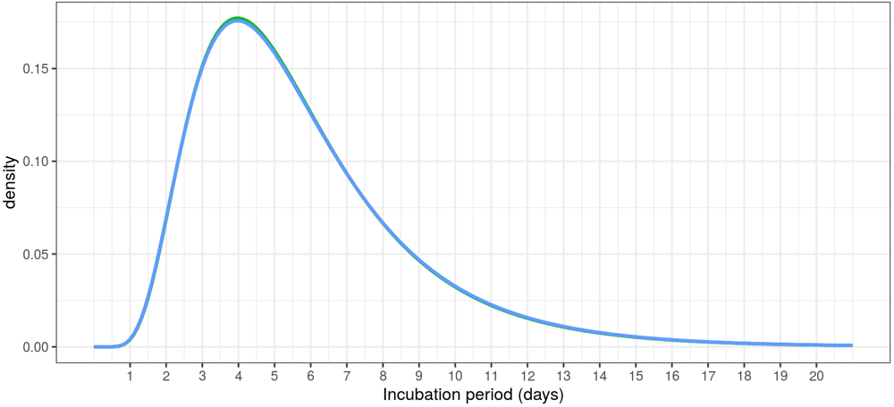
Incubation period of Covid-19, modeled as a lognormal distribution. The data come from a meta-analysis published by Conor McAloon and colleagues. The graph itself was generated by an R/Shiny app they have made available.
Ultimately I decided, for the sake of simplicity (or lazy convenience) to collapse this distribution to its median, which is about five days. Then there’s the question of when within this period an infected person becomes dangerous to those nearby. Various sources [Harvard, MIT, Fox News] suggest that infected individuals begin spreading the virus two or three days before they show symptoms, and that the moment of maximum infectiousness comes shortly before symptom onset. I chose to interpret “two or three days” as 2.5 days.
What all this boils down to is the following relation: If the national new-case rate is 50 per 100,000, then among Thanksgiving celebrants in the model, 125 per 100,000 are Covid spreaders. That’s 0.125 percent. Turn to the person on your left. Turn to your right. Are you feeling lucky?
The model’s default settings assume a new-case rate of \(50\) per \(100,000\), a Thanksgiving group size of \(12\), and a \(0.25\) probability of transmitting the virus from an infectious person to a susceptible person. Let’s do some back-of-the-envelope calculating. As noted above, the \(50/100{,}000\) new case rate translates into \(125/100{,}000\) infectious individuals. Among the \(\approx 10,000\) members of the model population, we shoud expect to see \(12\) or 1\(\)3 red-dot Is. Because the number of Is is much smaller than the number of groups \((825)\), it’s unlikely that more than one red dot will turn up in any single group of \(12\). In each group with a single spreader, we can expect the virus to jump to \(0.25 \times 11 = 2.75\) of the spreader’s companions. This assumes that all the companions are green-dot susceptibles, which isn’t quite true. There are also yellow-dot incubating and blue-dot recovered people, as well as the red-x empty chairs of those in quarantine. But these are small corrections. The envelope estimate gives \(344/100,000\) new infections on Thanksgiving day; the computer model yields 325 per 100,000, when averaged over many runs.
But the average doesn’t tell the whole story. The variance of these outcomes is quite high, as you’ll see if you press the “Go” button repeatedly. Counting the number of new infections in each of a million runs of the model, the distribution looks like this:

The peak of the curve is at 30 new infections per model run, which corresponds to about 300 cases for 100,000 population, but you shouldn’t be surprised to see a result of 150 or 500.
If the effect of Thanksgiving gatherings in the real world matches the results of this model, we’re in serious trouble. A rate of 300 cases per 100,000 people corresponds to just under a million new cases in the U.S. population. All of those infections would arise on a single day (although few of them would be detected until about a week later). That’s an outburst of contagion more than five times bigger than the worst daily toll recorded so far.
But there are plenty of reasons to be skeptical of this result.
Even in a “normal” year, not everyone in America sits down at a table for 12 to exchange gossip and germs, and surely many more will be sitting out this year’s events. According to a survey attributed
Another potential mitigating factor is that people invited to your holiday celebration are probably not selected at random from the whole population, as they are in the model. Guests tend to come in groups, often family units. If your aunt and uncle and their three kids all live together, they probably get sick together, too. Thus a gathering of 12 individuals might better be treated as an assembly of three or four “pods.” One way to introduce this idea into the computer model is to enforce nonzero correlations between the people selected for each group. If one attendee is infectious, that raises the probability that others will also be infectious, and vice versa. As the correlation coefficient increases, groups are increasingly homogeneous. If lots of spreaders are crowded in one group, they can’t infect the vulnerable people in other groups. In the model, a correlation coefficient of 0.5 reduces the average number of new cases from 32.5 to 23.5. (Complete or perfect correlation eliminates contagion altogether, but this is highly unrealistic.)
Geography should also be considered. The national average case rate of 50 per 100,000 conceals huge local and regional variations. In Hawaii the rate is about 5 cases, so if you and all your guests are Hawaiians, you’ll have to be quite unlucky to pick up a Covid case at the Thanksgiving luau. At the other end of the scale, there are counties in the Great Plains states that have approached 500 cases per 100,000 in recent weeks. A meal with a dozen attendees in one of those hotspots looks fairly calamitous: The model shows 3,000 new cases for 100,000, or 3 percent of the population.
If you are determined to have a big family meal tomorrow and you want to minimize the risks, there are two obvious strategies. You can reduce the chance that your gathering includes someone infectious, or you can reduce the likelihood that any infectious person who happens to be present will transmit the virus to others. Most of the recommendations I’ve read in the newspaper and on health-care websites focus on the latter approach. They urge us to wear masks, the keep everyone at arms’ length, to wash our hands, to open all the windows (or better yet to hold the whole affair outdoors). Making it a briefer event should also help.
In the model, any such measures are implemented by nudging the slider for transmission probability toward smaller values. The effect is essentially linear over a broad range of group sizes. Reducing the transmission probability by half reduces the number of new infections proportionally.

The probability that a spreader will produce at least one new infection in a group is a nearly linear function of group size except for the smallest and largest groups.
The trouble is, I have no firm idea of what the actual transmission probability might be, or how effective those practices would be in reducing it. A recent study by a group at Vanderbilt University found a transmission rate within households of greater than 50 percent. I chose 25 percent as the default value in the model on the grounds that spending a single day together should be less risky than living permanently under the same roof. But the range of plausible values remains quite wide. Perhaps studies done in the aftermath of this Thanksgiving will yield better data.
As for reducing the chance of having an infectious guest, one approach is simply to reduce the size of the group. In this case the effect is better than linear, but only slightly so. Splitting that 12-person meal into two separate 6-seat gatherings cuts the infection rate by a little more than half, from 32.5 to 15.2. And, predictably, larger groups have worse outcomes. Pack in 24 people per group and you can expect 70 infections. Neither of these strategies seems likely to cut the infection rate by a factor of 10 or more. Unless, of course, everyone eats alone. Set the group-size slider to 1, and no one gets sick.
Another factor to keep in mind is that this model counts only infections passed from person to person during a holiday get-together. Leaving all those cases aside, the country has quite a fierce rate of “background” transmission happening on days with no special events. If the Thanksgiving cases are to be added to the background cases, we’re even worse off than the model would suggest. But the effect could be just the opposite. A family holiday is an occasion when most people skip some ordinary activities that can also be risky. Most of us have the day off from work. We are less likely to go out to a bar or a restaurant. It’s even possible that the holiday will actually suppress the overall case rate. But don’t bet your life on it.
There’s one more wild card to be taken into account. A tacit assumption in the structure of the model is that the reported Covid case count accurately reflects the prevalence of the disease in the population. This is surely not quite true. There are persistent reports of asymptomatic cases—people who are infected and infectious, but who never feel unwell. Those cases are unlikely to be recorded. Others may be ill and suspect the cause is Covid but avoid getting medical care for one reason or another. (For example, they may fear losing their job.) All in all, it seems likely the CDC is under-reporting the number of infections.
Early in the course of the epidemic, a group at Georgia Tech led by Aroon Chande built a risk-estimating web tool based on case rates for individual U.S. counties. They included an adjustment for “ascertainment bias” to compensate for cases omitted from official public health estimates. Their model multiplies the reported case counts by a factor of either 5 or 10. This adjustment may well have been appropriate last spring, when Covid testing was hard to come by even for those with reasonable access to medical services. It seems harder to justify such a large multiplier now, but the model, which is still being maintained, continues to insert a fivefold or tenfold adjustment. Out of curiosity, I have included a slider that can be set to make a similar adjustment.
Is it possible that we are still counting only a tenth of all the cases? If so, the cumulative total of infections since the virus first came ashore in the U.S. is 10 times higher than official estimates. Instead of 12.5 million total cases, we’ve experienced 125 million; more than a third of the population has already been through the ordeal and (mostly) come out the other side. We’ll know the answer soon. At the present infection rate (multiplied by 10), we will have burned through another third of the population in just a few weeks, and infection rates should fall dramatically through herd immunity. (I’m not betting my life on this one either.)
One other element of the Covid story that ought to be in the model is testing, which provides another tool for improving the chances that we socialize only with safe companions. If tests were completely reliable, their effect would merely be to move some fraction of the dangerous red-dot category into the less-dangerous red-x quarantined camp. But false-positive and false-negative testing results complicate the situation. (If the actual infection rate is low, false positives may outnumber true positives.)
I offer no conclusions or advice as a result of my little adventure in computational epidemiology. You should not make life-or-death decisions based on the writings of some doofus at a website called bit-player. (Nor based on a tweet from @realDonaldTrump.)
I do have some stray thoughts about the nature of holidays in Covid times. In the U.S. most of our holidays, both religious and secular, are intensely social, convivial occasions. Thanksgiving is a feast, New Year’s Eve is a party, Mardi Gras is a parade, St. Patrick’s Day is a pub crawl, July Fourth is a picnic. I’m not asking to abolish these traditions, some of which I enjoy myself. But they are not helping matters in the midst of a raging epidemic. Every one of these occasions can be expected to produce a spike in that curve we’re supposed to be flattening.
I wish we could find a spot on the calendar for a new kind of holiday—a day or a weekend for silent and solitary contemplative respite. Close the door, or go off by yourself. Put a dent in the curve.
“pubic health consequences”, what a nasty thought!
I am blushing bright red, but thank you.
Hi Brian - great post! I made an almost identical model back at the start of lockdown in the spring. Although it wasn’t as fancy as interactive as yours.
https://mikedeskevich.github.io/covidsim/
I also put together a white paper that’s more related to my work trying to see if I could help out my state government combine modelling and policy decisions. I couldn’t get it to go anywhere, but if you know anyone who would find it useful, feel free to share it!
https://github.com/mikedeskevich/covid-decision-support
Love reading your blog posts! I just never had any relevant comments to make until now.