Whence the Demographic Transition
by Brian Hayes
Published 15 January 2026
As noted here recently, the human population is at the beginning of the end of the demographic transition. Growth rates are dropping pretty much everywhere in the world. I’ve long known this event was coming, and yet I’m still astonished to see it happening in my lifetime. For as long as I can remember, population has been growing fast enough to be cause for alarm. Now everyone is worried about the human species dwindling away. The new slogan is “Breed, baby, breed!”
Given the importance of the transition, I find it curious that the origin of the concept seems rather murky. You can browse a great deal of demographic literature and get the impression that this idea has always been with us, that it’s something everyone knows and there’s no need to cite a source or discuss the history. For example, my own introduction to the concept came through a 1974 single-topic issue of Scientific American; the demographic transition was the central theme of the entire issue, but its discovery was never mentioned. (To some extent I have myself to blame for that omission. I was the editor of the article that should have outlined the history of the concept. I didn’t think to ask the author.)
I don’t mean to suggest that the origin of the transition remains an unsolved mystery. Wikipedia will point you in the right direction to find the answer, and a scholarly article by Simon Szreter traces the history in detail. But the names of the originators are not household words.
A forerunner
If you plot population as a function of time, the demographic transition generates a curve with a sigmoid shape, a lazy S. In the distant past the trajectory was nearly flat, as our ancestors’ numbers increased very slowly; then there’s an interval of rapid growth, which we’re now nearing the end of; finally the curve flattens out again at a near-zero growth rate but at a much higher level of population.
A curve with this general form was constructed in the 1830s by Pierre François Verhulst, a Belgian mathematician. Verhulst was a student of Adolphe Quetelet, who pioneered in applying methods of statistics to the social sciences. Verhulst was searching for a mathematical description of population patterns in Belgium. The solution he found is a modified exponential function, which he named the logistic curve.
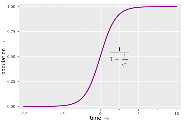
I’m fond of the logistic curve. I admire its elegant geometry and smooth transitions from horizontal to vertical and back again. The point at \(x=0\), \(y=1/2\) is a center of twofold rotational symmetry and is also an inflection point, where the curvature changes from concave-upward to concave-downward.
I am also fond of the mathematical function that generates this sleek form. In Figure 1 it is given as a nest of reciprocals built atop the exponention function \(e^t\). An equivalent form is easier to parse:
\[\frac{e^t}{1 + {e^t}} .\]The value of the expression goes to 0 as \(t\) becomes more negative, and it approaches 1 when \(t\) is large and positive. In between, at \(t = 0\), the value is \(1/2\).
Verhulst introduced the logistic curve to describe the dynamics of the human population, and the curve’s shape approximates what one would expect in what we now call the demographic transition. In the middle is a brief episode of rapid population growth, flanked by near-zero growth both before and after. But the resemblance is only superficial. The underlying mechanism creating this pattern is quite different.
For Verhulst the limit on human numbers was the “carrying capacity” of the environment, determined by factors such as the amount of food available. It was assumed that people would always reproduce fast enough to keep the population bumping up against this ceiling. Innovations that eased the constraints on human numbers, such as higher agricultural productivity, would allow a spurt of exponential growth, until the population approached the new, higher carrying capacity. This idea has many applications in population biology, but the demographic transition is not one of them. An essential feature of the transition is that population stops growing long before reaching the carrying capacity. Growth ends not because of increasing mortality but because of decreasing fertility.
Warren Thompson
The first published account of the demographic transition was a 1929 article by Warren S. Thompson, someone whose name and work I had never stumbled upon until some weeks ago. Yet Thompson was not an obscure figure. He was one of the founders of demography as a distinct subdiscipline within the social sciences, and for 30 years he headed the world’s first institute for demographic studies, the Scripps Foundation for Research in Population Problems at Miami University in Ohio. The foundation was funded by E. W. Scripps, the newspaper magnate, better known today as a benefactor of oceanographers and spelling bees. Thompson was also the author of an early textbook on demography, Population Problems, which went through five editions between 1930 and 1965.
Note that both the name of Thompson’s foundation and the title of his textbook refer to population problems. Throughout his career Thompson was concerned with overpopulation, especially as a threat to world peace. A nation that overcrowds its own territory is likely to seize someone else’s land, he argued, and low-growth countries are at risk of invasion by more-prolific neighbors. In particular, he worried that people of European origin, with declining birth rates, might be overrun by swelling Asian and African populations. (He betrays no sense of irony in saying this while living on a continent invaded not so long ago by roving hordes of Europeans, who elbowed aside the native residents.)
Thompson’s notion of a demographic transition might well have eased his anxiety about fecundity wars. In the transition, birth rates worldwide fall to low levels, at which point population pressure will need no relief valve.
According to Thompson, his development of this idea was data-driven, not theory-driven. He didn’t invent a mathematical curve and try to fit it to the data, as Verhulst did; he examined vital statistics from 22 countries, and went looking for patterns in their birth and death rates. He assigned the countries to three groups. Group A includes eight countries in northern and western Europe, plus four more countries “largely settled by peoples emigrating from this area within the last three hundred years.” Group B consists of seven countries in southern and eastern Europe. Group C has just three members—Russia, Japan, and India—but Thompson remarks, “we shall make no great mistake if we include with them most of the peoples of Asia, Africa, and South America.” The statistics cover the period from 1908 to 1927, omitting the interval 1914–1919.
Thompson presented his data in tabular form. I include a transcribed version of his main table as an appendix to this article, but for now here’s a small sample, with data for one country in each of the three categories.
| 1908–13 | 1920–23 | 1924 | 1925 | 1926 | 1927 | ||
|---|---|---|---|---|---|---|---|
| Group A | |||||||
| Belgium: | Births | 23.4 | 21.2 | 20.1 | 19.8 | 19.0 | 18.2 |
| Deaths | 15.7 | 13.6 | 13.0 | 13.1 | 13.3 | 13.0 | |
| Natural increase | 7.7 | 7.6 | 7.1 | 6.7 | 5.7 | 5.2 | |
| Group B | |||||||
| Italy: | Births | 32.4 | 30.4 | 28.2 | 27.5 | 27.2 | 26.4 |
| Deaths | 20.4 | 17.6 | 16.6 | 16.6 | 16.8 | 15.5 | |
| Natural increase | 12.0 | 12.8 | 11.6 | 10.9 | 10.4 | 10.9 | |
| Group C | |||||||
| Japan: | Births | 32.9 | 35.1 | 33.8 | 34.9 | 34.8 | --- |
| Deaths | 20.5 | 23.3 | 21.2 | 20.3 | 19.2 | --- | |
| Natural increase | 12.4* | 11.8 | 12.6 | 14.6 | 15.6 | --- | |
For each country Thompson reports birth and death rates per 1,000 people for various periods spanning two decades. The rate of natural increase is simply the difference between the birth and death rates. It represents the population growth rate if we ignore any effects of immigration and emigration. The numbers for Belgium (representing Group A) and Italy (Group B), show a gradual diminuendo in all three quantities. For Japan (Group C) no trend is clearly discernable.
Staring at rows and columns of numbers is not a very effective way of getting the big picture. In Figure 2, below, I have tried my hand at turning Thompson’s numbers into graphics. In each time period a country’s position on the graph is determined by its death rate (x coordinate) and birth rate (y coordinate). The rate of natural increase is then equal to the point’s height above the diagonal (which is the line where birth and death rates are equal, so that natural increase is zero). Arrows show the trajectories of each country over the course of three epochs: 1908–13, 1920–23, and 1924–27. The Group A countries are represented by blue arrows, Group B by green, and Group C by red.
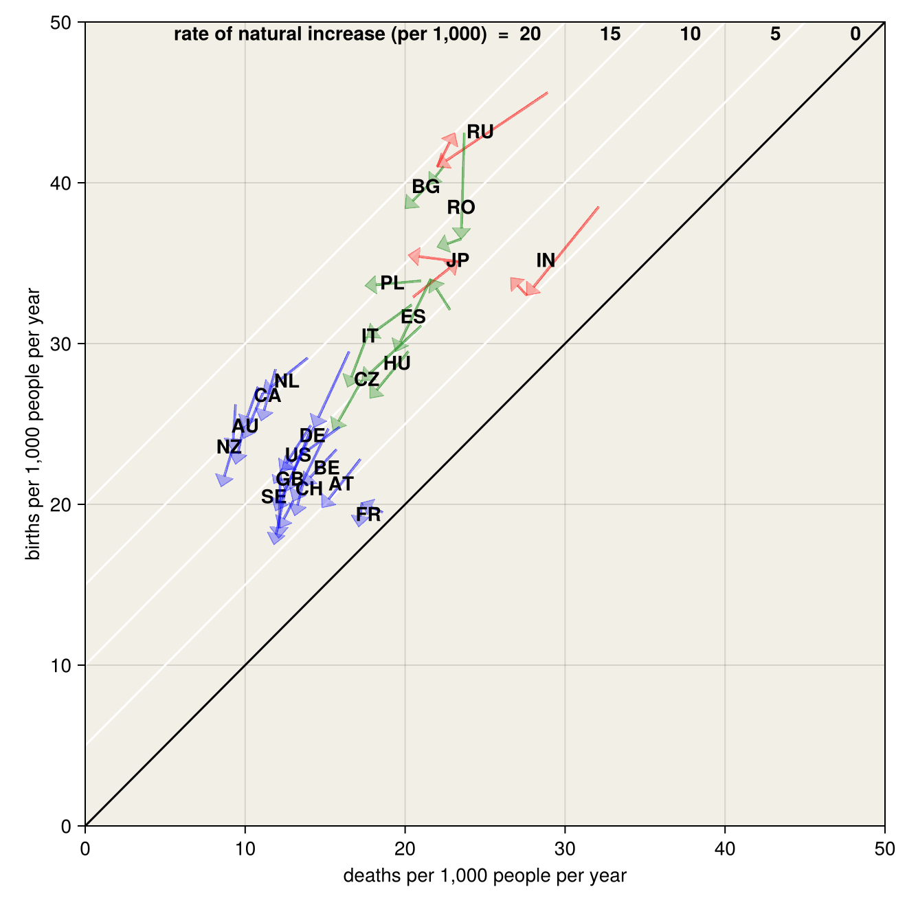
What can we infer from this diagram? Thompson argues that the three groups represent three stages of the demographic transition. Group A is approaching the end of the process, where birth and death rates will be low and nearly equal; Group B is in the middle, where death rates are low, but birth rates have not yet fallen far enough to restore zero growth; the “backward” countries of Group C are just getting started.
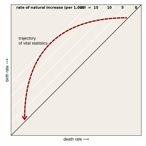
Today we know that Thompson’s analysis was more or less correct. What puzzles me is how he was able to draw his conclusions from the data he compiled and presented. To me, the evidence looks quite flimsy. I see a broad tendency for the sampled populations to drift toward the southwest, as birth and death rates both diminish. But something important is missing: In the demographic transition as we understand it today, the rate of natural increase should rise and then fall during an interval when births exceed deaths. The idealized trajectory might look something like Figure 3. But there’s no clear sign of such an arc in the graph of Thompson’s data.
In other ways as well the data offer only limited support for the conclusions. The sample of countries is small and strongly biased toward Europe and its offshoot populations. Thompson’s claim that Russia, India, and Japan can stand in for all the peoples of Asia, Africa, and South America seems wildly off-target. The temporal range of the data is also quite narrow. The worldwide demographic transition began in the 19th century, and it’s not over yet, so a 19-year interval is little more than a snapshot. Also, the particular interval chosen is hardly typical. Thompson’s data straddle the years 1914–19, in which major world events (a war, a pandemic) may well have had demographic consequences.
But if Thompson failed to prove his case, what of it? Sometimes it’s better to be right than rigorous.
Lost and Found
Inventing a concept such as the demographic transition might be expected to bring you fame, if not fortune. That’s not how it worked out for Thompson. For years no one paid much attention to the idea, not even Thompson himself. In his published works he never again discussed the demographic transition after the 1929 paper. And when the idea re-emerged in the 1940s, Thompson’s contribution was apparently forgotten. When Thompson died in 1973, his obituary in Population Index summarized his various accomplishments in demography but omitted the 1929 paper. A history of the demographic transition by Simon Szreter, published in 1993, noted: “...not until recently has Thompson’s claim to priority been widely recognized.”
Curiously, Verhulst’s invention of the logistic curve surffered a similar fate. The curve was rediscovered in 1920 by Raymond Pearl and Lowell J. Reed of Johns Hopkins University, who applied it to an analysis of population growth in the U.S. They were unaware of Verhulst’s prior work. When it was pointed out to them, they added a citation to a later paper, describing Verhulst’s publications as “long since forgotten.”
Szreter points out that there were several other “progenitors” of the transition theory, starting as early as 1909. At least one author, the French sociologist Adolphe Landry, gave an account of the concept that I find somewhat more persuasive than Thompson’s. His analysis is largely confined to Europe, but he examines data covering a much longer interval, from the end of the 18th century to the early years of the 20th. Landry wrote a few years after Thompson, but there’s no hint that he was aware of the earlier work.
So who deserves credit for the discovery of the demographic transition? I am inclined to adopt a principle enunciated in connection with another famous discovery:The aphorism comes from Alvin E. Roth and Marilda A. Oliveira Sotomayor. 1990. Two-sided Matching: A Study in Game-Theoretic Modeling and Analysis. Cambridge: Cambridge University Press. “What is important about Columbus’s discovery of America is not that it was the first, but that it was the last. After Columbus, America was never lost again; no subsequent explorers can claim its discovery.”
On this principle, the all-important last discoverers of the demographic transition were Frank W. Notestein and Kingsley Davis, both of whom worked in the Office of Population Research at Princeton University. Because they were close colleagues, their accounts of the transition should probably be viewed as joint work, but they were published independently as two single-author articles in different venues. Both appeared early in 1945, as World War II was nearing an end.
?
The Davis paper begins with a bang: “Viewed in long-run perspective, the growth of the earth’s population has been like a long, thin powder fuse that burns slowly and haltingly until it finally reaches the charge and then explodes.” The article is titled “The World Demographic Transition,” and this might be the first time the term appeared in print. Parts of the text read very much like a 21st-century review of the subject. Davis does not expend much rhetorical effort on establishing that the transition exists and that it will run to completion in the near future. That much is blithely taken for granted. There’s just one chart (which also appears in a slightly different form in Notestein’s article). The chart tracks population growth in six continent-scale regions of the world from 1650 to the early 20th century, with conjectural dotted lines showing a slackening or cessation of growth after 1950.
Perhaps the most intriguing aspect of Davis’s article concerns the causes of declining fertility.
focused on the cultural, economic, and technological causes of the change.. conserving energy that had been wasted bearing and raising children who would not survive to adulthood. .. mostly hear the argument that declining birth rates are caused by increasing affluence and improving nutrition and public health. Davis turns this upside down, suggesting that smaller families lead to greater affluence and liberate parents (especially mothers) to devote more energy to each child and also to pursuits outside the family.Why not more attention? Did not write of the demographic transition as a long-term solution to a population problem but as an aggravating factor in the short-term crisis of .. pointed out that in 1920 his Group C countries already home to more than 70 percent of the world’s people, and the percentage was sure to increase in the next few decades. .. a question that is still with us: “Is it probable that the peoples in Groups B and C will sit quietly by and starve while the Group A peoples enjoy the lion’s share of the good things of the earth?
I have questions about these data. Thompson initially defines the three groups based on demographic variables; each group is a cluster of nations with similar birth and death rates. But if that’s the criterion for membership, Japan should probably be in Group B, or else Bulgaria and Romania belong in Group C. For example, it seems that the U.S., Canada, Australia, and New Zealand earn their place in Group A as extraterritorial outposts of Britain, but India (which was still part of the British Empire when Thompson was writing) was relegated to Group C.
It doesn't help that the temporal distribution of the data points is highly irregular. We are given just two points in the 15-year interval from 1908 through 1923, then four points for the four-years 1924 through 1927. To reduce the impact of nonuniform sampling, I have replaced the four data points for 1924–27 by a single average value.Further Reading
Cramer, J. S. 2002. The Origins of Logistic Regression. Tinbergen Institure Discussion Paper, TI-2002-119/4. https://papers.tinbergen.nl/02119.pdf
Davis, Kingsley. 1945. The world demographic transition. The Annals of the American Academy of Political and Social Science 237:1–11. https://www.jstor.org/stable/1025490
Dublin, Louis I., and Alfred J. Lotka. 1925. On the true rate of natural increase. Journal of the American Statistical Association 20(151):305–339. https://www.jstor.org/stable/2965517
Kiser, Clyde V. 1974. Obituary: Warren S. Thompson 1887-1973. Population Index 40(1):21-23. https://www.jstor.org/stable/2733537
Landry, Adolphe. 1933. The Demographic Revolution. In Economic Essays in Honour of Gustav Cassel, London: George Allen & Unwin. Translated from the French by Odile Frank. Translation published 1987 in Population and Development Review, 13(4):731–740. https://www.jstor.org/stable/1973031
Notestein, Frank W. 1945. Population—The Long View. In Theodore W. Schultz (ed.), Food for the World. Chicago: University of Chicago Press, pp. 36–57. Reprinted 1976 by The Arno Press. https://archive.org/details/foodforworld0000schu/mode/2up
Szreter, Simon. 1993. The idea of demographic transition and the study of fertility change: a critical intellectual history. Population and Development Review 19(4):659–701. https://www.jstor.org/stable/2938410
Thompson, Warren S. 1929. Population. American Journal of Sociology 34(6):959–975. https://www.jstor.org/stable/2765883
Appendix: The Thompson data table
The data set from Warren Thompson’s 1929 paper is transcribed below. I have corrected one apparent error of arithmetic. In Group C, Thompson reports Japan’s rate of natural increase as 12.1, which is not consistent with the reported birth and death rates. I have corrected the number to 12.4.
| 1908–13 | 1920–23 | 1924 | 1925 | 1926 | 1927 | ||
|---|---|---|---|---|---|---|---|
| Group A | |||||||
| Australia: | Births | 27.3 | 24.8 | 23.2 | 22.9 | 22.0 | 21.7 |
| Deaths | 10.8 | 9.9 | 9.5 | 9.2 | 9.4 | 9.5 | |
| Natural increase | 16.5 | 14.9 | 13.7 | 13.7 | 12.6 | 12.2 | |
| Austria: | |||||||
| Births | --- | 22.8 | 21.7 | 20.6 | 19.2 | 17.8 | |
| Deaths | --- | 17.2 | 15.0 | 14.4 | 14.9 | 14.9 | |
| Natural increase | --- | 5.6 | 6.7 | 6.2 | 4.3 | 2.9 | |
| Belgium: | |||||||
| Births | 23.4 | 21.2 | 20.1 | 19.8 | 19.0 | 18.2 | |
| Deaths | 15.7 | 13.6 | 13.0 | 13.1 | 13.3 | 13.0 | |
| Natural increase | 7.7 | 7.6 | 7.1 | 6.7 | 5.7 | 5.2 | |
| Canada: | |||||||
| Births | --- | 28.4 | 25.7 | 25.8 | 24.8 | 24.6 | |
| Deaths | --- | 11.9 | 10.8 | 10.6 | 11.4 | 11.1 | |
| Natural increase | --- | 16.5 | 14.9 | 15.2 | 13.4 | 13.5 | |
| England and Wales: | |||||||
| Births | 24.9 | 22.0 | 18.8 | 18.3 | 17.8 | 16.7 | |
| Deaths | 14.1 | 12.2 | 12.2 | 12.2 | 11.6 | 12.3 | |
| Natural increase | 10.8 | 9.8 | 6.6 | 6.1 | 6.2 | 4.4 | |
| France: | |||||||
| Births | 19.5 | 20.1 | 18.7 | 18.9 | 18.8 | 18.1 | |
| Deaths | 18.6 | 17.3 | 16.9 | 17.5 | 17.4 | 16.5 | |
| Natural increase | 0.9 | 2.8 | 1.8 | 1.4 | 1.4 | 1.6 | |
| Germany: | |||||||
| Births | 29.5 | 23.8 | 20.2 | 20.4 | 19.5 | 18.3 | |
| Deaths | 16.5 | 14.3 | 12.1 | 11.8 | 11.7 | 12.0 | |
| Natural increase | 13.0 | 9.5 | 8.1 | 8.6 | 7.8 | 6.3 | |
| Netherlands: | |||||||
| Births | 29.1 | 26.9 | 25.1 | 24.3 | 23.8 | 23.1 | |
| Deaths | 13.9 | 11.1 | 9.8 | 9.8 | 9.8 | 10.3 | |
| Natural increase | 15.2 | 15.8 | 15.3 | 14.5 | 14.0 | 12.8 | |
| New Zealand: | |||||||
| Births | 26.2 | 23.4 | 21.6 | 21.2 | 21.1 | 20.3 | |
| Deaths | 9.4 | 9.2 | 8.3 | 8.3 | 8.7 | 8.5 | |
| Natural increase | 17.0 | 14.2 | 13.3 | 12.9 | 12.4 | 11.8 | |
| Sweden: | |||||||
| Births | 24.4 | 20.8 | 18.1 | 17.5 | 16.9 | --- | |
| Deaths | 14.0 | 12.5 | 12.0 | 11.7 | 11.8 | --- | |
| Natural increase | 10.4 | 8.3 | 6.1 | 5.8 | 5.1 | --- | |
| Switzerland: | |||||||
| Births | 24.7 | 20.2 | 18.8 | 18.4 | 18.2 | --- | |
| Deaths | 15.2 | 13.0 | 12.5 | 12.2 | 11.7 | --- | |
| Natural increase | 9.5 | 7.2 | 6.3 | 6.2 | 6.5 | --- | |
| United States: | |||||||
| Births | 24.8 | 23.2 | 22.6 | 21.4 | 20.6 | 20.4 | |
| Deaths | 15.9 | 12.3 | 11.8 | 11.8 | 12.1 | 11.4 | |
| Natural increase | 8.9 | 10.9 | 10.8 | 9.6 | 8.5 | 9.0 | |
| Group B | |||||||
| Bulgaria: | |||||||
| Births | 41.0 | 39.9 | 39.7 | 37.0 | --- | --- | |
| Deaths | 22.4 | 21.5 | 20.7 | 19.2 | --- | --- | |
| Natural increase | 18.6 | 18.4 | 19.0 | 17.8 | --- | --- | |
| Czechoslovakia: | |||||||
| Births | 31.1 | 27.7 | 25.6 | 25.0 | 24.4 | 23.3 | |
| Deaths | 21.0 | 17.3 | 15.2 | 15.2 | 15.5 | 16.0 | |
| Natural increase | 10.1 | 10.4 | 10.4 | 9.8 | 8.9 | 7.3 | |
| Hungary: | |||||||
| Births | --- | 29.5 | 26.8 | 27.7 | 26.7 | 25.2 | |
| Deaths | --- | 20.2 | 20.3 | 16.9 | 16.5 | 17.6 | |
| Natural increase | --- | 9.3 | 6.5 | 10.8 | 10.2 | 7.6 | |
| Italy: | |||||||
| Births | 32.4 | 30.4 | 28.2 | 27.5 | 27.2 | 26.4 | |
| Deaths | 20.4 | 17.6 | 16.6 | 16.6 | 16.8 | 15.5 | |
| Natural increase | 12.0 | 12.8 | 11.6 | 10.9 | 10.4 | 10.9 | |
| Poland: | |||||||
| Births | --- | 33.9 | 34.6 | 35.2 | 33.0 | 31.6 | |
| Deaths | --- | 21.0 | 17.9 | 16.7 | 17.8 | 17.4 | |
| Natural increase | --- | 12.9 | 16.7 | 18.5 | 15.2 | 14.2 | |
| Roumania: | |||||||
| Births | 43.1 | 36.5 | 36.7 | 35.2 | --- | --- | |
| Deaths | 24.7 | 23.5 | 23.3 | 21.0 | --- | --- | |
| Natural increase | 18.4 | 13.0 | 13.4 | 14.2 | --- | --- | |
| Spain: | |||||||
| Births | 32.1 | 30.4 | 29.9 | 29.4 | 29.9 | 28.6 | |
| Deaths | 22.8 | 21.6 | 19.8 | 19.7 | 19.0 | 18.9 | |
| Natural increase | 9.3 | 8.8 | 10.1 | 9.7 | 10.9 | 9.7 | |
| Group C | |||||||
| India: | |||||||
| Births | 38.5 | 33.0 | 34.5 | 33.6 | --- | --- | |
| Deaths | 32.1 | 27.6 | 28.5 | 24.7 | --- | --- | |
| Natural increase | 6.4 | 5.4 | 6.0 | 8.9 | --- | --- | |
| Japan: | |||||||
| Births | 32.9 | 35.1 | 33.8 | 34.9 | 34.8 | --- | |
| Deaths | 20.5 | 23.3 | 21.2 | 20.3 | 19.2 | --- | |
| Natural increase | 12.4* | 11.8 | 12.6 | 14.6 | 15.6 | --- | |
| Russia: | |||||||
| Births | 45.6 | 41.0 | 42.7 | --- | --- | 43.4 | |
| Deaths | 28.9 | 22.0 | 23.2 | --- | --- | 23.0 | |
| Natural increase | 16.7 | 19.0 | 19.5 | --- | --- | 20.4 | |
Publication history
First publication: