
Peaks and troughs, lumps and slumps, wave after wave of surge and retreat: I have been following the ups and downs of this curve, day by day, for a year and a half. The graph records the number of newly reported cases of Covid-19 in the United States for each day from 21 January 2020 through 20 July 2021. That’s 547 days, and also exactly 18 months. The faint, slender vertical bars in the background give the raw daily numbers; the bold blue line is a seven-day trailing average. (In other words, the case count for each day is averaged with the counts for the six preceding days.)
I struggle to understand the large-scale undulations of that graph. If you had asked me a few years ago what a major epidemic might look like, I would have mumbled something about exponential growth and decay, and I might have sketched a curve like this one:
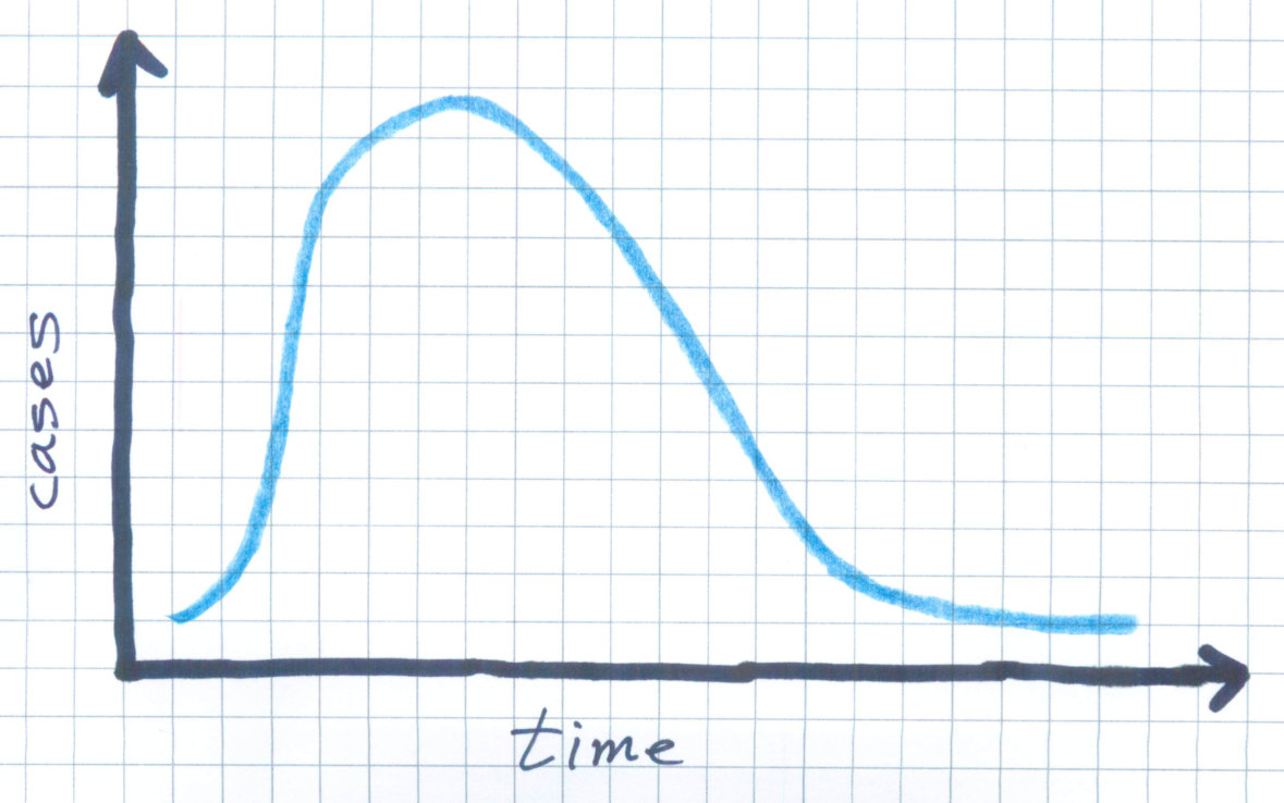
My imaginary epidemic is so much simpler than the real thing! The number of daily infections goes up, and then it comes down again. It doesn’t bounce around like a nervous stock market. It doesn’t have seasonal booms and busts.
The graph tracing the actual incidence of the disease makes at least a dozen reversals of direction, along with various small-scale twitches and glitches. The big mountain in the middle has foothills on both sides, as well as some high alpine valleys between craggy peaks. I’m puzzled by all this structural embellishment. Is it mere noise—a product of random fluctuations—or is there some driving mechanism we ought to know about, some switch or dial that’s turning the infection process on and off every few months?
I have a few ideas about possible explanations, but I’m not so keen on any of them that I would try to persuade you they’re correct. However, I do hope to persuade you there’s something here that needs explaining.
Before going further, I want to acknowledge my sources. The data files I’m working with are curated by The New York Times, based on information collected from state and local health departments. Compiling the data is a big job; the Times lists more than 150 workers on the project. They need to reconcile the differing and continually shifting policies of the reporting agencies, and then figure out what to do when the incoming numbers look fishy. (Back in June, Florida had a day with –40,000 new cases.) The entire data archive, now about 2.3 gigabytes, is freely available on GitHub. Figure 1 in this article is modeled on a graph updated daily in the Times.
I must also make a few disclaimers. In noodling around with this data set I am not trying to forecast the course of the epidemic, or even to retrocast it—to develop a model accurate enough to reproduce details of timing and magnitude observed over the past year and a half. I’m certainly not offering medical or public-health advice. I’m just a puzzled person looking for simple mechanisms that might explain the overall shape of the incidence curve, and in particular the roller coaster pattern of recurring hills and valleys.
So far, four main waves of infection have washed over the U.S., with a fifth wave now beginning to look like a tsunami. Although the waves differ greatly in height, they seem to be coming at us with some regularity. Eyeballing Figure 1, I get the impression that the period from peak to peak is pretty consistent, at roughly four months.
Periodic oscillations in epidemic diseases have been noticed many times before. The classical example is measles in Great Britain, for which there are weekly records going back to the early 18th century. In 1917 John Brownlee studied the measles data with a form of Fourier analysis called the periodogram. He found that the strongest peak in the frequency spectrum came at a period of 97 weeks, reasonably consistent with the widespread observation that the disease reappears every second year. But Brownlee’s periodograms bristle with many lesser peaks, indicating that the measles rhythm is not a simple, uniform drumbeat.
The mechanism behind the oscillatory pattern in measles is easy to understand. The disease strikes children in the early school years, and the virus is so contagious that it can run through an entire community in a few weeks. Afterwards, another outbreak can’t take hold until a new cohort of children has reached the appropriate age. No such age dependence exists in Covid-19, and the much shorter period of recurrence suggests that some other mechanism must be driving the oscillations. Nevertheless, it seems worthwhile to try applying Fourier methods to the data in Figure 1.
The Fourier transform decomposes any curve representing a function of time into a sum of simple sine and cosine waves of various frequencies. In textbook examples, the algorithm works like magic. Take a wiggly curve like this one:

Feed it into the Fourier transformer, turn the crank, and out comes a graph that looks like this, showing the coefficients of various frequency components:

It would be illuminating to have such a succinct encoding of the Covid curve—a couple of numbers that explain its comings and goings. Alas, that’s not so easy. When I poured the Covid data into the Fourier machine, this is what came out:

More than a dozen coefficients have significant magnitude; some are positive and some are negative; no obvious pattern leaps off the page. This spectrum, like the simpler one in Figure 4, holds all the information needed to reconstruct its input. I confirmed that fact with a quick computational experiment. But looking at the jumble of coefficients doesn’t help me to understand the structure of the Covid curve. The Fourier-transformed version is even more baffling than the original.
One lesson to be drawn from this exercise is that the Fourier transform is indeed magic: If you want to make it work, you need to master the dark arts. I am no wizard in this department; as a matter of fact, most of my encounters with Fourier analysis have ended in tears and trauma. No doubt someone with higher skills could tease more insight from the numbers than I can. But I doubt that any degree of Fourier finesse will lead to some clear and concise description of the Covid curve. Even with \(200\) years of measles records, Brownlee wasn’t able to isolate a clear signal; with just a year and a half of Covid data, success is unlikely.
Yet my foray into the Fourier realm was not a complete waste of time. Applying the inverse Fourier transform to the first 13 coefficients (for wavenumbers 0 through 6) yields this set of curves:

It looks a mess, but the sum of these 13 sinusoidal waves yields quite a handsome, smoothed version of the Covid curve. In Figure 7 below, the pink area in the background shows the Times data, smoothed with the seven-day rolling average. The blue curve, much smoother still, is the waveform reconstructed from the 13 Fourier coefficients.

The reconstruction traces the outlines of all the large-scale features of the Covid curve, with serious errors only at the end points (which are always problematic in Fourier analysis). The Fourier curve also fails to reproduce the spiky triple peak atop the big surge from last winter, but I’m not sure that’s a defect.
Let’s take a closer look at that triple peak. The graph below is an expanded view of the two-month interval from 20 November 2020 through 20 January 2021. The light-colored bars in the background are raw data on new cases for each day; the dark blue line is the seven-day rolling average computed by the Times.

The peaks and valleys in this view are just as high and low as those in Figure 1; they look less dramatic only because the horizontal axis has been stretched ninefold. My focus is not on the peaks but on the troughs between them. (After all, there wouldn’t be three peaks if there weren’t two troughs to separate them.) Three data points marked by pink bars have case counts far lower than the surrounding days. Note the dates of those events. November 26 was Thanksgiving Day in the U.S. in 2020; December 25 is Christmas Day, and January 1 is New Years Day. It looks like the virus went on holiday, but of course it was actually the medical workers and public health officials who took a day off, so that many cases did not get recorded on those days.
There may be more to this story. Although the holidays show up on the chart as low points in the progress of the epidemic, they were very likely occasions of higher-than-normal contagion, because of family gatherings, religious services, revelry, and so on. (I commented on the Thanksgiving risk last fall.) Those “extra” infections would not show up in the statistics until several days later, along with the cases that went undiagnosed or unreported on the holidays themselves. Thus each dip appears deeper because it is followed by a surge.
All in all, it seems likely that the troughs creating the triple peak are a reporting anomaly, rather than a reflection of genuine changes in the viral transmission rate. Thus a curve that smooths them away may give a better account of what’s really going on in the population.
There’s another transformation—quite different from Fourier analysis—that might tell us something about the data. The time derivative of the Covid curve gives the rate of change in the infection rate—positive when the epidemic is surging, negative when it’s retreating. Because we’re working with a series of discrete values, computing the derivative is trivially easy: It’s just the series of differences between successive values.

The derivative of the raw data (blue) looks like a seismograph recording from a jumpy day along the San Andreas. The three big holiday anomalies—where case counts change by 100,000 per day—produce dramatic excursions. The smaller jagged waves that extend over most of the 18-month interval are probably connected with the seven-day cycle of data collection, which typically show case counts increasing through the work week and then falling off on the weekend.
The seven-day trailing average is designed to suppress that weekly cycle, and it also smooths over some larger fluctuations. The resulting curve (red) is not only less jittery but also has much lower amplitude. (I have expanded the vertical scale by a factor of two for clarity.)
Finally, the reconstituted curve built by summing 13 Fourier components yields a derivative curve (green) whose oscillations are mere ripples, even when stretched vertically by a factor of four.
The points where the derivative curves cross the zero line—going from positive to negative or vice versa—correspond to peaks or troughs in the underlying case-count curve. Each zero crossing marks a moment when the epidemic’s trend reversed direction, when a growing daily case load began to decline, or a falling one turned around and started gaining again. The blue raw-data curve has 255 zero crossings, and the red averaged curve has 122. Even the lesser figure implies that the infection trend is reversing course every four or five days, which is not plausible; most of those sign changes must result from noise in the data.
The silky smooth green curve has nine zero crossings, most of which seem to signal real changes in the course of the epidemic. I would like to understand what’s causing those events.
You catch a virus. (Sorry about that.) Some days later you infect a few others, who after a similar delay pass the gift on to still more people. This is the mechanism of exponential (or geometric) growth. With each link in the chain of transmission the number of new cases is multiplied by a factor of \(R\), which is the natural growth ratio of the epidemic—the average number of cases spawned by each infected individual. Starting with a single case at time \(t = 0\), the number of new infections at any later time \(t\) is \(R^t\). If \(R\) is greater than 1, even very slightly, the number of cases increases without limit; if \(R\) is less than 1, the epidemic fades away.
The average delay between when you become infected and when you infect others is known as the serial passage time, which I am going to abbreviate TSP and take as the basic unit for measuring the duration of events in the epidemic. For Covid-19, one TSP is probably about five days.
Exponential growth is famously unmanageable. If \(R = 2\), the case count doubles with every iteration: \(1, 2, 4, 8, 16, 32\dots\). It increases roughly a thousandfold after 10 TSP, and a millionfold after 20 TSP. The rate of increase becomes so steep that I can’t even graph it except on a logarithmic scale, where an exponential trajectory becomes a straight line.

What is the value of \(R\) for the SARS-CoV-2 virus? No one knows for sure. The number is difficult to measure, and it varies with time and place. Another number, \(R_0\), is often regarded as an intrinsic property of the virus itself, an indicator of how easily it passes from person to person. The Centers for Disease Control and Prevention (CDC) suggests that \(R_0\) for SARS-CoV-2 probably lies between 2.0 and 4.0, with a best guess of 2.5. That would make it catchier than influenza but less so than measles. However, the CDC has also published a report arguing that \(R_0\) is “easily misrepresented, misinterpreted, and misapplied.” I’ve certainly been confused by much of what I’ve read on the subject.
Whatever numerical value we assign to \(R\), if it’s greater than 1, it cannot possibly describe the complete course of an epidemic. As \(t\) increases, \(R^t\) will grow at an accelerating pace, and before you know it the predicted number of cases will exceed the global human population. For \(R = 2\), this absurdity arrives after about 33 TSP, which is less than six months.
What we need is a mathematical model with a built-in limit to growth. As it happens, the best-known model in epidemiology features just such a mechanism. Introduced almost 100 years ago by W. O. Kermack and A. G. McKendrick of the Royal College of Physicians in Edinburgh,
A SIR epidemic can’t keep growing indefinitely for the same reason that a forest fire can’t keep burning after all the trees are reduced to ashes. At the beginning of an epidemic, when the entire population is susceptible, the case count can grow exponentially. But growth slows later, when each infective has a harder time finding susceptibles to infect. Kermack and McKendrick made the interesting discovery that the epidemic dies out before it has reached the entire population. That is, the last infective recovers before the last susceptible is infected, leaving a residual \(\mathcal{S}\) population that has never experienced the disease.
The SIR model itself has gone viral in the past few years. There are tutorials everywhere on the web, as well as scholarly articles and books. (I recommend Epidemic Modelling: An Introduction, by Daryl J. Daley and Joseph Gani. Or try Mathematical Modelling of Zombies if you’re feeling brave.) Most accounts of the SIR model, including the original by Kermack and McKendrick, are presented in terms of differential equations. I’m instead going to give a version with discrete time steps—\(\Delta t\) rather than \(dt\)—because I find it easier to explain and because it translates line for line into computer code. In the equations that follow, \(\mathcal{S}\), \(\mathcal{I}\), and \(\mathcal{R}\) are real numbers in the range \([0, 1]\), representing proportions of some fixed-size population.
\[\begin{align}
\Delta\mathcal{I} & = \beta \mathcal{I}\mathcal{S}\\[0.8ex]
\Delta\mathcal{R} & = \gamma \mathcal{I}\\[1.5ex]
\mathcal{S}_{t+\Delta t} & = \mathcal{S}_{t} - \Delta\mathcal{I}\\[0.8ex]
\mathcal{I}_{t+\Delta t} & = \mathcal{I}_{t} + \Delta\mathcal{I} - \Delta\mathcal{R}\\[0.8ex]
\mathcal{R}_{t+\Delta t} & = \mathcal{R}_{t} + \Delta\mathcal{R}\\[0.8ex]
\end{align}\]
The first equation, with \(\Delta\mathcal{I}\) on the left hand side, describes the actual contagion process—the recruitment of new infectives from the susceptible population. The number of new cases is proportional to the product of \(\mathcal{I}\) and \(\mathcal{S}\), since the only way to propagate the disease is to bring together someone who already has it with someone who can catch it. The constant of proportionality, \(\beta\), is a basic parameter of the model. It measures how often (per TSP) an infective person encounters others closely enough to communicate the virus.
The second equation, for \(\Delta\mathcal{R}\), similarly describes recovery. For epidemiological purposes, you don’t have to be feeling tiptop again to be done with the disease; recovery is defined as the moment when you are no long capable of infecting other people. The model takes a simple approach to this idea, withdrawing a fixed fraction of the infectives in every time step. The fraction is given by the parameter \(\gamma\).
After the first two equations calculate the number of people who are changing their status in a given time step, the last three equations update the population segments accordingly. The susceptibles lose \(\Delta\mathcal{I}\) members; the infectives gain \(\Delta\mathcal{I}\) and lose \(\Delta\mathcal{R}\); the recovereds gain \(\Delta\mathcal{R}\). The total population \(\mathcal{S} + \mathcal{I} + \mathcal{R}\) remains constant throughout.
In
Here’s what happens when you put the model in motion. For this run I set \(\beta = 0.6\) and \(\gamma = 0.2\), which implies that \(\rho = 3.0\). Another number that needs to be specified is the initial proportion of infectives; I chose \(10^{-6}\), or in other words one in a million. The model ran for \(100\) TSP, with a time step of \(\Delta t = 0.1\) TSP; thus there were \(1{,}000\) iterations overall.

Let me call your attention to a few features of this graph. At the outset, nothing seems to happen for weeks and weeks, and then all of a sudden a huge blue wave rises up out of the calm waters. Starting from one case in a population of a million, it takes \(18\) TSP to reach one case in a thousand, but just \(12\) more TSP to reach one in \(10\).
Note that the population of infectives reaches a peak near where the susceptible and recovered curves cross—that is, where \(\mathcal{S} = \mathcal{R}\). This relationship holds true over a wide range of parameter values. That’s not surprising, because the whole epidemic process acts as a mechanism for converting susceptibles into recovereds, via a brief transit through the infective stage. But, as Kermack and McKendrick predicted, the conversion doesn’t quite go to completion. At the end, about \(6\) percent of the population remains in the susceptible category, and there are no infectives left to convert them. This is the condition called herd immunity, where the population of susceptibles is so diluted that most infectives recover before they can find someone to infect. It’s the end of the epidemic, though it comes only after \(90+\) percent of the people have gotten sick. (That’s not what I would call a victory over the virus.)
The \(\mathcal{I}\) class in the SIR model can be taken as a proxy for the tally of new cases tracked in the Times data. The two variables are not quite the same—infectives remain in the class \(\mathcal{I}\) until they recover, whereas new cases are counted only on the day they are reported—but they are very similar and roughly proportional to one another. And that brings me to the main point I want to make about the SIR model: In Figure 11 the blue curve for infectives looks nothing like the corresponding new-case tally in Figure 1. In the SIR model, the number of infectives starts near zero, rises steeply to a peak, and thereafter tapers gradually back to zero, never to rise again. It’s a one-hump camel. The roller coaster Covid curve is utterly different.
The detailed geometry of the \(\mathcal{I}\) curve depends on the values assigned to the parameters \(\beta\) and \(\gamma\). Changing those variables can make the curve longer or shorter, taller or flatter. But no choice of parameters will give the curve multiple ups and downs. There are no oscillatory solutions to these equations.
The SIR model strikes me as so plausible that it—or some variant of it—really must be a correct description of the natural course of an epidemic. But that doesn’t mean it can explain what’s going on right now with Covid-19. A key element of the model is saturation: the spread of the disease stalls when there are too few susceptibles left to catch it. That can’t be what caused the steep downturn in Covid incidence that began in January of this year, or the earlier slumps that began in April and July of 2020. We were nowhere near saturation during any of those events, and we still aren’t now. (For the moment I’m ignoring the effects of vaccination. I’ll take up that subject below.)
In Figure 11 there comes a dramatic triple point where each of the three categories constitutes about a third of the total population. If we projected that situation onto the U.S., we would have (in very round numbers) \(100\) million active infections, another \(100\) million people who have recovered from an earlier bout with the virus, and a third \(100\) million who have so far escaped (but most of whom will catch it in the coming weeks). That’s orders of magnitude beyond anything seen so far. The cumulative case count, which combines the \(\mathcal{I}\) and \(\mathcal{R}\) categories, is approaching \(37\) million, or \(11\) percent of the U.S. population.  Even if the true case count is double the official tally, we are still far short of the model’s crucial triple point. Judged from the perspective of the SIR model, we are still in the early stages of the epidemic, where case counts are too low to see in the graph. (If you rescale Figure 1 so that the y axis spans the full U.S. population of 330 million, you get the flatline graph at right.)
If we are still on the early part of the curve, in the regime of rampant exponential growth, it’s easy to understand the surging accelerations we’ve seen in the worst moments of the epidemic. The hard part is explaining the repeated slowdowns in viral transmission that punctuate the Covid curve. In the SIR model, the turnaround comes when the virus begins to run out of victims, but that’s a one-time phenomenon, and we haven’t gotten there yet. What can account for the deep valleys in the Times Covid curve?
Among the ideas that immediately come to mind, one strong contender is feedback. We all have access to real-time information on the status of the epidemic. It comes from governmental agencies, from the news media, from idiots on Facebook, and from the personal communications of family, friends, and neighbors. Most of us, I think, respond appropriately to those messages, modulating our anti-contagion precautions according to the perceived severity of the threat. When it’s scary outside, we hunker down and mask up. When the risk abates, it’s party time again! I can easily imagine a scenario where such on-again, off-again measures would trigger oscillations in the incidence of the disease.
If this hypothesis turns out to be true, it is cause for both hope and frustration. Hope because the interludes of viral retreat suggest that our tools for fighting the epidemic must be reasonably effective. Frustration because the rebounds indicate we’re not deploying those tools as well as we could. Look again at the Covid curve of Figure 1, specifically at the steep downturn following the winter peak. In early February, the new case rate was dropping by 30,000 per week. Over the first three weeks of that month, the rate was cut in half. Whatever we were doing then, it was working brilliantly. If we had just continued on the same trajectory, the case count would have hit zero in early March. Instead, the downward slope flattened, and then turned upward again.
We had another chance in June. All through April and May, new cases had been falling steadily, from 65,000 to 17,000, a pace of about –800 cases a day. If we’d been able to sustain that rate for just three more weeks, we’d have crossed the finish line in late June. But again the trend reversed course, and by now we’re back up well above 100,000 cases a day.
Are these pointless ups and downs truly caused by feedback effects? I don’t know. I am particularly unsure about the “if only” part of the story—the idea that if only we’d kept the clamps on for just a few more weeks, the virus would have been eradicated, or nearly so. But it’s an idea to keep in mind.
Perhaps we could learn more by creating a feedback loop in the SIR model, and looking for oscillatory dynamics. Negative feedback is anything that acts to slow the infection rate when that rate is high, and to boost it when it’s low. Such a contrarian mechanism could be added to the model in several ways. Perhaps the simplest is a lockdown threshold: Whenever the number of infectives rises above some fixed limit, everyone goes into isolation; when the \(\mathcal{I}\) level falls below the threshold again, all cautions and restrictions are lifted. It’s an all-or-nothing rule, which makes it simple to implement. We need a constant to represent the threshold level, and a new factor (which I am naming \(\varphi\), for fear) in the equation for \(\Delta \mathcal{I}\):
\[\Delta\mathcal{I} = \beta \varphi \mathcal{I} \mathcal{S}\]
The \(\varphi\) factor is 1 whenever \(\mathcal{I}\) is below the threshold, and \(0\) when it rises above. The effect is to shut down all new infections as soon as the threshold is reached, and start them up again when the rate falls.
Does this scheme produce oscillations in the \(\mathcal{I}\) curve? Strictly speaking, the answer is yes, but you’d never guess it by looking at the graph.

The feedback loop serves as a control system, like a thermostat that switches the furnace off and on to maintain a set temperature. In this case, the feedback loop holds the infective population steady at the threshold level, which is set at 0.05. On close examination, it turns out that \(\mathcal{I}\) is oscillating around the threshold level, but with such a short period and tiny amplitude that the waves are invisible. The value bounces back and forth between 0.049 and 0.051.
To get macroscopic oscillations, we need more than feedback. The SIR output shown below comes from a model that combines feedback with a delay between measuring the state of the epidemic and acting on that information. Introducing such a delay is not the only way to make the model swing, but it’s certainly a plausible one. As a matter of fact, a model without any delay, in which a society responds instantly to every tiny twitch in the case count, seems wholly unrealistic.

The model of Figure 14 adopts the same parameters, \(\beta = 0.6\) and \(\gamma = 0.2\), as the version of Figure 13, as well as the same lockdown threshold \((0.05)\). It differs only in the timing of events. If the infective count climbs above the threshold at time \(t\), control measures do not take effect until \(t + 3\); in the meantime, infections continue to spread through the population. The delay and overshoot on the way up are matched by a delay and undershoot at the other end of the cycle, when lockdown continues for three TSP after the threshold is crossed on the way down.
Given these specific parameters and settings, the model produces four cycles of diminishing amplitude and increasing wavelength. (No further cycles are possible because \(\mathcal{I}\) remains below the threshold.) Admittedly, those four spiky sawtooth peaks don’t look much like the humps in the Covid curve. If we’re going to seriously consider the feedback hypothesis, we’ll need stronger evidence than this. But the model is very crude; it could be refined and improved.
The fact is, I really want to believe that feedback could be a major component in the oscillatory dynamics of Covid-19. It would be comforting to know that our measures to combat the epidemic have had a powerful effect, and that we therefore have some degree of control over our fate. But I’m having a hard time keeping the faith. For one thing, I would note that our countermeasures have not always been on target. In the epidemic’s first wave, when the characteristics of the virus were largely unknown, the use of facemasks was discouraged (except by medical personnel), and there was a lot of emphasis on hand washing, gloves, and sanitizing surfaces. Not to mention drinking bleach. Those measures were probably not very effective in stopping the virus, but the wave receded anyway.
Another source of doubt is that wavelike fluctuations are not unique to Covid-19. 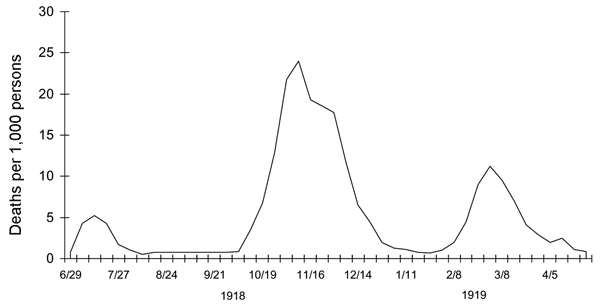 On the contrary, they seem to be a common characteristic of epidemics across many times and places. The \(1918\textrm{–}1919\) influenza epidemic had at least three waves. Figure 15, which Wikipedia attributes to the CDC, shows influenza deaths per \(1{,}000\) people in the United Kingdom. Those humps look awfully familiar. They are similar enough to the Covid waves that it seems natural to look for a common cause. But if both patterns are a product of feedback effects, we have to suppose that public health measures undertaken a century ago, in the middle of a world war, worked about as well as those today. (I’d like to think there’s been some progress.)
Update: Alina Glaubitz and Feng Fu of Dartmouth have applied a game-theoretical approach to generating oscillatory dynamics in a SIR model. Their work was published last November but I have only just learned about it from an article by Lina Sorg in SIAM News.
One detail of the SIR model troubles me. As formulated by Kermack and McKendrick, the model treats infection and recovery as symmetrical, mirror-image processes, both of them described by exponential functions. The exponential rule for infections makes biological sense. You can only get the virus via transmission from someone who already has it, so the number of new infections is proportional to the number of existing infections. But recovery is different; it’s not contagious. Although the duration of the illness may vary to some extent, there’s no reason to suppose it would depend on the number of other people who are sick at the same time.
In the model, a fixed fraction of the infectives, \(\gamma \mathcal{I}\), recover at every time step.  For \(\gamma = 0.2\), this rule generates the exponential distribution seen in Figure 16. Imagine that some large group of people have all been infected at the same time, \(t = 0\). At \(t = 1\), a fifth of the infectives recover, leaving \(80\) percent of the cohort still infective. At \(t = 2\), a fifth of the remaining \(80\) percent are removed from the infective class, leaving \(64\) percent. And so it goes. Even after \(10\) TSP, more than \(10\) percent of the original group remain infectious.
The long tail of this distribution corresponds to illnesses that persist for many weeks. Such cases exist, but they are rare. According to the CDC, most Covid patients have no detectable “replication-competent virus” \(10\) days after the onset of symptoms. Even in the most severe cases, with immunocompromised patients, \(20\) days of infectivity seems to be the outer limit.
Modifying the model for a fixed period of infectivity is not difficult. We can keep track of the infectives with a data structure called a queue. Each new batch of newly recruited infectives goes into the tail of the queue, then advances one place with each time step. After \(m\) steps (where \(m\) is the duration of the illness), the batch reaches the head of the queue and joins the company of the recovered. Here is what happens when \(m = 3\) TSP:

I chose \(3\) TSP for this example because it is close to the median duration in the exponential distribution in Figure 11, and therefore ought to resemble the earlier result. And so it does, approximately. As in Figure 11, the peak in the infectives curve lies near where the susceptible and recovered curves cross. But the peak never grows quite as tall; and, for obvious reasons, it decays much faster. As a result, the epidemic ends with many more susceptibles untouched by the disease—more than 25 percent.
A disease duration of \(3\) TSP, or about \(15\) days, is still well over the CDC estimates of the typical length. Shortening the queue to \(2\) TSP, or about \(10\) days, transforms the outcome even more dramatically. Now the susceptible and recovered curves never cross, and almost \(70\) percent of the susceptible population remains uninfected when the epidemic peters out.

Figure 18 comes a little closer to describing the current Covid situation in the U.S. than the other models considered above. It’s not that the curves’ shape resembles that of the data, but the overall magnitude or intensity of the epidemic is closer to observed levels. Of the models presented so far, this is the first that reaches a natural limit without burning through most of the population. Maybe we’re on to something.
On the other hand, there are a couple of reasons for caution. First, with these parameters, the initial growth of the epidemic is extremely slow; it takes \(40\) or \(50\) TSP before infections have a noticeable effect on the population. That’s well over six months. Second, we’re still dealing with a one-hump camel. Even though most of the population is untouched, the epidemic has run its course, and there will not be a second wave. Something important is still missing.
Before leaving this topic behind, I want to point out that the finite time span of a viral infection gives us a special point of leverage for controlling the spread of the disease. The viruses that proliferate in your body must find a new host within a week or two, or else they face extinction. Therefore, if we could completely isolate every individual in the country for just two or three weeks, the epidemic would be over. Admittedly, putting each and every one of us into solitary confinement is not feasible (or morally acceptable), but we could strive to come as close as possible, strongly discouraging all forms of person-to-person contact. Testing, tracing, and quarantines would deal with straggler cases. My point is that a very strict but brief lockdown could be both more effective and less disruptive than a loose one that goes on for months. Where other strategies aim to flatten the curve, this one attempts to break the chain.
When Covid emerged late in 2019, it was soon labeled a pandemic, signifying that it’s bigger than a mere epidemic, that it’s everywhere. But it’s not everywhere at once. Flareups have skipped around from region to region and country to country. Perhaps we should view the pandemic not as a single global event but as an ensemble of more localized outbreaks.
Suppose small clusters of infections erupt at random times, then run their course and subside. By chance, several geographically isolated clusters might be active over the same range of dates and add up to a big bump in the national case tally. Random fluctuations could also produce interludes of widespread calm, which would cause a dip in the national curve.
We can test this notion with a simple computational experiment, modeling a population divided into \(N\) clusters or communities. For each cluster a SIR model generates a curve giving the proportion of infectives as a function of time. The initiation time for each of these mini-epidemics is chosen randomly and independently. Summing the \(N\) curves gives the total case count for the country as a whole, again as a function of time.
Before scrolling down to look at the graphs generated by this process, you might make a guess about how the experiment will turn out. In particular, how will the shape of the national curve change as the number of local clusters increases?
If there’s just one cluster, then the national curve is obviously identical to the trajectory of the disease in that one place. With two clusters, there’s a good chance they will not overlap much, and so the national curve will probably have two humps, with a deep valley between them. With \(N = 3\) or \(4\), overlap becomes more of an issue, but the sum curve still seems likely to have \(N\) humps, perhaps with shallower depressions separating them. Before I saw the results, I made the following guess about the behavior of the sum as \(N\) continues increasing: The sum curve will always have approximately \(N\) peaks, I thought, but the height difference between peaks and troughs should get steadily smaller. Thus at large \(N\) the sum curve would have many tiny ripples, small enough that the overall curve would appear to be one broad, flat-topped hummock.
So much for my intuition. Here are two examples of sum curves generated by clusters of \(N\) mini-epidemics, one curve for \(N = 6\) and one for \(N = 50\). The histories for individual clusters are traced by fine red lines; the sums are blue. All the curves have been scaled so that the highest peak of the sum curve touches \(1.0\).

My
I have to confess that the two examples in Figure 19 were not chosen at random. I picked them because they looked good, and because they illustrated a point I wanted to make—namely that the number of peaks in the sum curve remains nearly constant, regardless of the value of \(N\). Figure 20 assembles a more representative sample, selected without deliberate bias but again showing that the number of peaks is not sensitive to \(N\), although the valleys separating those peaks get shallower as \(N\) grows.

The  takeaway message from these simulations seems to be that almost any collection of randomly timed mini-epidemics will combine to form a macro-epidemic with just a few waves. The number of peaks is not always four, but it’s seldom very far from that number. The bar graphs in Figure 21 offer some quantitative evidence on this point. They record the distribution of the number of peaks in the sum curve for values of \(N\) between \(4\) and \(100\). Each set of bars represents \(1{,}000\) repetitions of the process. In all cases the peak falls at \(N = 3, 4,\) or \(5\).
The question is: Why \(4 \pm 1\)? Why do we keep seeing those particular numbers? And if \(N\), the number of components being summed, has little influence on this property of the sum curve, then what does govern it? I puzzled over these questions for some time before a helpful analogy occurred to me.
Suppose you have a bunch of sine waves, all at the same frequency \(f\) but with randomly assigned phases; that is, the waves all have the same shape, but they are shifted left or right along the \(x\) axis by random amounts. What would the sum of those waves look like? The answer is: another sine wave of frequency \(f\). This is a little fact that’s been known for ages (at least since Euler) and is not hard to prove, but it still comes as a bit of a shock every time I run into it. I believe the same kind of argument can explain the behavior of a sum of SIR curves, even though those curves are not sinusoidal. The component SIR curves have a period of \(20\) to \(30\) TSP. In a model run that spans \(100\) TSP, these curves can be considered to have a frequency of between three and five cycles per epidemic period. Their sum should be a wave with the same frequency—something like the Covid curve, with its four (or four and a half) prominent humps. In support of this thesis, when I let the model run to \(200\) TSP, I get a sum curve with seven or eight peaks.
I am intrigued by the idea that an epidemic might arrive in cyclic waves not because of anything special about viral or human behavior but because of a mathematical process akin to wave interference. It’s such a cute idea, dressing up an obscure bit of counterintuitive mathematics and bringing it to bear on a matter of great importance to all of us. And yet, alas, a closer look at the Covid data suggests that nature doesn’t share my fondness for summing waves with random phases.
Figure 22, again based on data extracted from the Times archive, plots \(49\) curves, representing the time course of case counts in the Lower \(48\) states and the District of Columbia. I have separated them by region, and in each group I’ve labeled the trace with the highest peak. We already know that these curves yield a sum with four tall peaks; that’s where this whole investigation began. But the \(49\) curves do not support the notion that those peaks might be produced by summing randomly timed mini-epidemics. The oscillations in the \(49\) curves are not randomly timed; there are strong correlations between them. And many of the curves have multiple humps, which isn’t possible if each mini-epidemic is supposed to act like a SIR model that runs to completion.

Although these curves spoil a hypothesis I had found alluring, they also reveal some interesting facts about the Covid epidemic. I knew that the first wave was concentrated in New York City and surrounding areas, but I had not realized how much the second wave, in the summer of 2020, was confined to the country’s southern flank, from Florida all the way to California. The summer wave this year is also most intense in Florida and along the Gulf Coast. Coincidence? When I showed the graphs to a friend, she responded: “Air conditioning.”
Searching for the key to Covid, I’ve tried out three slightly whimsical notions: the possibility of a periodic signal, like the sunspot cycle, bringing us waves of infection on a regular schedule; feedback loops producing yo-yo dynamics in the case count; and randomly timed mini-epidemics that add up to a predictable, slow variation in the infection rate. In retrospect they still seem like ideas worth looking into, but none of them does a convincing job of explaining the data.
In my mind the big questions remain unanswered. In November of 2020 the daily tally of new Covid cases was above \(100{,}000\) and rising at a fearful rate. Three months later the infection rate was falling just as steeply. What changed between those dates? What action or circumstance or accident of fate blunted the momentum of the onrushing epidemic and forced it into retreat? And now, just a few months after the case count bottomed out, we are again above \(100{,}000\) cases per day and still climbing. What has changed again to bring the epidemic roaring back?
There are a couple of obvious answers to these questions. As a matter of fact, those answers are sitting in the back of the room, frantically waving their hands, begging me to call on them. First is the vaccination campaign, which has now reached half the U.S. population. The incredibly swift development, manufacture, and distribution of those vaccines is a wonder. In the coming months and years they are what will save us, if anything can. But it’s not so clear that vaccination is what stopped the big wave last winter. The sharp downturn in infection rates began in the first week of January, when vaccination was just getting under way in the U.S. On January 9 (the date when the decline began) only about \(2\) percent of the population had received even one dose. The vaccination effort reached a peak in April, when more than three million doses a day were being administered. By then, however, the dropoff in case numbers had stopped and reversed. If you want to argue that the vaccine ended the big winter surge, it’s hard to align causation with chronology.
On the other hand, the level of vaccination that has now been achieved should exert a powerful damping effect on any future waves. Removing half the people from the susceptible list may not be enough to reach herd immunity and eliminate the virus from the population, but it ought to be enough to turn a growing epidemic into a wilting one.

The SIR model of Figure 23 has the same parameters as the model of Figure 3 \((\beta = 0.6, \gamma = 0.2,\) implying \(\rho = 3.0)\), but \(50\) percent of the people are vaccinated at the start of the simulation. With this diluted population of susceptibles, essentially nothing happens for almost a year. The epidemic is dormant, if not quite defunct.
That’s the world we should be living in right now, according to the SIR model. Instead, today’s new case count is \(141{,}365\); almost \(81{,}556\) people are hospitalized with Covid infections; and 704 people have died. What gives? How can this be happening?
At this point I must acknowledge the other hand waving in the back of the room: the Delta variant, otherwise known as B.1.617.2. Half a dozen mutations in the viral spike protein, which binds to a human cell-surface receptor, have apparently made this new strain at least twice as contagious as the original one.

In Figure 24 contagiousness is doubled by increasing \(\rho\) from \(3.0\) to \(6.0\). That boost brings the epidemic back to life, although there is still quite a long delay before the virus becomes widespread in the unvaccinated half of the population.
The situation is may well be worse than the model suggests. All the models I have reported on here pretend that the human population is homogeneous, or thoroughly mixed. If an infected person is about to spread the virus, everyone in the country has the same probability of being the recipient. This assumption greatly simplifies the construction of the model, but of course it’s far from the truth. In daily life you most often cross paths with people like yourself—people from your own neighborhood, your own age group, your own workplace or school. Those frequent contacts are also people who share your vaccination status. If you are unvaccinated, you are not only more vulnerable to the virus but also more likely to meet people who carry it. This somewhat subtle birds-of-a-feather effect is what allows us to have “a pandemic of the unvaccinated.”
Recent reports have brought still more unsettling and unwelcome news, with evidence that even fully vaccinated people may sometimes spread the virus. I’m waiting for confirmation of that before I panic. (But I’m waiting with my face mask on.)
Having demonstrated that I understand nothing about the history of the epidemic in the U.S.—why it went up and down and up and down and up and down and up and down—I can hardly expect to understand the present upward trend. About the future I have no clue at all. Will this new wave tower over all the previous ones, or is it Covid’s last gasp? I can believe anything.
But let us not despair. This is not the zombie apocalypse. The survival of humanity is not in question. It’s been a difficult ordeal for the past 18 months, and it’s not over yet, but we can get through this. Perhaps, at some point in the not-too-distant future, we’ll even understand what’s going on.
Update 2021-09-01
Today The New York Times has published two articles raising questions similar to those asked here. David Leonhardt and Ashley Wu write a “morning newsletter” titled “Has Delta Peaked?” Apoorva Mandavilli, Benjamin Mueller, and Shalini Venugopal Bhagat ask “When Will the Delta Surge End?” I think it’s fair to say that the questions in the headlines are not answered in the articles, but that’s not a complaint. I certainly haven’t answered them either.
I’m going to take this opportunity to update two of the figures to include data through the end of August.

In Figure 1r the surge in case numbers that was just beginning back in late July has become a formidable sugarloaf peak. The open question is what happens next. Leonhardt and Wu make the optimistic observation that “The number of new daily U.S. cases has risen less over the past week than at any point since June.” In other words, we can celebrate a negative second derivative: The number of cases is still high and is still growing, but it’s growing slower than it was. And they cite the periodicity observed in past U.S. peaks and in those elsewhere as a further reason for hope that we may be near the turning point.

Figure 22r tracks where the new cases are coming from. As in earlier peaks, California, Texas, and Florida stand out.
Data and Source Code
The New York Times data archive for Covid-19 cases and deaths in the United States is available in this GitHub repository. The version I used in preparing this article, cloned on 21 July 2021, is identified as “commit c3ab8c1beba1f4728d284c7b1e58d7074254aff8″. You should be able to access the identical set of files through this link.
Source code for the SIR models and for generating the illustrations in this article is also available on GitHub. The code is written in the Julia programming language and organized in Pluto notebooks.
Further Reading
Bartlett, M. S. 1956. Deterministic and stochastic models for recurrent epidemics. In Proceedings of the Third Berkeley Symposium on Mathematical Statistics and Probability, Volume 4: Contributions to Biology and Problems of Health, pp. 81–109. Berkeley: University of California Press.
Bartlett, M. S. 1957. Measles periodicity and community size. Journal of the Royal Statistical Society, Series A (General) 120(1):48–70.
Brownlee, John. 1917. An investigation into the periodicity of measles epidemics in London from 1703 to the present day by the method 0f the periodogram. Philosophical Transactions of the Royal Society of London, Series B, 208:225–250.
Daley, D. J., and J. Gani. 1999. Epidemic Modelling: An Introduction. Cambridge: Cambridge University Press.
Glaubitz, Alina, and Feng Fu. 2020. Oscillatory dynamics in the
dilemma of social distancing. Proceedings of the Royal Society A 476:20200686.
Kendall, David G. 1956. Deterministic and stochastic epidemics in closed populations. In Proceedings of the Third Berkeley Symposium on Mathematical Statistics and Probability, Volume 4: Contributions to Biology and Problems of Health, pp. 149–165. Berkeley: University of California Press.
Kermack, W. O., and A. G. McKendrick. 1927. A contribution to the mathematical theory of epidemics. Proceedings of the Royal Society of London, Series A 115:700–721.
Lloyd, Alun L. 2001. Realistic distributions of infectious periods in epidemic models: changing patterns of persistence and dynamics. Theoretical Population Biology 60:59–71.
Smith?, Robert (editor). 2014. Mathematical Modelling of Zombies. Ottawa: University of Ottawa Press.
Ottowa?
Thonks.
The emergence of variants might be interesting to model: new variants emerge faster the more Infected people there are, and the variants reduce the Recovered population (as well as drift the parameters towards the worse).
I found your detailed analysis of the data and your attempts to model the pandemic vary interesting. Please excuse me for saying that your reference to drinking bleach is needsly devisive and unfortunately only serves to further divides the American people. Thank you again for your ideas and insights I enjoyed reading your analysis.
Brian, hi. You have got really wonderfool result. Could You please provide me with coefficients of Fourier approximation for Figure 7? Thank You in advance. Alexey